Learning Objectives
Following this assignment students should be able to:
- understand the basic plot function of
ggplot2- import ‘messy’ data with missing values and extra lines
- execute and visualize a regression analysis
Reading
-
Topics
ggplot
-
Readings
-
Additional information
Lecture Notes
Setup
install.packages(c('dplyr', 'ggplot2', 'readr', 'tidyr'))
download.file("https://ndownloader.figshare.com/files/5629542",
              "ACACIA_DREPANOLOBIUM_SURVEY.txt")
download.file("https://ndownloader.figshare.com/files/5629536",
              "TREE_SURVEYS.txt")
download.file("https://esapubs.org/archive/ecol/E084/093/Mammal_lifehistories_v2.txt",
              "Mammal_lifehistories_v2.txt")
Lecture Notes
Place this code at the start of the assignment to load all the required packages.
library(dplyr)
library(ggplot2)
library(readr)
Exercises
Acacia and Ants (10 pts)
An experiment in Kenya has been exploring the influence of large herbivores on plants.
Check to see if
ACACIA_DREPANOLOBIUM_SURVEY.txtis in your workspace. If not, download it. Read it into R using the following command:acacia <- read_tsv("ACACIA_DREPANOLOBIUM_SURVEY.txt", na = c("dead"))- Make a scatter plot with
CIRCon the x axis andAXIS1(the maximum canopy width) on the y axis. Label the x axis “Circumference” and the y axis “Canopy Diameter”. - The same plot as (1), but with points colored based on the
ANTcolumn (the species of ant symbiont living with the acacia) - The same plot as (2), but instead of different colors show different species of ant (values of
ANT) each in a separate subplot.
- Make a scatter plot with
Mass vs Metabolism (10 pts)
The relationship between the body size of an organism and its metabolic rate is one of the most well studied and still most controversial areas of organismal physiology. We want to graph this relationship in the Artiodactyla using a subset of data from a large compilation of body size data (Savage et al. 2004). You can copy and paste this data frame into your program:
size_mr_data <- data.frame(
  body_mass = c(32000, 37800, 347000, 4200, 196500, 100000,
    4290, 32000, 65000, 69125, 9600, 133300, 150000, 407000,
    115000, 67000,325000, 21500, 58588, 65320, 85000, 135000,
    20500, 1613, 1618),
  metabolic_rate = c(49.984, 51.981, 306.770, 10.075, 230.073,
    148.949, 11.966, 46.414, 123.287, 106.663, 20.619, 180.150,
    200.830, 224.779, 148.940, 112.430, 286.847, 46.347,
    142.863, 106.670, 119.660, 104.150, 33.165, 4.900, 4.865),
  family = c("Antilocapridae", "Antilocapridae", "Bovidae",
    "Bovidae", "Bovidae", "Bovidae", "Bovidae", "Bovidae",
    "Bovidae", "Bovidae", "Bovidae", "Bovidae", "Bovidae",
    "Camelidae", "Camelidae", "Canidae", "Cervidae",
    "Cervidae", "Cervidae", "Cervidae", "Cervidae", "Suidae",
    "Tayassuidae", "Tragulidae", "Tragulidae"))
Make the following plots with appropriate axis labels:
- A plot of body mass vs. metabolic rate
- The same plot as (1) but with the point size set to 3.
- The same plot as (2), but with the different families indicated using color.
- The same plot as (2), but with the different families each in their own subplot.
Acacia and Ants Data Manipulation (10 pts)
An experiment in Kenya has been exploring the influence of large herbivores on plants.
Check to see if
TREE_SURVEYS.txtis in your workspace. If not, downloadTREE_SURVEYS.txt. Useread_tsvfrom thereadrpackage to read in the data using the following command:trees <- read_tsv("TREE_SURVEYS.txt", col_types = list(HEIGHT = col_double(), AXIS_2 = col_double()))- Update the
treesdata frame with a new column namedcanopy_areathat contains the estimated canopy area calculated as the value in theAXIS_1column times the value in theAXIS_2column. Show output of thetreesdata frame with just theSURVEY,YEAR,SITE, andcanopy_areacolumns. - Make a scatter plot with
canopy_areaon the x axis andHEIGHTon the y axis. Color the points byTREATMENTand plot the points for each value in theSPECIEScolumn in a separate subplot. Label the x axis “Canopy Area (m)” and the y axis “Height (m)”. Make the point size 2. - That’s a big outlier in the plot from (2). 50 by 50 meters is a little too
big for a real Acacia, so filter the data to remove any values for
AXIS_1andAXIS_2that are over 20 and update the data frame. Then remake the graph. - Using the data without the outlier (i.e., the data generated in (3)),
find out how the abundance of each species has been changing through time.
Use
group_by,summarize, andnto make a data frame withYEAR,SPECIES, and anabundancecolumn that has the number of individuals in each species in each year. Print out this data frame. - Using the data frame generated in (4),
make a line plot with points (by using
geom_linein addition togeom_point) withYEARon the x axis andabundanceon the y axis with one subplot per species. To let you seen each trend clearly let the scale for the y axis vary among plots by addingscales = "free_y"as an optional argument tofacet_wrap.
- Update the
Lifespan vs Gestation Time (20 pts)
Longer lived organisms typically invest more in their offspring. We want to explore the form of this relationship by looking at the relationship between lifespan and gestation period in mammals.
Check to see if
Mammal_lifehistories_v2.txtis in your working directory. If not download it from the web. This is tab delimited data, so you’ll want to useread_tsv().Missing data in this file is specified by
-999and-999.00. Tell R that these are null values using the optionalread_tsv()argument,na = c("-999", "-999.00"). This will stop them from being plotted.Some of the column names have parentheses in them. E.g.,
mass(g). To work with column names like this we enclose them in back ticks. E.g.,`mass(g)`Back ticks are typically on the same key as the ~ and look like a slanted single quotation mark.- Graph lifespan (
max. life(mo)) vs. gestation period(gestation(mo)). Label the axes with clearer labels than the column names. - This looks like a pretty regular pattern, so you wonder if it varies among different groups. Graph lifespan vs. gestation periodwith the data points colored by order. Label the axes.
- Coloring the points was useful, but there are a lot of points and it’s kind
of hard to see what’s going on with all of the orders. Use
facet_wrapto create a subplot for each order. - Since different orders have different average sizes it can be hard to see the relationship for some orders.
Let the axes vary across different facets by setting the options
scalesargument to"free" - Now let’s visualize the relationships between the variables using a simple
linear model. Create a new graph like your faceted plot, but using
geom_smoothto fit a linear model to each order. You can do this using the optional argumentmethod = "lm"ingeom_smooth. - Challenge (optional): Some of the orders don’t have enough data points to fit a meaningful linear model.
Use
group_byandsummarizeand your data frame to create a new data frame with counts of the number of species (i.e., rows) in each order. Join this data frame (usinginner_join) to your main data frame and use the new species counts tofilterthe data frame to only keep orders with at least 20 species. Then remake the graph from (5) with this filtered data. Note that there won’t be 20 points for all orders because some orders are missing values for some columns.
- Graph lifespan (
Acacia and Ants Histograms (20 pts)
An experiment in Kenya has been exploring the influence of large herbivores on plants.
Check to see if
ACACIA_DREPANOLOBIUM_SURVEY.txtis in your workspace. If not, download it. Read it into R using the following command:acacia <- read_tsv("data/ACACIA_DREPANOLOBIUM_SURVEY.txt", na = c("dead"))- Make a bar plot of the number of acacia with each mutualist ant species (using the
ANTcolumn). - Make a histogram of the height of acacia (using the
HEIGHTcolumn). Label the x axis “Height (m)” and the y axis “Number of Acacia”. - Make a non-stacked histogram of the height of acacia (using the
HEIGHTcolumn) colored by theTREATMENT. Set the transparency (usingalpha) to 0.5 so that you can see all of the bars. Label the x-axis “Heigth (m)” and the y-axis “Count of Acacia”. Set the binwidth to 0.5.
- Make a bar plot of the number of acacia with each mutualist ant species (using the
Acacia and Ants Layers (20 pts)
An experiment in Kenya has been exploring the influence of large herbivores on plants.
Check to see if
ACACIA_DREPANOLOBIUM_SURVEY.txtis in your workspace. If not, download it. Read it into R using the following command:acacia <- read_tsv("data/ACACIA_DREPANOLOBIUM_SURVEY.txt", na = c("dead"))-
Make a scatter plot with
CIRCon the x axis andAXIS1(the maximum canopy width) on the y axis. Add a simple model of the data by addinggeom_smooth. Label the x axis “Circumference” and the y axis “Canopy Diameter”. -
The same plot as (1), but use a linear model (
method = "lm") and show different species of ant (values ofANT) in separate subplots. Once this works, you can, as an optional challenge, try to automatically include only plot subplots (i.e., ant species) with at least 5 data points. Note: results are shown for the basic exercise, not the optional challenge. -
Make a plot that shows histograms of both
AXIS1andAXIS2. Due to the way the data is structured you’ll need to add a 2ndgeom_histogram()layer that specifies a new aesthetic. To make it possible to see both sets of bars you’ll need to make them transparent with the optional argument alpha = 0.3. Set the color forAXIS1to “red” andAXIS2to “black” using thefillargument. Label the x axis “Canopy Diameter(m)” and the y axis “Number of Acacia”. -
Use
facet_wrap()to make the same plot as (3) but with one subplot for each treatment. Set the number of bins in the histogram to 10.
-
Check That Your Code Runs (10 pts)
Sometimes you think you’re code runs, but it only actually works because of something else you did previously. To make sure it actually runs you should save your work and then run it in a clean environment.
Follow these steps in RStudio to make sure your code really runs:
1. Restart R (see above) by clicking
Sessionin the menu bar and selectingRestart R: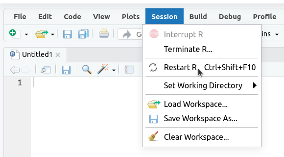
2. If the
Environmenttab isn’t empty click on the broom icon to clear it: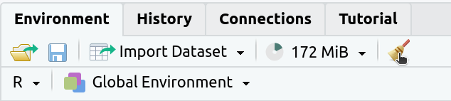
The
Environmenttab should now say “Environment Is Empty”: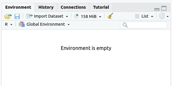
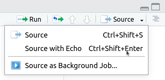
3. Rerun your entire homework assignment using “Source with Echo” to make sure it runs from start to finish and produces the expected results.
4. Make sure that you saved your code with the name
assignmentsomewhere in the file name. You should see the file in theFilestab and the name of the file should be black (not red with an*in the tab at the top of the text editor):
5. Make sure that your code will run on other computers
- No
setwd()(use RStudio Projects instead) - Use
/not\for paths
- No
Graphing Data From Multiple Tables (Challenge - optional)
An experiment in Kenya has been exploring the influence of large herbivores on plants.
Check to see if
ACACIA_DREPANOLOBIUM_SURVEY.txtandTREE_SURVEYS.txtis in your workspace. If not, downloadACACIA_DREPANOLOBIUM_SURVEY.txtandTREE_SURVEYS.txtInstall thereadrpackage and useread_tsvto read in the data using the following commands:library(readr) acacia <- read_tsv("ACACIA_DREPANOLOBIUM_SURVEY.txt", na = c("dead")) trees <- read_tsv("TREE_SURVEYS.txt", col_types = list(HEIGHT = col_double(), AXIS_2 = col_double()))We want to compare the circumference to height relationship in acacia on different treatments in the context of the same relationship for trees in the region. These data are stored in the two tables above. Make a graph with the relationship between
Expected outputs for Graphing Data From Multiple TablesCIRCandHEIGHTfor the trees as gray points in the background and the same relationship for acacia as red points plotted on top of the tree points. There should be one subplot for each treatment. Include linear models for both sets of data. Provide clear labels for the axes.