All Images
Image 1 of 1: ‘RStudio layout’
Image 1 of 1: ‘RStudio layout with .R file open’
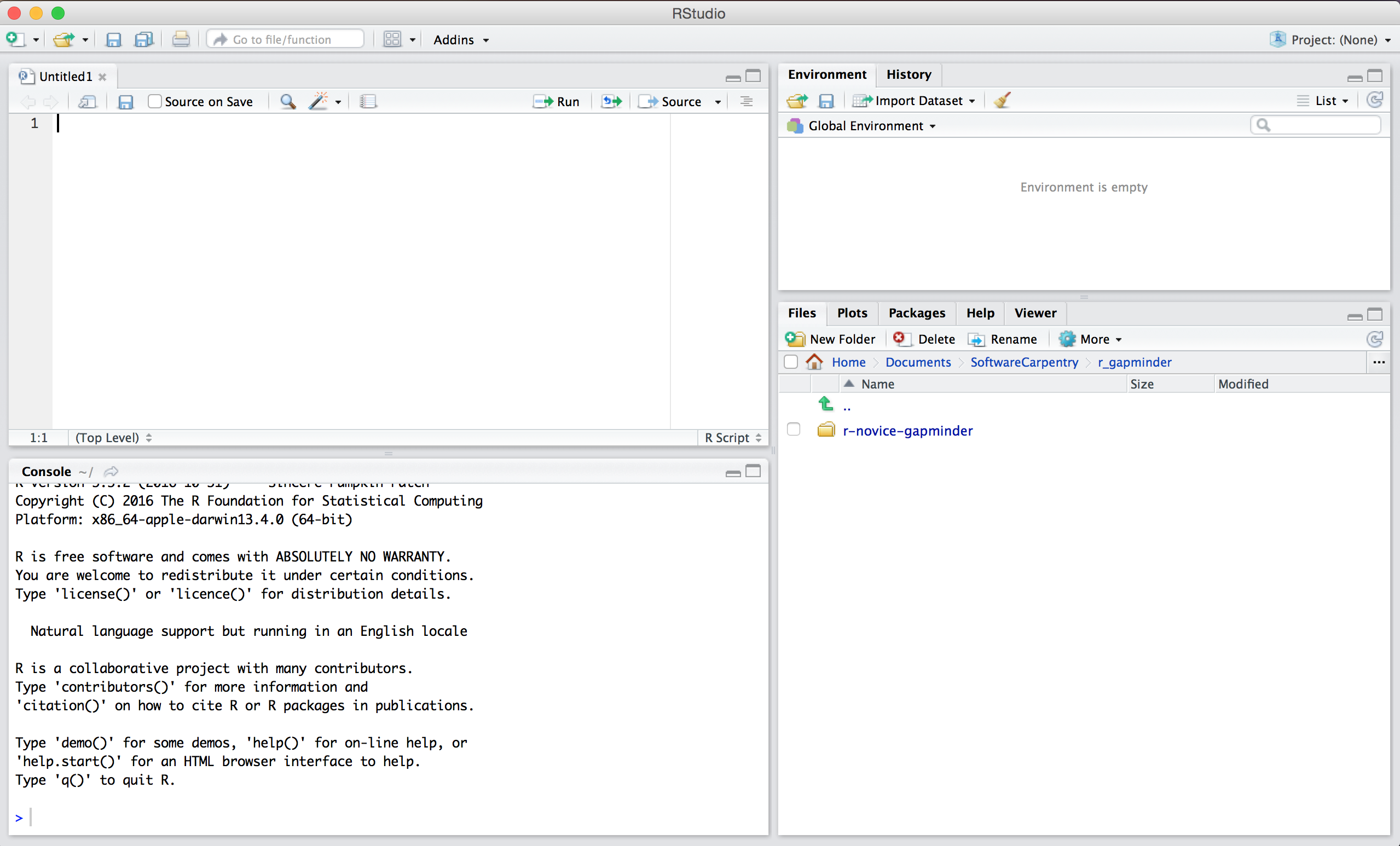
Image 1 of 1: ‘A screenshot of a project folder containing multiple versions of data, analysis scripts, figures, and results files’
Image 1 of 1: ‘Illustration of selecting two columns from a dataframe’
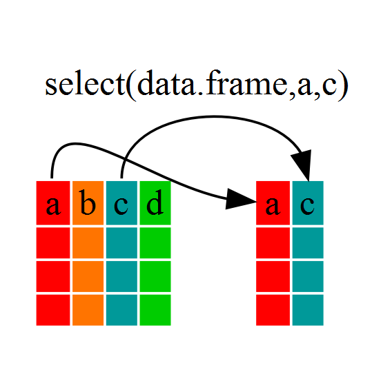
Image 1 of 1: ‘Illustration of multiple dataframes created by piping a dataframe to group_by’
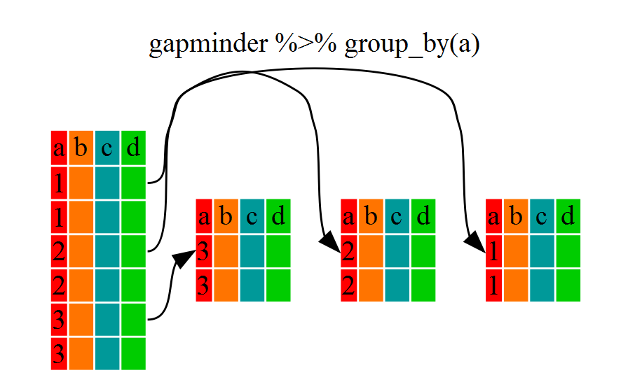
Image 1 of 1: ‘illustration of creating a summary dataframe from grouped data’
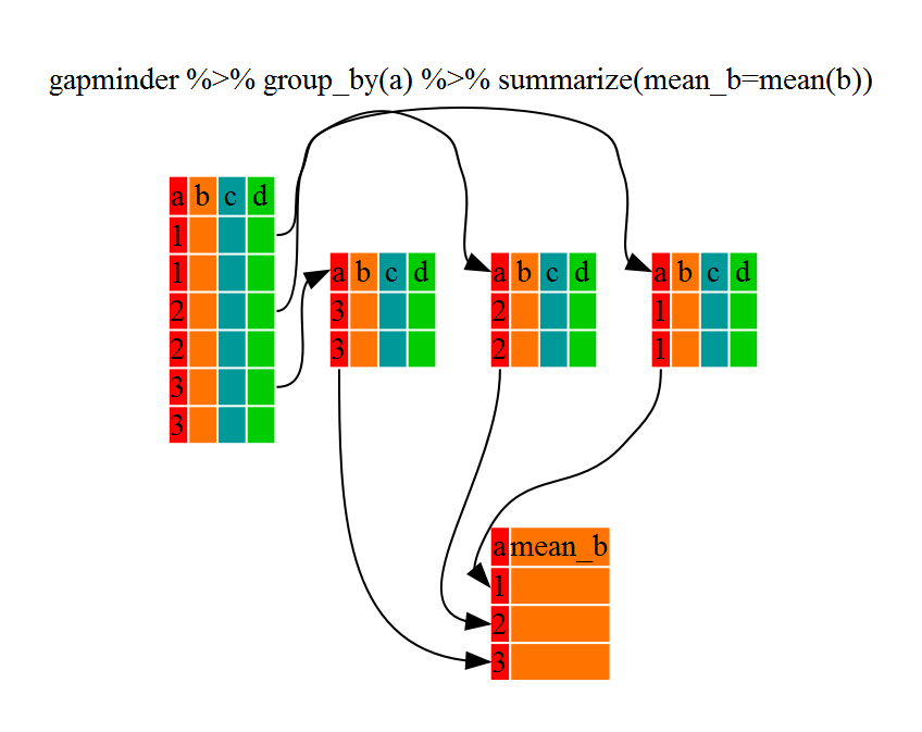
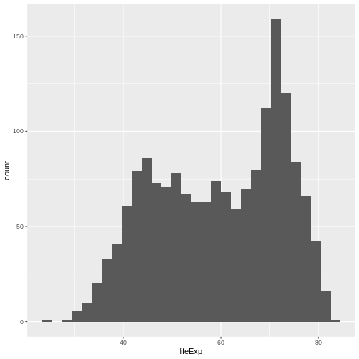
Image 1 of 1: ‘Histogram of life expectancy by country showing bimodal distribution with modes at 45 and 75’
 Histogram of life expectancy by country showing bimodal distribution
with modes at 45 and 75
Histogram of life expectancy by country showing bimodal distribution
with modes at 45 and 75
Image 1 of 1: ‘[decorative]’
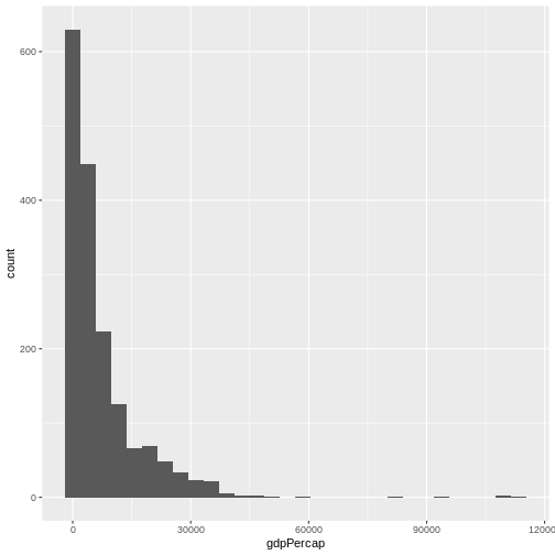
Image 1 of 1: ‘Barplot of GDP per capita. Country names on x-axis overlap and are not readable’
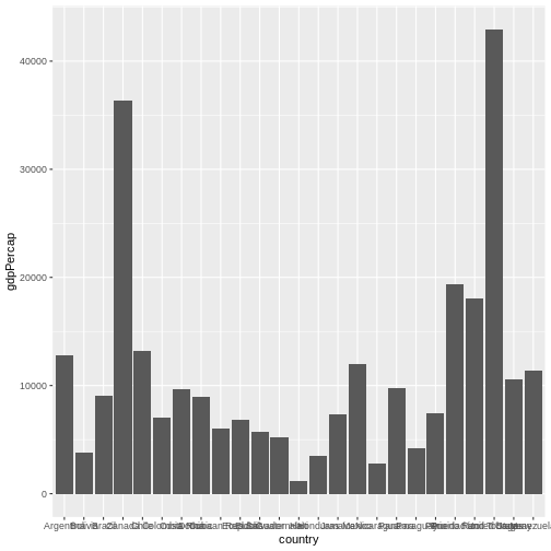 Barplot of GDP per capita. Country names on x-axis overlap and are not
readable
Barplot of GDP per capita. Country names on x-axis overlap and are not
readable
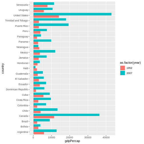
Image 1 of 1: ‘Barplot showing GDP per capita. Country names on the y-axis are readable’
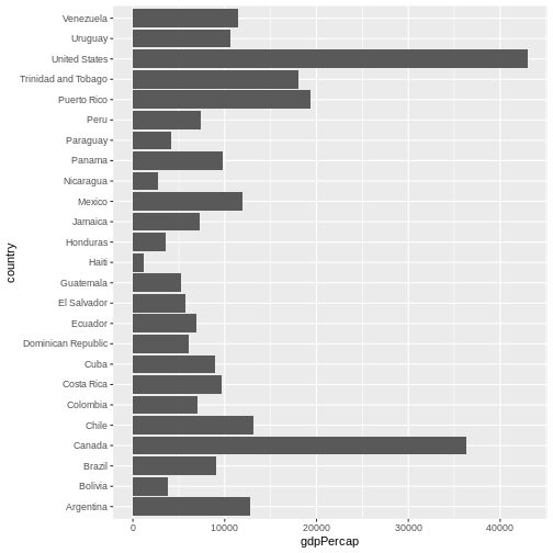 Barplot showing GDP per capita. Country names on the y-axis are readable
Image 1 of 1: ‘[decorative]’