Image 1 of 1: ‘A 3 by 3 data frame with columns showing numeric, character and logical values.’
Figure 2
Image 1 of 1: ‘Monsters at a fork in the road, with signs saying here, and not here. One direction, not here, leads to a scary dark forest with spiders and absolute filepaths, while the other leads to a sunny, green meadow, and a city below a rainbow and a world free of absolute filepaths. Art by Allison Horst’
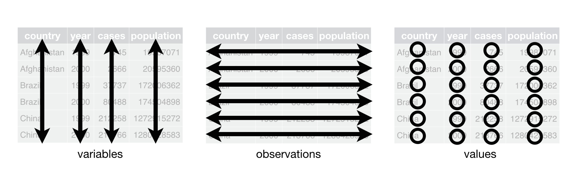
Long and wide
dataframe layouts mainly affect readability. You may find that visually
you may prefer the “wide” format, since you can see more of the data on
the screen. However, all of the R functions we have used thus far expect
for your data to be in a “long” data format. This is because the long
format is more machine readable and is closer to the formatting of
databases.
Figure 3
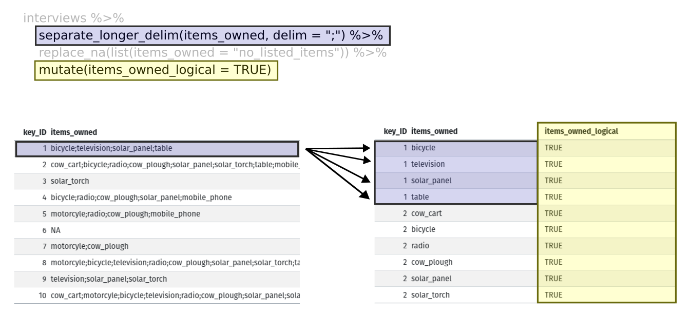
Image 1 of 1: ‘Two tables shown side-by-side. The first row of the left table is highlighted in blue, and the first four rows of the right table are also highlighted in blue to show how each of the values of 'items owned' are given their own row with the separate longer delim function. The 'items owned logical' column is highlighted in yellow on the right table to show how the mutate function adds a new column.’
Figure 4
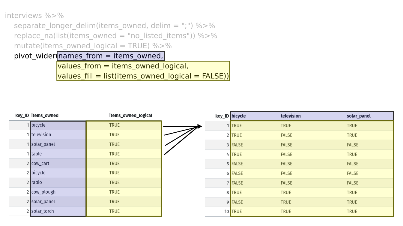
Image 1 of 1: ‘Two tables shown side-by-side. The 'items owned' column is highlighted in blue on the left table, and the column names are highlighted in blue on the right table to show how the values of the 'items owned' become the column names in the output of the pivot wider function. The 'items owned logical' column is highlighted in yellow on the left table, and the values of the bicycle, television, and solar panel columns are highlighted in yellow on the right table to show how the values of the 'items owned logical' column became the values of all three of the aforementioned columns.’
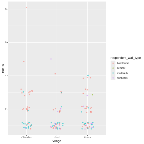
Image 1 of 1: ‘a greyscale base R scatterplot of number of household members by number of livestock owned’
Figure 2
Image 1 of 1: ‘A Lattice scatter plot of number of household members by number of livestock owned, with 3 panels, each showing data from one village’
Figure 3
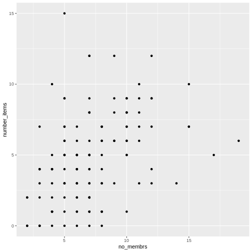
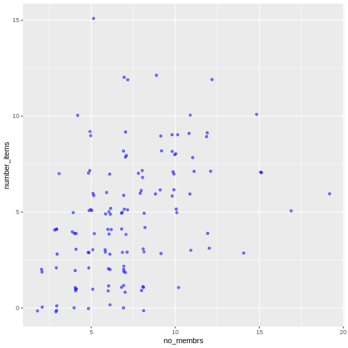
Image 1 of 1: ‘A geom_point scatter plot of the variables `no_membrs` and `number_items` with overplotted points’
Figure 4
Image 1 of 1: ‘Scatter plot of number of items owned versus number of household members.’
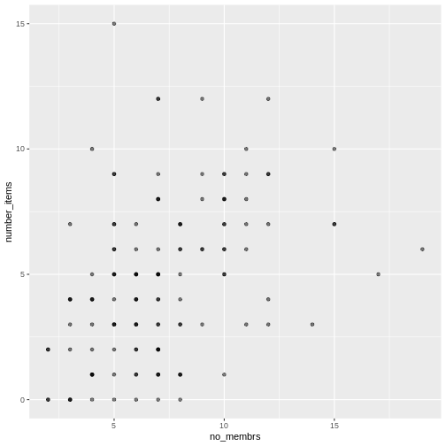
Figure 5
Image 1 of 1: ‘Scatter plot of number of items owned versus number of household members, with transparency added to points.’
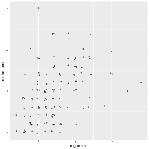
Figure 6
Image 1 of 1: ‘Scatter plot of number of items owned versus number of household members, showing jitter.’
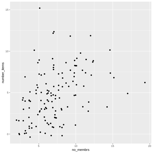
Figure 7
Image 1 of 1: ‘Scatter plot of number of items owned versus number of household members, with jitter and transparency.’
Figure 8
Image 1 of 1: ‘Scatter plot of number of items owned versus number of household members, showing points as blue.’
Figure 9
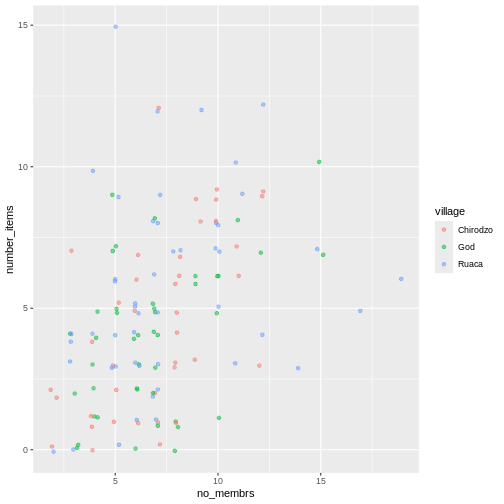
Image 1 of 1: ‘Previous plot with points colored by village and an added legend with color keys for each village’
Figure 10
Image 1 of 1: ‘Scatter plot showing positive trend between number of household members and number of items owned.’
Figure 11
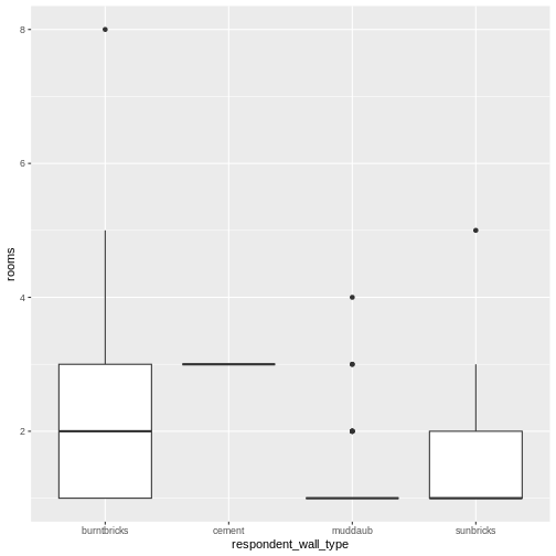
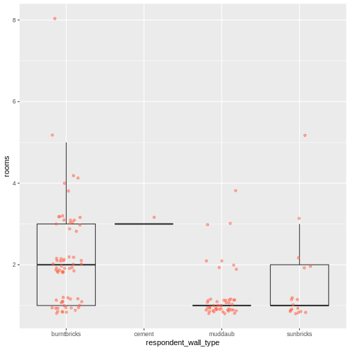
Image 1 of 1: ‘Box plot of number of rooms by wall type.’
Figure 12
Image 1 of 1: ‘Previous plot with dot plot added as additional layer to show individual values. Boxplot layer is transparent.’
Figure 13
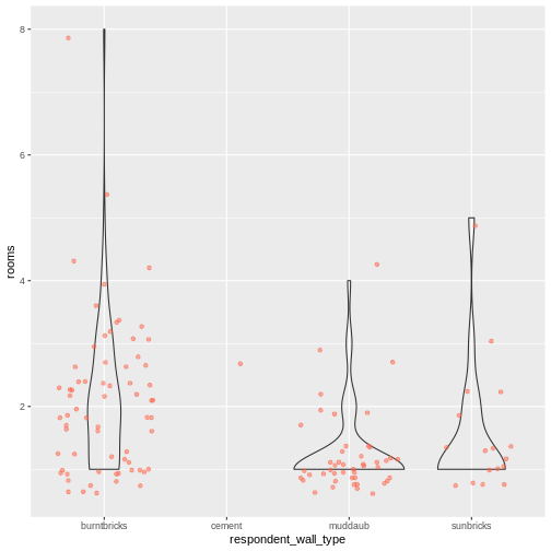
Image 1 of 1: ‘A violin plot showing number of rooms within homes of each wall type. The points are jittered to avoid overplotting and the width of each vertical segment is determined by the number of points of that wall type with similar number of rooms’
Figure 14
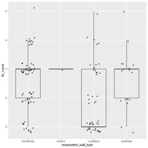
Image 1 of 1: ‘Box plot of number of livestock owned by wall type, with dot plot added as additional layer to show individual values.’
Figure 15
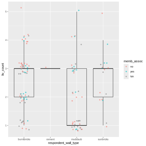
Image 1 of 1: ‘Previous plot with dots colored based on whether respondent was a member of an irrigation association.’
Figure 16
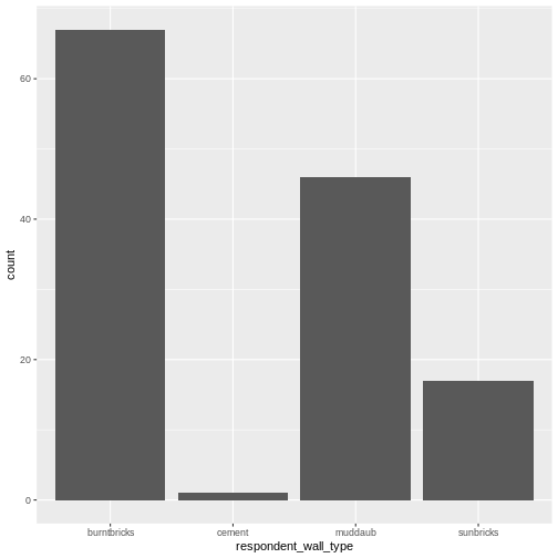
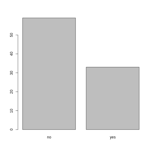
Image 1 of 1: ‘Bar plot showing counts of respondent wall types.’
Figure 17
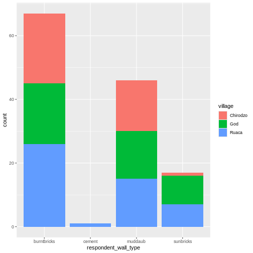
Image 1 of 1: ‘Stacked bar plot of wall types showing each village as a different color.’
Figure 18
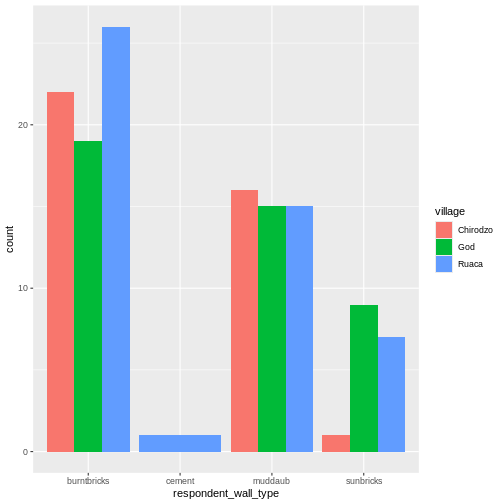
Image 1 of 1: ‘Bar plot of respondent wall types with each village as a separate bar.’
Figure 19
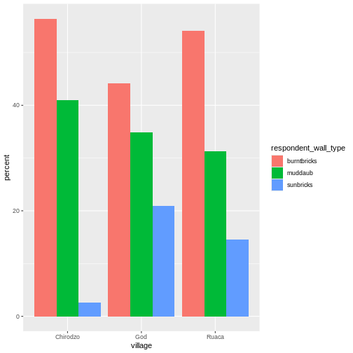
Image 1 of 1: ‘Side by side bar plot showing percent of respondents in each village with each wall type.’
Figure 20
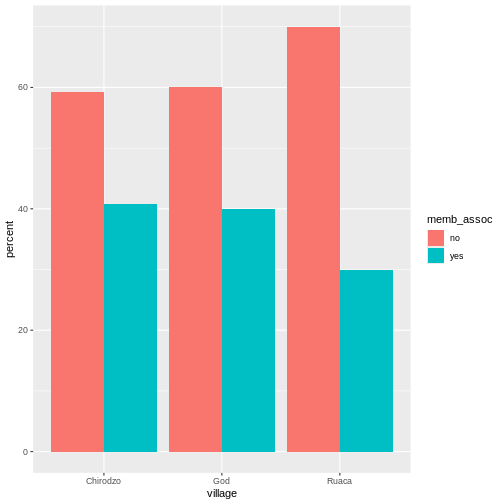
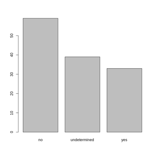
Image 1 of 1: ‘Bar plot showing percent of respondents in each village who were part of association.’
Figure 21
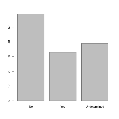
Image 1 of 1: ‘Previous plot with plot title and labells added.’
Figure 22
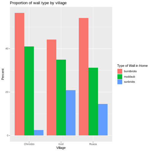
Image 1 of 1: ‘Bar plot showing percent of each wall type in each village.’
Figure 23
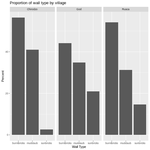
Image 1 of 1: ‘Bar plot showing percent of each wall type in each village, with black and white theme applied.’
Figure 24
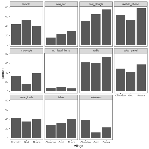
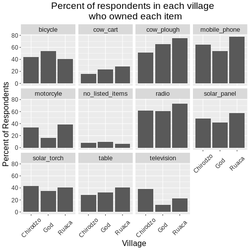
Image 1 of 1: ‘Multi-panel bar chart showing percent of respondents in each village and who owned each item, with no grids behid bars.’
Figure 25
Image 1 of 1: ‘Faceted barplot of the percent of respondents in each village who owned each type of item, styled in a black and white theme’
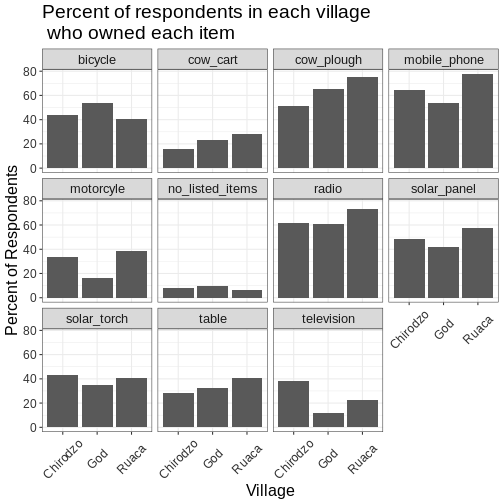
Figure 26
Image 1 of 1: ‘Previous plot, but with font size increased from default to 16 points’
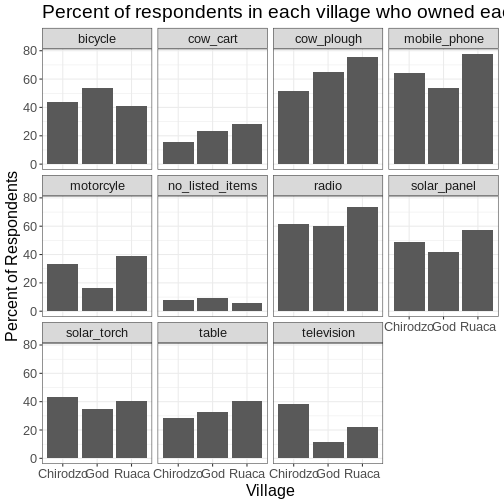
Figure 27
Image 1 of 1: ‘Multi-panel bar charts showing percent of respondents in each village and who owned each item, with grids behind the bars and village labes displayed at a 45 degree angle to avoid overlapping labels’
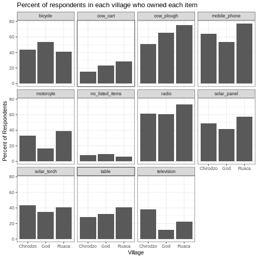
Figure 28
Image 1 of 1: ‘Identical plot to previous multi-panel bar chart, but with the figure title centered horizontally’


 R for Data Science,
Wickham H and Grolemund G (https://r4ds.had.co.nz/index.html)
© Wickham, Grolemund 2017 This image is licenced under
Attribution-NonCommercial-NoDerivs 3.0 United States (CC-BY-NC-ND 3.0
US)
R for Data Science,
Wickham H and Grolemund G (https://r4ds.had.co.nz/index.html)
© Wickham, Grolemund 2017 This image is licenced under
Attribution-NonCommercial-NoDerivs 3.0 United States (CC-BY-NC-ND 3.0
US)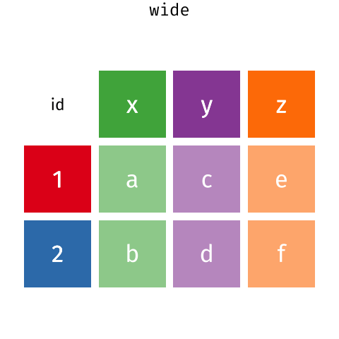 Long and wide
dataframe layouts mainly affect readability. You may find that visually
you may prefer the “wide” format, since you can see more of the data on
the screen. However, all of the R functions we have used thus far expect
for your data to be in a “long” data format. This is because the long
format is more machine readable and is closer to the formatting of
databases.
Long and wide
dataframe layouts mainly affect readability. You may find that visually
you may prefer the “wide” format, since you can see more of the data on
the screen. However, all of the R functions we have used thus far expect
for your data to be in a “long” data format. This is because the long
format is more machine readable and is closer to the formatting of
databases.