Plotting and pandas
Last updated on 2026-06-19 | Edit this page
Overview
Questions
- How to efficiently explore our data and identify appropriate filters to produce a clean sample (in this case of GD-1 stars)?
Objectives
- Use a Boolean pandas
Seriesto select rows in aDataFrame. - Save multiple
DataFrames in an HDF5 file.
In the previous episode, we wrote a query to select stars from the region of the sky where we expect GD-1 to be, and saved the results in a FITS and HDF5 file.
Now we will read that data back in and implement the next step in the analysis, identifying stars with the proper motion we expect for GD-1.
Outline
We will put those results into a pandas
DataFrame, which we will use to select stars near the centerline of GD-1.Plotting the proper motion of those stars, we will identify a region of proper motion for stars that are likely to be in GD-1.
Finally, we will select and plot the stars whose proper motion is in that region.
Starting from this episode
If you are starting a new notebook for this episode, expand this section for information you will need to get started.
Previously, we ran a query on the Gaia server, downloaded data for
roughly 140,000 stars, transformed the coordinates to the GD-1 reference
frame, and saved the results in an HDF5 file (Dataset name
results_df). We will use that data for this episode.
Whether you are working from a new notebook or coming back from a
checkpoint, reloading the data will save you from having to run the
query again.
If you are starting this episode here or starting this episode in a new notebook, you will need to run the following lines of code.
This imports previously imported functions:
PYTHON
import astropy.units as u
import matplotlib.pyplot as plt
import pandas as pd

from episode_functions import *
The following code loads in the data (instructions for downloading
data can be found in the setup instructions).
You may need to add a the path to the filename variable below
(e.g. filename = 'student_download/backup-data/gd1_data.hdf')
Exploring data
One benefit of using pandas is that it provides functions for
exploring the data and checking for problems. One of the most useful of
these functions is describe, which computes summary
statistics for each column.
OUTPUT
          source_id             ra            dec           pmra  \
count  1.403390e+05  140339.000000  140339.000000  140339.000000
mean   6.792399e+17     143.823122      26.780285      -2.484404
std    3.792177e+16       3.697850       3.052592       5.913939
min    6.214900e+17     135.425699      19.286617    -106.755260
25%    6.443517e+17     140.967966      24.592490      -5.038789
50%    6.888060e+17     143.734409      26.746261      -1.834943
75%    6.976579e+17     146.607350      28.990500       0.452893
max    7.974418e+17     152.777393      34.285481     104.319923

               pmdec       parallax           phi1           phi2  \
[Output truncated]Exercise (10 minutes)
Review the summary statistics in this table.
Do the values make sense based on what you know about the context?
Do you see any values that seem problematic, or evidence of other data issues?
The most noticeable issue is that some of the parallax values are negative, which seems non-physical.
Negative parallaxes in the Gaia database can arise from a number of causes like source confusion (high negative values) and the parallax zero point with systematic errors (low negative values).
Fortunately, we do not use the parallax measurements in the analysis (one of the reasons we used constant distance for reflex correction).
Plot proper motion
Now we are ready to replicate one of the panels in Figure 1 of the Price-Whelan and Bonaca paper, the one that shows components of proper motion as a scatter plot:
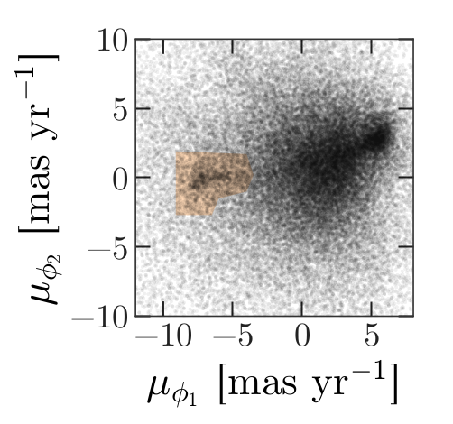
In this figure, the shaded area identifies stars that are likely to be in GD-1 because:
Due to the nature of tidal streams, we expect the proper motion for stars in GD-1 to be along the axis of the stream; that is, we expect motion in the direction of
phi2to be near 0.In the direction of
phi1, we do not have a prior expectation for proper motion, except that it should form a cluster at a non-zero value.
By plotting proper motion in the GD-1 frame, we hope to find this cluster. Then we will use the bounds of the cluster to select stars that are more likely to be in GD-1.
The following figure is a scatter plot of proper motion, in the GD-1
frame, for the stars in results_df.
PYTHON
x = results_df['pm_phi1']
y = results_df['pm_phi2']
plt.plot(x, y, 'ko', markersize=0.1, alpha=0.1)

plt.xlabel('Proper motion phi1 (mas/yr GD1 frame)')
plt.ylabel('Proper motion phi2 (mas/yr GD1 frame)')
OUTPUT
<Figure size 432x288 with 1 Axes>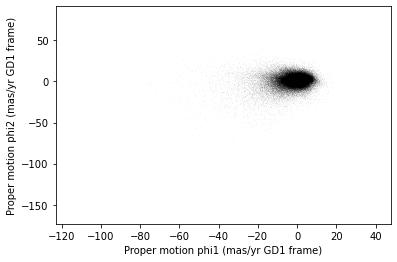
Most of the proper motions are near the origin, but there are a few
extreme values. Following the example in the paper, we will use
xlim and ylim to zoom in on the region near
the origin.
PYTHON
x = results_df['pm_phi1']
y = results_df['pm_phi2']
plt.plot(x, y, 'ko', markersize=0.1, alpha=0.1)

plt.xlabel('Proper motion phi1 (mas/yr GD1 frame)')
plt.ylabel('Proper motion phi2 (mas/yr GD1 frame)')

plt.xlim(-12, 8)
plt.ylim(-10, 10)
OUTPUT
<Figure size 432x288 with 1 Axes>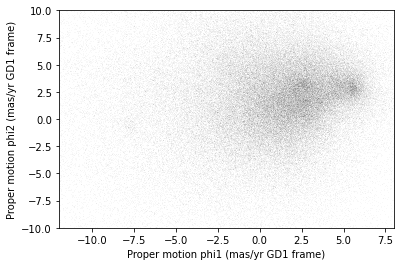
There is a hint of an overdense region near (-7.5, 0), but if you did not know where to look, you would miss it.
To see the cluster more clearly, we need a sample that contains a higher proportion of stars in GD-1. We will do that by selecting stars close to the centerline.
Selecting the centerline
As we can see in the following figure, many stars in GD-1 are less
than 1 degree from the line phi2=0.
Stars near this line have the highest probability of being in GD-1.
To select them, we will use a “Boolean mask”. We will start by
selecting the phi2 column from the
DataFrame:
OUTPUT
pandas.core.series.SeriesThe result is a Series, which is the structure pandas
uses to represent columns.
We can use a comparison operator, >, to compare the
values in a Series to a constant.
OUTPUT
pandas.core.series.SeriesThe result is a Series of Boolean values, that is,
True and False.
OUTPUT
0    False
1    False
2    False
3    False
4    False
Name: phi2, dtype: bool
To select values that fall between phi2_min and
phi2_max, we will use the & operator,
which computes “logical AND”. The result is true where elements from
both Boolean Series are true.
Logical operators
Python’s logical operators (and, or, and
not) do not work with NumPy or pandas. Both libraries use
the bitwise operators (&, |, and
~) to do elementwise logical operations (explanation
here).
Also, we need the parentheses around the conditions; otherwise the order of operations is incorrect.
The sum of a Boolean Series is the number of
True values, so we can use sum to see how many
stars are in the selected region.
OUTPUT
np.int64(25084)A Boolean Series is sometimes called a “mask” because we
can use it to mask out some of the rows in a DataFrame and
select the rest, like this:
OUTPUT
pandas.core.frame.DataFramecenterline_df is a DataFrame that contains
only the rows from results_df that correspond to
True values in mask. So it contains the stars
near the centerline of GD-1.
We can use len to see how many rows are in
centerline_df:
OUTPUT
25084And what fraction of the rows we have selected.
OUTPUT
0.1787386257562046There are about 25,000 stars in this region, about 18% of the total.
Plotting proper motion
This is the second time we are plotting proper motion, and we can imagine we might do it a few more times. Instead of copying and pasting the previous code, we will write a function that we can reuse on any dataframe.
PYTHON
def plot_proper_motion(df):
    """Plot proper motion.

    df: DataFrame with `pm_phi1` and `pm_phi2`
    """
    x = df['pm_phi1']
    y = df['pm_phi2']
    plt.plot(x, y, 'ko', markersize=0.3, alpha=0.3)

    plt.xlabel('Proper motion phi1 (mas/yr)')
    plt.ylabel('Proper motion phi2 (mas/yr)')

    plt.xlim(-12, 8)
    plt.ylim(-10, 10)
And we can call it like this:
OUTPUT
<Figure size 432x288 with 1 Axes>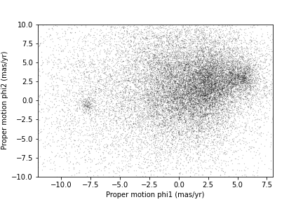
Now we can see more clearly that there is a cluster near (-7.5, 0).
You might notice that our figure is less dense than the one in the paper. That is because we started with a set of stars from a relatively small region. The figure in the paper is based on a region about 10 times bigger.
In the next episode we will go back and select stars from a larger region. But first we will use the proper motion data to identify stars likely to be in GD-1.
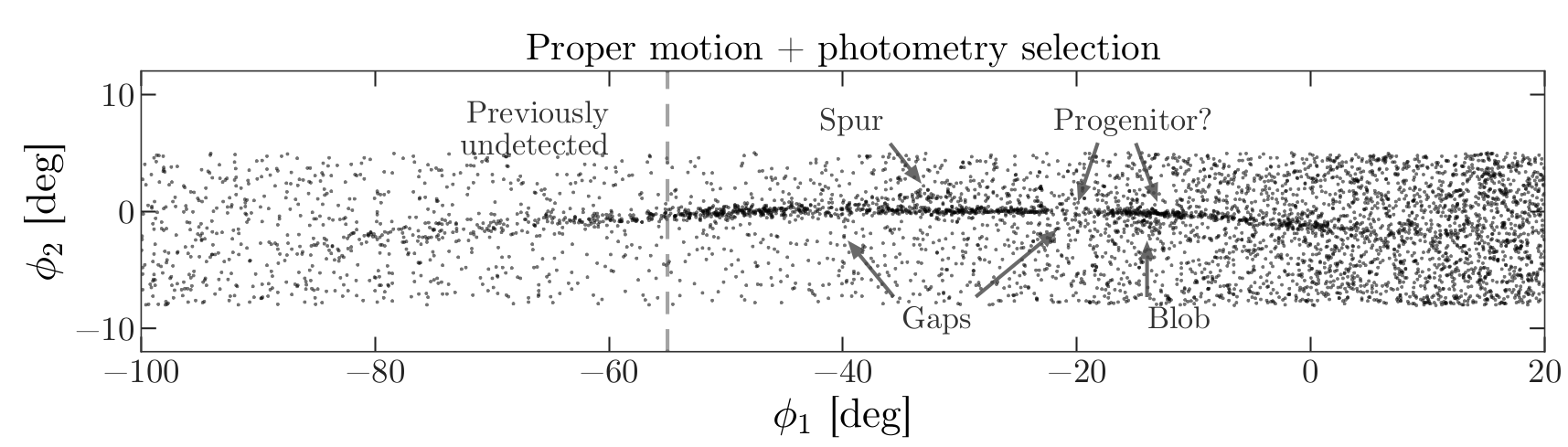
Filtering based on proper motion
The next step is to select stars in the “overdense” region of proper motion, which are candidates to be in GD-1.
In the original paper, Price-Whelan and Bonaca used a polygon to cover this region, as shown in this figure.
We will use a simple rectangle for now, but in a later lesson we will see how to select a polygonal region as well.
Here are bounds on proper motion we chose by eye:
To draw these bounds, we will use the make_rectangle
function we wrote in episode 2 to make two lists containing the
coordinates of the corners of the rectangle.
Here is what the plot looks like with the bounds we chose.
OUTPUT
<Figure size 432x288 with 1 Axes>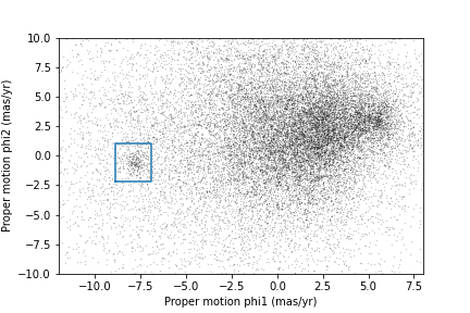
Now that we have identified the bounds of the cluster in proper
motion, we will use it to select rows from results_df.
We will use the following function, which uses pandas operators to
make a mask that selects rows where series falls between
low and high.
PYTHON
def between(series, low, high):
    """Check whether values are between `low` and `high`."""
    return (series > low) & (series < high)
The following mask selects stars with proper motion in the region we chose.
PYTHON
pm1 = results_df['pm_phi1']
pm2 = results_df['pm_phi2']

pm_mask = (between(pm1, pm1_min, pm1_max) &
           between(pm2, pm2_min, pm2_max))
Again, the sum of a Boolean series is the number of TRUE
values.
OUTPUT
np.int64(1049)Now we can use this mask to select rows from
results_df.
OUTPUT
1049These are the stars we think are likely to be in GD-1. We can inspect these stars, plotting their coordinates (not their proper motion).
PYTHON
x = selected_df['phi1']
y = selected_df['phi2']
plt.plot(x, y, 'ko', markersize=1, alpha=1)

plt.xlabel('phi1 (degree GD1)')
plt.ylabel('phi2 (degree GD1)')
OUTPUT
<Figure size 432x288 with 1 Axes>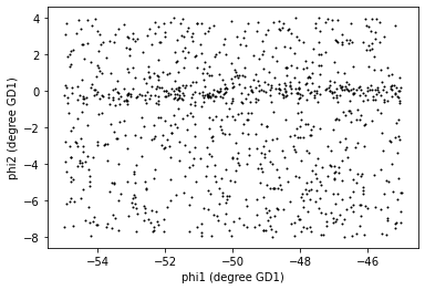
Now that is starting to look like a tidal stream!
To clean up the plot a little bit we can add two new Matplotlib commands:
axiswith the parameterequalsets up the axes so a unit is the same size along thexandyaxes.titleputs the input string as a title at the top of the plot. Thefontsizekeyword sets thefontsizeto bemedium, a little smaller than the defaultlarge.
In an example like this, where x and y
represent coordinates in space, equal axes ensure that the distance
between points is represented accurately. Since we are now constraining
the relative proportions of our axes, the data may not fill the entire
figure.
PYTHON
x = selected_df['phi1']
y = selected_df['phi2']

plt.plot(x, y, 'ko', markersize=0.3, alpha=0.3)

plt.xlabel('phi1 [deg]')
plt.ylabel('phi2 [deg]')
plt.title('Proper motion selection', fontsize='medium')

plt.axis('equal')
OUTPUT
<Figure size 432x288 with 1 Axes>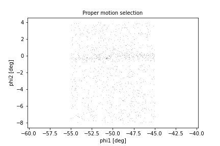
Before we go any further, we will put the code we wrote to make one of the panel figures into a function that we will use in future episodes to recreate this entire plot with a single line of code.
PYTHON
def plot_pm_selection(df):
    """Plot in GD-1 spatial coordinates the location of the stars
    selected by proper motion
    """
    x = df['phi1']
    y = df['phi2']

    plt.plot(x, y, 'ko', markersize=0.3, alpha=0.3)

    plt.xlabel('phi1 [deg]')
    plt.ylabel('phi2 [deg]')
    plt.title('Proper motion selection', fontsize='medium')

    plt.axis('equal')
Now our one line plot command is:
Saving the DataFrame
At this point we have run a successful query and cleaned up the
results. This is a good time to save the data. We have already started a
results file called gd1_data.hdf which we wrote results_df
to.
Recall that we chose HDF5 because it is a binary format producing small files that are fast to read and write and are a cross-language standard.
Additionally, HDF5 files can contain more than one dataset and can store metadata associated with each dataset (such as column names or observatory information, like a FITS header).
We can add to our existing pandas DataFrame to an HDF5
file by omitting the mode='w' keyword like this:
Because an HDF5 file can contain more than one Dataset, we have to provide a name, or “key”, that identifies the Dataset in the file.
We could use any string as the key, but it is generally a good
practice to use a descriptive name (just like your
DataFrame variable name) so we will give the Dataset in the
file the same name (key) as the DataFrame.
Exercise (5 minutes)
We are going to need centerline_df later as well. Write
a line of code to add it as a second Dataset in the HDF5 file.
Hint: Since the file already exists, you should not use
mode='w'.
We can use getsize to confirm that the file exists and
check the size. getsize returns a value in bytes. For the
size files we’re looking at, it will be useful to view their size in
MegaBytes (MB), so we will divide by 1024*1024.
OUTPUT
13.992530822753906If you forget what the names of the Datasets in the file are, you can read them back like this:
OUTPUT
['/centerline_df', '/results_df', '/selected_df']Context Managers
We use a with statement here to open the file before the
print statement and (automatically) close it after. Read more about context
managers.
The keys are the names of the Datasets which makes it easy for us to
remember which DataFrame is in which Dataset.
Summary
In this episode, we re-loaded the transformed Gaia data we saved from a previous query.
Then we prototyped the selection process from the Price-Whelan and Bonaca paper locally using data that we had already downloaded.:
We selected stars near the centerline of GD-1 and made a scatter plot of their proper motion.
We identified a region of proper motion that contains stars likely to be in GD-1.
We used a Boolean
Seriesas a mask to select stars whose proper motion is in that region.
So far, we have used data from a relatively small region of the sky so that our local dataset was not too big. In the next lesson, we will write a query that selects stars based on the proper motion limits we identified in this lesson, which will allow us to explore a larger region.
- A workflow is often prototyped on a small set of data which can be explored more easily and used to identify ways to limit a dataset to exactly the data you want.
- To store data from a pandas
DataFrame, a good option is an HDF5 file, which can contain multiple Datasets.