All in One View
Content from Basic Queries
Last updated on 2025-12-12 | Edit this page
Overview
Questions
- How can we select and download the data we want from the Gaia server?
Objectives
- Compose a basic query in ADQL/SQL.
- Use queries to explore a database and its tables.
- Use queries to download data.
- Develop, test, and debug a query incrementally.
As a running example, we will replicate parts of the analysis in the paper, “Off the beaten path: Gaia reveals GD-1 stars outside of the main stream” by Adrian Price-Whelan and Ana Bonaca.
Outline
This episode demonstrates the steps for selecting and downloading data from the Gaia Database:
First we will make a connection to the Gaia server,
We will explore information about the database and the tables it contains,
We will write a query and send it to the server, and finally
We will download the response from the server.
Query Language
In order to select data from a database, you need to compose a query, which is a program written in a “query language”. The query language we will use is ADQL, which stands for “Astronomical Data Query Language”.
ADQL is a dialect of SQL (Structured Query Language), which is by far the most commonly used query language. Almost everything you will learn about ADQL also works in SQL.
The reference manual for ADQL is here. But you might find it easier to learn from this ADQL Cookbook.
Using Jupyter
If you have not worked with Jupyter notebooks before, you might start with the tutorial from Jupyter.org called “Try Classic Notebook”, or this tutorial from DataQuest.
There are two environments you can use to write and run notebooks:
“Jupyter Notebook” is the original, and
“Jupyter Lab” is a newer environment with more features.
For this lesson, you can use either one.
Here are the most important things to know about running a Jupyter notebook:
Notebooks are made up of code cells and text cells (and a few other less common kinds). Code cells contain code; text cells contain explanatory text written in Markdown.
To run a code cell, click the cell to select it and press Shift-Enter. The output of the code should appear below the cell.
In general, notebooks only run correctly if you run every code cell in order from top to bottom. If you run cells out of order, you are likely to get errors.
You can modify existing cells, but then you have to run them again to see the effect.
You can add new cells, but you need to be careful about the order you run them in.
If you have added or modified cells, and the behavior of the notebook seems strange, you can restart the “kernel”, which clears all of the variables and functions you have defined, and run the cells again from the beginning.
If you are using Jupyter Notebook, open the
Kernelmenu and select “Restart and Run All”.In Jupyter Lab, open the
Kernelmenu and select “Restart Kernel and Run All Cells”.
Before you continue with this lesson, you might want to explore the other menus and the toolbar to see what else you can do.
Connecting to Gaia
The library we will use to get Gaia data is Astroquery.
Astroquery provides Gaia, which is an object
that represents a connection to the Gaia database.
We can connect to the Gaia database like this:
Old versions of astroquery output
if you are using a version of astroquery that’s older than v0.4.4, you may see this output
OUTPUT
Created TAP+ (v1.2.1) - Connection:
	Host: gea.esac.esa.int
	Use HTTPS: True
	Port: 443
	SSL Port: 443
Created TAP+ (v1.2.1) - Connection:
	Host: geadata.esac.esa.int
	Use HTTPS: True
	Port: 443
	SSL Port: 443
This import statement creates a TAP+ connection; TAP stands for “Table Access Protocol”, which is a network protocol for sending queries to the database and getting back the results.
Databases and Tables
What is a database? Most generally, it can be any collection of data, but when we are talking about ADQL or SQL:
A database is a collection of one or more named tables.
Each table is a 2-D array with one or more named columns of data.
We can use Gaia.load_tables to get the names of the
tables in the Gaia database. With the option
only_names=True, it loads information about the tables,
called “metadata”, but not the data itself.
OUTPUT
INFO: Retrieving tables... [astroquery.utils.tap.core]
INFO: Parsing tables... [astroquery.utils.tap.core]
INFO: Done. [astroquery.utils.tap.core]
The following for loop prints the names of the
tables.
OUTPUT
external.apassdr9
external.gaiadr2_geometric_distance
external.gaiaedr3_distance
external.galex_ais
external.ravedr5_com
external.ravedr5_dr5
external.ravedr5_gra
external.ravedr5_on
external.sdssdr13_photoprimary
external.skymapperdr1_master
external.skymapperdr2_master
[Output truncated]
So that is a lot of tables. The ones we will use are:
gaiadr2.gaia_source, which contains Gaia data from data release 2,gaiadr2.panstarrs1_original_valid, which contains the photometry data we will use from PanSTARRS, andgaiadr2.panstarrs1_best_neighbour, which we will use to cross-match each star observed by Gaia with the same star observed by PanSTARRS.
We can use load_table (not load_tables) to
get the metadata for a single table. The name of this function is
misleading, because it only downloads metadata, not the contents of the
table.
OUTPUT
Retrieving table 'gaiadr2.gaia_source'
Parsing table 'gaiadr2.gaia_source'...
Done.

<astroquery.utils.tap.model.taptable.TapTableMeta at 0x7f50edd2aeb0>
Jupyter shows that the result is an object of type
TapTableMeta, but it does not display the contents.
To see the metadata, we have to print the object.
OUTPUT
TAP Table name: gaiadr2.gaiadr2.gaia_source
Description: This table has an entry for every Gaia observed source as listed in the
Main Database accumulating catalogue version from which the catalogue
release has been generated. It contains the basic source parameters,
that is only final data (no epoch data) and no spectra (neither final
nor epoch).
Size (bytes): 4906520690688
Num. columns: 96
Columns
The following loop prints the names of the columns in the table.
OUTPUT
solution_id
designation
source_id
random_index
ref_epoch
ra
ra_error
dec
dec_error
parallax
parallax_error
[Output truncated]
You can probably infer what many of these columns are by looking at the names, but you should resist the temptation to guess. To find out what the columns mean, read the documentation.
Exercise (2 minutes)
One of the other tables we will use is
gaiadr2.panstarrs1_original_valid. Use
load_table to get the metadata for this table. How many
columns are there and what are their names?
PYTHON
panstarrs_metadata = Gaia.load_table('gaiadr2.panstarrs1_original_valid')
print(panstarrs_metadata)
OUTPUT
Retrieving table 'gaiadr2.panstarrs1_original_valid'
TAP Table name: gaiadr2.gaiadr2.panstarrs1_original_valid
Description: The Panoramic Survey Telescope and Rapid Response System (Pan-STARRS) is
a system for wide-field astronomical imaging developed and operated by
the Institute for Astronomy at the University of Hawaii. Pan-STARRS1

[Output truncated]

Catalogue curator:
SSDC - ASI Space Science Data Center
https://www.ssdc.asi.it/
Size (bytes): 933802426368
Num. columns: 26OUTPUT
obj_name
obj_id
ra
dec
ra_error
dec_error
epoch_mean
g_mean_psf_mag
g_mean_psf_mag_error
g_flags
r_mean_psf_mag
r_mean_psf_mag_error
r_flags
i_mean_psf_mag
i_mean_psf_mag_error
i_flags
z_mean_psf_mag
z_mean_psf_mag_error
z_flags
y_mean_psf_mag
y_mean_psf_mag_error
y_flags
n_detections
zone_id
obj_info_flag
quality_flag
Writing queries
You might be wondering how we download these tables. With tables this big, you generally don’t. Instead, you use queries to select only the data you want.
A query is a program written in a query language like SQL. For the Gaia database, the query language is a dialect of SQL called ADQL.
Here’s an example of an ADQL query.
Triple-quotes strings
We use a triple-quoted string here so we can include line breaks in the query, which makes it easier to read.
The words in uppercase are ADQL keywords:
SELECTindicates that we are selecting data (as opposed to adding or modifying data).TOPindicates that we only want the first 10 rows of the table, which is useful for testing a query before asking for all of the data.FROMspecifies which table we want data from.
The third line is a list of column names, indicating which columns we want.
In this example, the keywords are capitalized and the column names are lowercase. This is a common style, but it is not required. ADQL and SQL are not case-sensitive.
Also, the query is broken into multiple lines to make it more readable. This is a common style, but not required. Line breaks don’t affect the behavior of the query.
To run this query, we use the Gaia object, which
represents our connection to the Gaia database, and invoke
launch_job:
OUTPUT
<astroquery.utils.tap.model.job.Job at 0x7f50edd2adc0>The result is an object that represents the job running on a Gaia server.
If you print it, it displays metadata for the forthcoming results.
OUTPUT
<Table length=10>
   name    dtype  unit                            description                             n_bad
--------- ------- ---- ------------------------------------------------------------------ -----
source_id   int64      Unique source identifier (unique within a particular Data Release)     0
       ra float64  deg                                                    Right ascension     0
      dec float64  deg                                                        Declination     0
 parallax float64  mas                                                           Parallax     2
Jobid: None
Phase: COMPLETED
Owner: None
Output file: sync_20210315090602.xml.gz
[Output truncated]
Don’t worry about Results: None. That does not actually
mean there are no results.
However, Phase: COMPLETED indicates that the job is
complete, so we can get the results like this:
OUTPUT
astropy.table.table.TableThe type function indicates that the result is an Astropy Table.
Repetition
Why is table repeated three times? The first is the name
of the module, the second is the name of the submodule, and the third is
the name of the class. Most of the time we only care about the last one.
It’s like the Linnean name for the Western lowland gorilla, which is
Gorilla gorilla gorilla.
An Astropy Table is similar to a table in an SQL
database except:
SQL databases are stored on disk drives, so they are persistent; that is, they “survive” even if you turn off the computer. An Astropy
Tableis stored in memory; it disappears when you turn off the computer (or shut down your Jupyter notebook).SQL databases are designed to process queries. An Astropy
Tablecan perform some query-like operations, like selecting columns and rows. But these operations use Python syntax, not SQL.
Jupyter knows how to display the contents of a
Table.
OUTPUT
<Table length=10>
     source_id              ra                 dec               parallax
                           deg                 deg                 mas
       int64             float64             float64             float64
------------------- ------------------ ------------------- --------------------
5887983246081387776   227.978818386372  -53.64996962450103   1.0493172163332998
5887971250213117952 228.32280834041364  -53.66270726203726  0.29455652682279093
5887991866047288704  228.1582047014091 -53.454724911639794  -0.5789179941669236
5887968673232040832 228.07420888099884   -53.8064612895961  0.41030970779603076
5887979844465854720 228.42547805195946  -53.48882284470035 -0.23379683441525864
5887978607515442688 228.23831627636855  -53.56328249482688  -0.9252161956789068
[Output truncated]
Each column has a name, units, and a data type.
For example, the units of ra and dec are
degrees, and their data type is float64, which is a 64-bit
floating-point
number, used to store measurements with a fraction part.
This information comes from the Gaia database, and has been stored in
the Astropy Table by Astroquery.
Exercise (3 minutes)
Read the documentation of this table and choose a column that looks interesting to you. Add the column name to the query and run it again. What are the units of the column you selected? What is its data type?
For example, we can add radial_velocity : Radial velocity (double, Velocity[km/s] ) - Spectroscopic radial velocity in the solar barycentric reference frame. The radial velocity provided is the median value of the radial velocity measurements at all epochs.
PYTHON
query1_with_rv = """SELECT
TOP 10
source_id, ra, dec, parallax, radial_velocity
FROM gaiadr2.gaia_source
"""
job1_with_rv = Gaia.launch_job(query1_with_rv)
results1_with_rv = job1_with_rv.get_results()
results1_with_rv
OUTPUT
     source_id              ra         ...       parallax       radial_velocity
                           deg         ...         mas               km / s
------------------- ------------------ ... -------------------- ---------------
5800603716991968256 225.13905251174302 ...   0.5419737483675161              --
5800592790577127552 224.30113911598448 ...  -0.6369101209622813              --
5800601273129497856 225.03260084885449 ...  0.27554460953986526              --
[Output truncated]
Asynchronous queries
launch_job asks the server to run the job
“synchronously”, which normally means it runs immediately. But
synchronous jobs are limited to 2000 rows. For queries that return more
rows, you should run “asynchronously”, which mean they might take longer
to get started.
If you are not sure how many rows a query will return, you can use
the SQL command COUNT to find out how many rows are in the
result without actually returning them. We will see an example in the
next lesson.
The results of an asynchronous query are stored in a file on the server, so you can start a query and come back later to get the results. For anonymous users, files are kept for three days.
As an example, let us try a query that is similar to
query1, with these changes:
It selects the first 3000 rows, so it is bigger than we should run synchronously.
It selects two additional columns,
pmraandpmdec, which are proper motions along the axes ofraanddec.It uses a new keyword,
WHERE.
PYTHON
query2 = """SELECT
TOP 3000
source_id, ra, dec, pmra, pmdec, parallax
FROM gaiadr2.gaia_source
WHERE parallax < 1
"""
A WHERE clause indicates which rows we want; in this
case, the query selects only rows “where” parallax is less
than 1. This has the effect of selecting stars with relatively low
parallax, which are farther away. We’ll use this clause to exclude
nearby stars that are unlikely to be part of GD-1.
WHERE is one of the most common clauses in ADQL/SQL, and
one of the most useful, because it allows us to download only the rows
we need from the database.
We use launch_job_async to submit an asynchronous
query.
OUTPUT
INFO: Query finished. [astroquery.utils.tap.core]

<astroquery.utils.tap.model.job.Job at 0x7f50edd40f40>
And here are the results.
OUTPUT
<Table length=3000>
     source_id              ra         ...       parallax       radial_velocity
                           deg         ...         mas               km / s
       int64             float64       ...       float64            float64
------------------- ------------------ ... -------------------- ---------------
5895270396817359872 213.08433715252883 ...    2.041947005434917              --
5895272561481374080  213.2606587905109 ...  0.15693467895110133              --
5895247410183786368 213.38479712976664 ... -0.19017525742552605              --
5895249226912448000 213.41587389088238 ...                   --              --
5895261875598904576  213.5508930114549 ... -0.29471722363529257              --
5895258302187834624 213.87631129557286 ...   0.6468437015289753              --
[Output truncated]
You might notice that some values of parallax are
negative. As this
FAQ explains, “Negative parallaxes are caused by errors in the
observations.” They have “no physical meaning,” but they can be a
“useful diagnostic on the quality of the astrometric solution.”
Different results
Your results for this query may differ from the Instructor’s. This is
because TOP 3000 returns 3000 results, but those results
are not organized in any particular way.
Exercise (5 minutes)
The clauses in a query have to be in the right order. Go back and
change the order of the clauses in query2 and run it again.
The modified query should fail, but notice that you don’t get much
useful debugging information.
For this reason, developing and debugging ADQL queries can be really hard. A few suggestions that might help:
Whenever possible, start with a working query, either an example you find online or a query you have used in the past.
Make small changes and test each change before you continue.
While you are debugging, use
TOPto limit the number of rows in the result. That will make each test run faster, which reduces your development time.Launching test queries synchronously might make them start faster, too.
In this example, the WHERE clause is in the wrong place.
ERROR
query2_erroneous = """SELECT
TOP 3000
source_id, ra, dec, pmra, pmdec, parallax
FROM gaiadr2.gaia_source
WHERE parallax < 1
"""
Operators
In a WHERE clause, you can use any of the SQL comparison
operators; here are the most common ones:
| Symbol | Operation |
|---|---|
> |
greater than |
< |
less than |
>= |
greater than or equal |
<= |
less than or equal |
= |
equal |
!= or <>
|
not equal |
Most of these are the same as Python, but some are not. In
particular, notice that the equality operator is =, not
==. Be careful to keep your Python out of your ADQL!
You can combine comparisons using the logical operators:
- AND: true if both comparisons are true
- OR: true if either or both comparisons are true
Finally, you can use NOT to invert the result of a
comparison.
Exercise (5 minutes)
Read about
SQL operators here and then modify the previous query to select rows
where bp_rp is between -0.75 and
2.
bp_rp contains BP-RP color, which is the difference
between two other columns, phot_bp_mean_mag and
phot_rp_mean_mag. You can read
about this variable here.
This Hertzsprung-Russell diagram shows the BP-RP color and luminosity of stars in the Gaia catalog (Copyright: ESA/Gaia/DPAC, CC BY-SA 3.0 IGO).
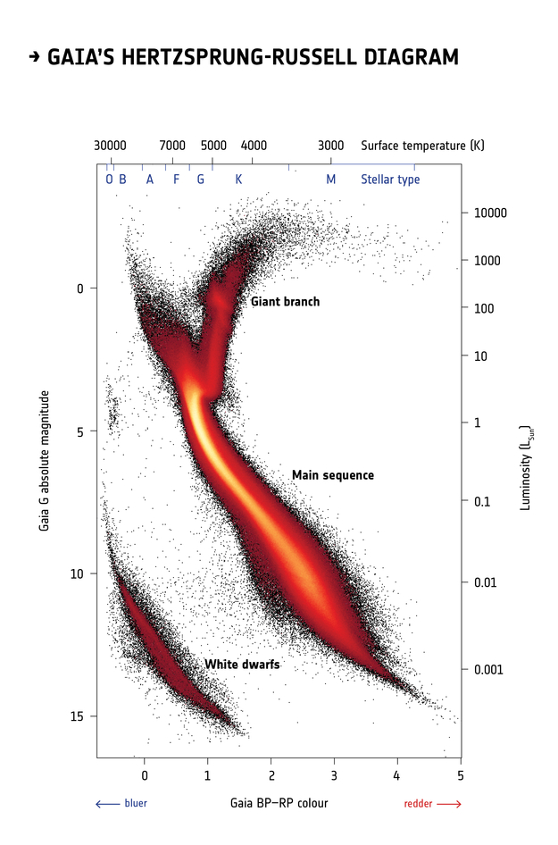
Selecting stars with bp-rp less than 2 excludes many class M dwarf stars, which are low
temperature, low luminosity. A star like that at GD-1’s distance would
be hard to detect, so if it is detected, it is more likely to be in the
foreground.
Formatting queries
The queries we have written so far are string “literals”, meaning that the entire string is part of the program. But writing queries yourself can be slow, repetitive, and error-prone.
It is often better to write Python code that assembles a query for
you. One useful tool for that is the string
format method.
As an example, we will divide the previous query into two parts; a list of column names and a “base” for the query that contains everything except the column names.
Here is the list of columns we will select.
And here is the base. It is a string that contains at least one format specifier in curly brackets (braces).
PYTHON
query3_base = """SELECT
TOP 10
{columns}
FROM gaiadr2.gaia_source
WHERE parallax < 1
  AND bp_rp BETWEEN -0.75 AND 2
"""
This base query contains one format specifier,
{columns}, which is a placeholder for the list of column
names we will provide.
To assemble the query, we invoke format on the base
string and provide a keyword argument that assigns a value to
columns.
In this example, the variable that contains the column names and the variable in the format specifier have the same name. That is not required, but it is a common style.
The result is a string with line breaks. If you display it, the line
breaks appear as \n.
OUTPUT
'SELECT \nTOP 10 \nsource_id, ra, dec, pmra, pmdec, parallax\nFROM gaiadr2.gaia_source\nWHERE parallax < 1\n AND bp_rp BETWEEN -0.75 AND 2\n'But if you print it, the line breaks appear as line breaks.
OUTPUT
SELECT
TOP 10
source_id, ra, dec, pmra, pmdec, parallax
FROM gaiadr2.gaia_source
WHERE parallax < 1
  AND bp_rp BETWEEN -0.75 AND 2
Notice that the format specifier has been replaced with the value of
columns.
Let’s run it and see if it works:
OUTPUT
<Table length=10>
   name    dtype    unit                              description
--------- ------- -------- ------------------------------------------------------------------
source_id   int64          Unique source identifier (unique within a particular Data Release)
       ra float64      deg                                                    Right ascension
      dec float64      deg                                                        Declination
     pmra float64 mas / yr                         Proper motion in right ascension direction
    pmdec float64 mas / yr                             Proper motion in declination direction
 parallax float64      mas                                                           Parallax
Jobid: None
Phase: COMPLETED
Owner: None
[Output truncated]OUTPUT
<Table length=10>
     source_id              ra         ...       parallax
                           deg         ...         mas
------------------- ------------------ ... -------------------
3031147124474711552 110.10540720349103 ... 0.47255775887968876
3031114276567648256 110.92831846731636 ... 0.41817219481822415
3031130872315906048 110.61072654450903 ...   0.178490206751036
3031128162192428544 110.78664993513391 ...  0.8412331482786942
3031140497346996736  110.0617759777779 ... 0.16993569795437397
3031111910043832576 110.84459425332385 ...  0.4668864606089576
[Output truncated]Exercise (10 minutes)
This query always selects sources with parallax less
than 1. But suppose you want to take that upper bound as an input.
Modify query3_base to replace 1 with a
format specifier like {max_parallax}. Now, when you call
format, add a keyword argument that assigns a value to
max_parallax, and confirm that the format specifier gets
replaced with the value you provide.
Summary
This episode has demonstrated the following steps:
Making a connection to the Gaia server,
Exploring information about the database and the tables it contains,
Writing a query and sending it to the server, and finally
Downloading the response from the server as an Astropy
Table.
In the next episode we will extend these queries to select a particular region of the sky.
- If you can’t download an entire dataset (or it is not practical) use queries to select the data you need.
- Read the metadata and the documentation to make sure you understand the tables, their columns, and what they mean.
- Develop queries incrementally: start with something simple, test it, and add a little bit at a time.
- Use ADQL features like
TOPandCOUNTto test before you run a query that might return a lot of data. - If you know your query will return fewer than 3000 rows, you can run it synchronously. If it might return more than 3000 rows, you should run it asynchronously.
- ADQL and SQL are not case-sensitive. You don’t have to capitalize the keywords, but it will make your code more readable.
- ADQL and SQL don’t require you to break a query into multiple lines, but it will make your code more readable.
- Make each section of the notebook self-contained. Try not to use the same variable name in more than one section.
- Keep notebooks short. Look for places where you can break your analysis into phases with one notebook per phase.
Content from Coordinate Transformations
Last updated on 2025-12-15 | Edit this page
Overview
Questions
- How do we transform celestial coordinates from one frame to another and save a subset of the results in files?
Objectives
- Use Python string formatting to compose more complex ADQL queries.
- Work with coordinates and other quantities that have units.
- Download the results of a query and store them in a file.
In the previous episode, we wrote ADQL queries and used them to select and download data from the Gaia server. In this episode, we will write a query to select stars from a particular region of the sky.
Outline
We’ll start with an example that does a “cone search”; that is, it selects stars that appear in a circular region of the sky.
Then, to select stars in the vicinity of GD-1, we will:
Use
Quantityobjects to represent measurements with units.Use Astropy to convert coordinates from one frame to another.
Use the ADQL keywords
POLYGON,CONTAINS, andPOINTto select stars that fall within a polygonal region.Submit a query and download the results.
Store the results in a FITS file.
Working with Units
The measurements we will work with are physical quantities, which means that they have two parts, a value and a unit. For example, the coordinate 30° has value 30 and its units are degrees.
Until recently, most scientific computation was done with values only; units were left out of the program altogether, sometimes with catastrophic results.
Astropy provides tools for including units explicitly in computations, which makes it possible to detect errors before they cause disasters.
To use Astropy units, we import them like this:
u is an object that contains most common units and all
SI units.
You can use dir to list them, but you should also read the
documentation.
OUTPUT
['A',
 'AA',
 'AB',
 'ABflux',
 'ABmag',
 'AU',
 'Angstrom',
 'B',
 'Ba',
 'Barye',
 'Bi',
[Output truncated]
To create a quantity, we multiply a value by a unit:
OUTPUT
astropy.units.quantity.QuantityThe result is a Quantity object. Jupyter knows how to
display Quantities like this:
OUTPUT
<Quantity 10. deg>10°
Quantities provides a method called to that
converts to other units. For example, we can compute the number of
arcminutes in angle:
OUTPUT
<Quantity 600. arcmin>600′
If you add quantities, Astropy converts them to compatible units, if possible:
OUTPUT
<Quantity 10.5 deg>10.5°
If the units are not compatible, you get an error. For example:
ERROR
angle + 5 * u.kgcauses a UnitConversionError.
Exercise (5 minutes)
Create a quantity that represents 5 arcminutes
and assign it to a variable called radius.
Then convert it to degrees.
Selecting a Region
One of the most common ways to restrict a query is to select stars in a particular region of the sky. For example, here is a query from the Gaia archive documentation that selects objects in a circular region centered at (88.8, 7.4) with a search radius of 5 arcmin (0.08333 deg).
PYTHON
cone_query = """SELECT
TOP 10
source_id
FROM gaiadr2.gaia_source
WHERE 1=CONTAINS(
  POINT(ra, dec),
  CIRCLE(88.8, 7.4, 0.08333333))
"""
This query uses three keywords that are specific to ADQL (not SQL):
POINT: a location in ICRS coordinates, specified in degrees of right ascension and declination.CIRCLE: a circle where the first two values are the coordinates of the center and the third is the radius in degrees.CONTAINS: a function that returns1if aPOINTis contained in a shape and0otherwise. Here is the documentation ofCONTAINS.
A query like this is called a cone search because it selects stars in a cone. Here is how we run it:
OUTPUT
Created TAP+ (v1.2.1) - Connection:
	Host: gea.esac.esa.int
	Use HTTPS: True
	Port: 443
	SSL Port: 443
Created TAP+ (v1.2.1) - Connection:
	Host: geadata.esac.esa.int
	Use HTTPS: True
	Port: 443
	SSL Port: 443

<astroquery.utils.tap.model.job.Job at 0x7f277785fa30>OUTPUT
<Table length=10>
     source_id
       int64
-------------------
3322773965056065536
3322773758899157120
3322774068134271104
3322773930696320512
3322774377374425728
3322773724537891456
3322773724537891328
[Output truncated]Exercise (5 minutes)
When you are debugging queries like this, you can use
TOP to limit the size of the results, but then you still
don’t know how big the results will be.
An alternative is to use COUNT, which asks for the
number of rows that would be selected, but it does not return them.
In the previous query, replace TOP 10 source_id with
COUNT(source_id) and run the query again. How many stars
has Gaia identified in the cone we searched?
PYTHON
count_cone_query = """SELECT
COUNT(source_id)
FROM gaiadr2.gaia_source
WHERE 1=CONTAINS(
  POINT(ra, dec),
  CIRCLE(88.8, 7.4, 0.08333333))
"""

count_cone_job = Gaia.launch_job(count_cone_query)
count_cone_results = count_cone_job.get_results()
count_cone_results
OUTPUT
<Table length=1>
count
int64
-----
594
Getting GD-1 Data
From the Price-Whelan and Bonaca paper, we will try to reproduce Figure 1, which includes this representation of stars likely to belong to GD-1:
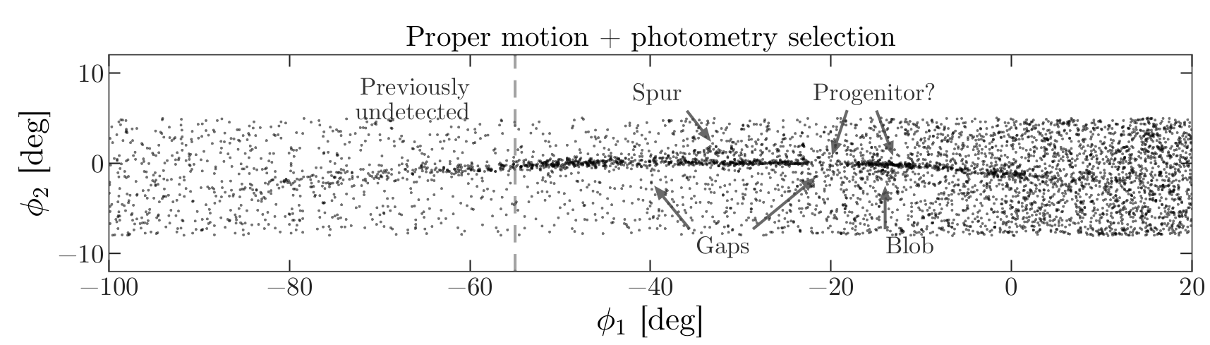
The axes of this figure are defined so the x-axis is aligned with the stars in GD-1, and the y-axis is perpendicular.
Along the x-axis (\(\phi_1\)) the figure extends from -100 to 20 degrees.
Along the y-axis (\(\phi_2\)) the figure extends from about -8 to 4 degrees.
Ideally, we would select all stars from this rectangle, but there are more than 10 million of them. This would be difficult to work with, and as anonymous Gaia users, we are limited to 3 million rows in a single query. While we are developing and testing code, it will be faster to work with a smaller dataset.
So we will start by selecting stars in a smaller rectangle near the center of GD-1, from -55 to -45 degrees \(\phi_1\) and -8 to 4 degrees \(\phi_2\). First we will learn how to represent these coordinates with Astropy.
Transforming coordinates
Astronomy makes use of many different coordinate systems. Transforming between coordinate systems is a common task in observational astronomy, and thankfully, Astropy has abstracted the required spherical trigonometry for us. Below we show the steps to go from Equatorial coordinates (sky coordinates) to Galactic coordinates and finally to a reference frame defined to more easily study GD-1.
Astropy provides a SkyCoord object that represents sky
coordinates relative to a specified reference frame.
The following example creates a SkyCoord object that
represents the approximate coordinates of Betelgeuse
(alf Ori) in the ICRS frame.
ICRS is the “International Celestial Reference System”, adopted in 1997 by the International Astronomical Union.
PYTHON
from astropy.coordinates import SkyCoord

ra = 88.8 * u.degree
dec = 7.4 * u.degree
coord_icrs = SkyCoord(ra=ra, dec=dec, frame='icrs')

coord_icrs
OUTPUT
<SkyCoord (ICRS): (ra, dec) in deg
    (88.8, 7.4)>
SkyCoord objects require units in order to understand
the context. There are a number of ways to define SkyCoord
objects, in our example, we explicitly specified the coordinates and
units and provided a reference frame.
SkyCoord provides the transform_to function
to transform from one reference frame to another reference frame. For
example, we can transform coords_icrs to Galactic
coordinates like this:
OUTPUT
<SkyCoord (Galactic): (l, b) in deg
(199.79693102, -8.95591653)>Coordinate Variables
Notice that in the Galactic frame, the coordinates are the variables
we usually use for Galactic longitude and latitude called l
and b, respectively, not ra and
dec. Most reference frames have different ways to specify
coordinates and the SkyCoord object will use these
names.
To transform to and from GD-1 coordinates, we will use a frame defined by Gala, which is an Astropy-affiliated library that provides tools for galactic dynamics.
Gala provides GD1Koposov10,
which is “a Heliocentric spherical coordinate system defined by the
orbit of the GD-1 stream”. In this coordinate system, one axis is
defined along the direction of the stream (the x-axis in Figure 1) and
one axis is defined perpendicular to the direction of the stream (the
y-axis in Figure 1). These are called the \(\phi_1\) and \(\phi_2\) coordinates, respectively.
OUTPUT
<GD1Koposov10 Frame>GD1Koposov10 import
The GD1Koposov10 reference frame is part of the
gala package. For convience we provide the stand alone file
as part of the student_download zip file you downloaded. If
your notebook is not in your student_download directory,
you will need to add the following before the import statement
Where <path to student_download> is the path to
your student_download directory ending with
student_download.
We can use it to find the coordinates of Betelgeuse in the GD-1 frame, like this:
OUTPUT
<SkyCoord (GD1Koposov10): (phi1, phi2) in deg
(-94.97222038, 34.5813813)>Exercise (10 minutes)
Find the location of GD-1 in ICRS coordinates.
Create a
SkyCoordobject at 0°, 0° in the GD-1 frame.Transform it to the ICRS frame.
Hint: Because ICRS is a standard frame, it is built into Astropy. You
can specify it by name, icrs (as we did with
galactic).
Notice that the origin of the GD-1 frame maps to ra=200,
exactly, in ICRS. That is by design.
Selecting a rectangle
Now that we know how to define coordinate transformations, we are going to use them to get a list of stars that are in GD-1. As we mentioned before, this is a lot of stars, so we are going to start by defining a rectangle that encompasses a small part of GD-1. This is easiest to define in GD-1 coordinates.
The following variables define the boundaries of the rectangle in \(\phi_1\) and \(\phi_2\).
PYTHON
phi1_min = -55 * u.degree
phi1_max = -45 * u.degree
phi2_min = -8 * u.degree
phi2_max = 4 * u.degree
Throughout this lesson we are going to be defining a rectangle often. Rather than copy and paste multiple lines of code, we will write a function to build the rectangle for us. By having the code contained in a single location, we can easily fix bugs or update our implementation as needed. By choosing an explicit function name our code is also self documenting, meaning it’s easy for us to understand that we are building a rectangle when we call this function.
To create a rectangle, we will use the following function, which takes the lower and upper bounds as parameters and returns a list of x and y coordinates of the corners of a rectangle starting with the lower left corner and working clockwise.
PYTHON
def make_rectangle(x1, x2, y1, y2):
    """Return the corners of a rectangle."""
    xs = [x1, x1, x2, x2, x1]
    ys = [y1, y2, y2, y1, y1]
    return xs, ys
The return value is a tuple containing a list of coordinates in \(\phi_1\) followed by a list of coordinates in \(\phi_2\).
phi1_rect and phi2_rect contain the
coordinates of the corners of a rectangle in the GD-1 frame.
While it is easier to visualize the regions we want to define in the GD-1 frame, the coordinates in the Gaia catalog are in the ICRS frame. In order to use the rectangle we defined, we need to convert the coordinates from the GD-1 frame to the ICRS frame. We will do this using the SkyCoord object. Fortunately SkyCoord objects can take lists of coordinates, in addition to single values.
OUTPUT
<SkyCoord (GD1Koposov10): (phi1, phi2) in deg
[(-55., -8.), (-55., 4.), (-45., 4.), (-45., -8.), (-55., -8.)]>Now we can use transform_to to convert to ICRS
coordinates.
OUTPUT
<SkyCoord (ICRS): (ra, dec) in deg
[(146.27533314, 19.26190982), (135.42163944, 25.87738723),
(141.60264825, 34.3048303 ), (152.81671045, 27.13611254),
(146.27533314, 19.26190982)]>Notice that a rectangle in one coordinate system is not necessarily a rectangle in another. In this example, the result is a (non-rectangular) polygon. This is why we defined our rectangle in the GD-1 frame.
Defining a polygon
In order to use this polygon as part of an ADQL query, we have to convert it to a string with a comma-separated list of coordinates, as in this example:
SkyCoord provides to_string, which produces
a list of strings.
OUTPUT
['146.275 19.2619',
'135.422 25.8774',
'141.603 34.3048',
'152.817 27.1361',
'146.275 19.2619']We can use the Python string function join to join
corners_list_str into a single string (with spaces between
the pairs):
OUTPUT
'146.275 19.2619 135.422 25.8774 141.603 34.3048 152.817 27.1361 146.275 19.2619'This is almost what we need, but we have to replace the spaces with commas.
OUTPUT
'146.275, 19.2619, 135.422, 25.8774, 141.603, 34.3048, 152.817, 27.1361, 146.275, 19.2619'This is something we will need to do multiple times. We will write a function to do it for us so we don’t have to copy and paste every time. The following function combines these steps.
PYTHON
def skycoord_to_string(skycoord):
"""Convert a one-dimensional list of SkyCoord to string for Gaia's query format."""
corners_list_str = skycoord.to_string()
corners_single_str = ' '.join(corners_list_str)
return corners_single_str.replace(' ', ', ')Here is how we use this function:
OUTPUT
'146.275, 19.2619, 135.422, 25.8774, 141.603, 34.3048, 152.817, 27.1361, 146.275, 19.2619'Assembling the query
Now we are ready to assemble our query to get all of the stars in the Gaia catalog that are in the small rectangle we defined and are likely to be part of GD-1 with the criteria we previously defined.
We need columns again (as we saw in the previous
episode).
And here is the query base we used in the previous lesson:
PYTHON
query3_base = """SELECT
TOP 10
{columns}
FROM gaiadr2.gaia_source
WHERE parallax < 1
AND bp_rp BETWEEN -0.75 AND 2
"""Now we will add a WHERE clause to select stars in the
polygon we defined and start using more descriptive variables for our
queries.
PYTHON
polygon_top10query_base = """SELECT
TOP 10
{columns}
FROM gaiadr2.gaia_source
WHERE parallax < 1
AND bp_rp BETWEEN -0.75 AND 2
AND 1 = CONTAINS(POINT(ra, dec),
POLYGON({sky_point_list}))
"""The query base contains format specifiers for columns
and sky_point_list.
We will use format to fill in these values.
PYTHON
polygon_top10query = polygon_top10query_base.format(columns=columns,
sky_point_list=sky_point_list)
print(polygon_top10query)OUTPUT
SELECT
TOP 10
source_id, ra, dec, pmra, pmdec, parallax
FROM gaiadr2.gaia_source
WHERE parallax < 1
AND bp_rp BETWEEN -0.75 AND 2
AND 1 = CONTAINS(POINT(ra, dec),
POLYGON(146.275, 19.2619, 135.422, 25.8774, 141.603, 34.3048, 152.817, 27.1361, 146.275, 19.2619))
As always, we should take a minute to proof-read the query before we launch it.
PYTHON
polygon_top10query_job = Gaia.launch_job_async(polygon_top10query)
print(polygon_top10query_job)OUTPUT
INFO: Query finished. [astroquery.utils.tap.core]
<Table length=10>
name dtype unit description
--------- ------- -------- ------------------------------------------------------------------
source_id int64 Unique source identifier (unique within a particular Data Release)
ra float64 deg Right ascension
dec float64 deg Declination
pmra float64 mas / yr Proper motion in right ascension direction
pmdec float64 mas / yr Proper motion in declination direction
parallax float64 mas Parallax
Jobid: 1615815873808O
Phase: COMPLETED
[Output truncated]Here are the results.
OUTPUT
<Table length=10>
source_id ra ... parallax
deg ... mas
------------------ ------------------ ... --------------------
637987125186749568 142.48301935991023 ... -0.2573448962333354
638285195917112960 142.25452941346344 ... 0.4227283465319491
638073505568978688 142.64528557468074 ... 0.10363972229362585
638086386175786752 142.57739430926034 ... -0.8573270355079308
638049655615392384 142.58913564478618 ... 0.099624729200593
638267565075964032 141.81762228999614 ... -0.07271215219283075
[Output truncated]Finally, we can remove TOP 10 and run the query
again.
The result is bigger than our previous queries, so it will take a little longer.
PYTHON
polygon_query_base = """SELECT
{columns}
FROM gaiadr2.gaia_source
WHERE parallax < 1
AND bp_rp BETWEEN -0.75 AND 2
AND 1 = CONTAINS(POINT(ra, dec),
POLYGON({sky_point_list}))
"""PYTHON
polygon_query = polygon_query_base.format(columns=columns,
sky_point_list=sky_point_list)
print(polygon_query)OUTPUT
SELECT
source_id, ra, dec, pmra, pmdec, parallax
FROM gaiadr2.gaia_source
WHERE parallax < 1
AND bp_rp BETWEEN -0.75 AND 2
AND 1 = CONTAINS(POINT(ra, dec),
POLYGON(146.275, 19.2619, 135.422, 25.8774, 141.603, 34.3048, 152.817, 27.1361, 146.275, 19.2619))OUTPUT
INFO: Query finished. [astroquery.utils.tap.core]
<Table length=140339>
name dtype unit description
--------- ------- -------- ------------------------------------------------------------------
source_id int64 Unique source identifier (unique within a particular Data Release)
ra float64 deg Right ascension
dec float64 deg Declination
pmra float64 mas / yr Proper motion in right ascension direction
pmdec float64 mas / yr Proper motion in declination direction
parallax float64 mas Parallax
Jobid: 1615815886707O
Phase: COMPLETED
[Output truncated]OUTPUT
140339There are more than 100,000 stars in this polygon, but that’s a manageable size to work with.
Saving results
This is the set of stars we will work with in the next step. Since we have a substantial dataset now, this is a good time to save it.
Storing the data in a file means we can shut down our notebook and pick up where we left off without running the previous query again.
Astropy Table objects provide write, which
writes the table to disk.
Because the filename ends with fits, the table is
written in the FITS
format, which preserves the metadata associated with the table.
If the file already exists, the overwrite argument
causes it to be overwritten.
We can use getsize to confirm that the file exists and
check the size:
OUTPUT
6.4324951171875Summary
In this notebook, we composed more complex queries to select stars within a polygonal region of the sky. Then we downloaded the results and saved them in a FITS file.
In the next notebook, we’ll reload the data from this file and replicate the next step in the analysis, using proper motion to identify stars likely to be in GD-1.
- For measurements with units, use
Quantityobjects that represent units explicitly and check for errors. - Use the
formatfunction to compose queries; it is often faster and less error-prone. - Develop queries incrementally: start with something simple, test it, and add a little bit at a time.
- Once you have a query working, save the data in a local file. If you shut down the notebook and come back to it later, you can reload the file; you don’t have to run the query again.
Content from Plotting and Tabular Data
Last updated on 2026-06-19 | Edit this page
Overview
Questions
- How do we make scatter plots in Matplotlib?
- How do we store data in a pandas
DataFrame?
Objectives
- Select rows and columns from an Astropy
Table. - Use Matplotlib to make a scatter plot.
- Use Gala to transform coordinates.
- Make a pandas
DataFrameand use a BooleanSeriesto select rows. - Save a
DataFramein an HDF5 file.
In the previous episode, we wrote a query to select stars from the region of the sky where we expect GD-1 to be, and saved the results in a FITS file.
Now we will read that data back in and implement the next step in the analysis, identifying stars with the proper motion we expect for GD-1.
Outline
We will read back the results from the previous lesson, which we saved in a FITS file.
Then we will transform the coordinates and proper motion data from ICRS back to the coordinate frame of GD-1.
We will put those results into a pandas
DataFrame.
Starting from this episode
If you are starting a new notebook for this episode, expand this section for information you will need to get started.
In the previous episode, we ran a query on the Gaia server, downloaded data for roughly 140,000 stars, and saved the data in a FITS file. We will use that data for this episode. Whether you are working from a new notebook or coming back from a checkpoint, reloading the data will save you from having to run the query again.
If you are starting this episode here or starting this episode in a
new notebook, you will need to run the following lines of code. The last
two lines of the import statements assume your notebook is being run in
the student_download directory. If you are running it from
a different directory you will need to add the path using
sys.path.append(<path to student download>) where
<path to student_download> is the path to your
student_download directory ending with
student_download.
This imports previously imported functions:
PYTHON
import astropy.units as u
from astropy.coordinates import SkyCoord
from astropy.table import Table
from episode_functions import *
from gd1 import GD1Koposov10The following code loads in the data (instructions for downloading
data can be found in the setup instructions).
You may need to add a the path to the filename variable below
(e.g. filename = 'student_download/backup-data/gd1_results.fits')
Selecting rows and columns
In the previous episode, we selected spatial and proper motion
information from the Gaia catalog for stars around a small part of GD-1.
The output was returned as an Astropy Table. We can use
info to check the contents.
OUTPUT
<Table length=140339>
name dtype unit description
--------- ------- -------- ------------------------------------------------------------------
source_id int64 Unique source identifier (unique within a particular Data Release)
ra float64 deg Right ascension
dec float64 deg Declination
pmra float64 mas / yr Proper motion in right ascension direction
pmdec float64 mas / yr Proper motion in declination direction
parallax float64 mas ParallaxIn this episode, we will see operations for selecting columns and
rows from an Astropy Table. You can find more information
about these operations in the Astropy
documentation.
We can get the names of the columns like this:
OUTPUT
['source_id', 'ra', 'dec', 'pmra', 'pmdec', 'parallax']And select an individual column like this:
OUTPUT
<Column name='ra' dtype='float64' unit='deg' description='Right ascension' length=140339>
142.48301935991023
142.25452941346344
142.64528557468074
142.57739430926034
142.58913564478618
141.81762228999614
143.18339801317677
142.9347319464589
142.26769745823267
142.89551292869012
[Output truncated]The result is a Column object that contains the data,
and also the data type, units, and name of the column.
OUTPUT
astropy.table.column.ColumnThe rows in the Table are numbered from 0 to
n-1, where n is the number of rows. We can
select the first row like this:
OUTPUT
<Row index=0>
source_id ra dec pmra pmdec parallax
deg deg mas / yr mas / yr mas
int64 float64 float64 float64 float64 float64
------------------ ------------------ ----------------- ------------------- ----------------- -------------------
637987125186749568 142.48301935991023 21.75771616932985 -2.5168384683875766 2.941813096629439 -0.2573448962333354The result is a Row object.
OUTPUT
astropy.table.row.RowNotice that the bracket operator can be used to select both columns and rows. You might wonder how it knows which to select. If the expression in brackets is a string, it selects a column; if the expression is an integer, it selects a row.
If you apply the bracket operator twice, you can select a column and then an element from the column.
OUTPUT
np.float64(142.48301935991023)Or you can select a row and then an element from the row.
OUTPUT
np.float64(142.48301935991023)You get the same result either way.
Scatter plot
To see what the results look like, we will use a scatter plot. The library we will use is Matplotlib, which is the most widely-used plotting library for Python. The Matplotlib interface is based on MATLAB (hence the name), so if you know MATLAB, some of it will be familiar.
We will import like this:
Pyplot is part of the Matplotlib library. It is conventional to
import it using the shortened name plt.
Keeping plots in the notebook
In recent versions of Jupyter, plots appear “inline”; that is, they are part of the notebook. In some older versions, plots appear in a new window. If your plots appear in a new window, you might want to run the following Jupyter magic command in a notebook cell:
Pyplot provides two functions that can make scatter plots, plt.scatter and plt.plot.
scatteris more versatile; for example, you can make every point in a scatter plot a different color.plotis more limited, but for simple cases, it can be substantially faster.
Jake Vanderplas explains these differences in The Python Data Science Handbook.
Since we are plotting more than 100,000 points and they are all the
same size and color, we will use plot.
Here is a scatter plot of the stars we selected in the GD-1 region with right ascension on the x-axis and declination on the y-axis, both ICRS coordinates in degrees.
PYTHON
x = polygon_results['ra']
y = polygon_results['dec']
plt.plot(x, y, 'ko')
plt.xlabel('ra (degree ICRS)')
plt.ylabel('dec (degree ICRS)')OUTPUT
<Figure size 432x288 with 1 Axes>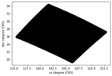
The arguments to plt.plot are x,
y, and a string that specifies the style. In this case, the
letters ko indicate that we want a black, round marker
(k is for black because b is for blue). The
functions xlabel and ylabel put labels on the
axes.
Looking at this plot, we can see that the region we selected, which is a rectangle in GD-1 coordinates, is a non-rectangular region in ICRS coordinates.
However, this scatter plot has a problem. It is “overplotted”, which means that there are so many overlapping points, we cannot distinguish between high and low density areas.
To fix this, we can provide optional arguments to control the size and transparency of the points.
Exercise (5 minutes)
In the call to plt.plot, use the keyword argument
markersize to make the markers smaller.
Then add the keyword argument alpha to make the markers
partly transparent.
Adjust these arguments until you think the figure shows the data most clearly.
Note: Once you have made these changes, you might notice that the figure shows stripes with lower density of stars. These stripes are caused by the way Gaia scans the sky, which you can read about here. The dataset we are using, Gaia Data Release 2, covers 22 months of observations; during this time, some parts of the sky were scanned more than others.
Transform back
Remember that we selected data from a rectangle of coordinates in the GD-1 frame, then transformed them to ICRS when we constructed the query. The coordinates in the query results are in ICRS.
To plot them, we will transform them back to the GD-1 frame; that way, the axes of the figure are aligned with the orbit of GD-1, which is useful for two reasons:
By transforming the coordinates, we can identify stars that are likely to be in GD-1 by selecting stars near the centerline of the stream, where \(\phi_2\) is close to 0.
By transforming the proper motions, we can identify stars with non-zero proper motion along the \(\phi_1\) axis, which are likely to be part of GD-1.
To do the transformation, we will put the results into a
SkyCoord object. In a previous episode, we created a
SkyCoord object like this:
Notice that we did not specify the reference frame. That is because
when using ra and dec in
SkyCoord, the ICRS frame is assumed by
default.
The SkyCoord object can keep track not just of location,
but also proper motions. This means that we can initialize a
SkyCoord object with location and proper motions, then use
all of these quantities together to transform into the GD-1 frame.
Now we are going to do something similar, but now we will take
advantage of the SkyCoord object’s capacity to include and
track space motion information in addition to ra and
dec. We will now also include:
pmraandpmdec, which are proper motion in theICRSframe, anddistanceandradial_velocity, which are important for the reflex correction and will be discussed in that section.
PYTHON
distance = 8 * u.kpc
radial_velocity= 0 * u.km/u.s
skycoord = SkyCoord(ra=polygon_results['ra'],
dec=polygon_results['dec'],
pm_ra_cosdec=polygon_results['pmra'],
pm_dec=polygon_results['pmdec'],
distance=distance,
radial_velocity=radial_velocity)For the first four arguments, we use columns from
polygon_results.
For distance and radial_velocity we use
constants, which we explain in the section on reflex correction.
The result is an Astropy SkyCoord object, which we can
transform to the GD-1 frame.
The result is another SkyCoord object, now in the GD-1
frame.
Reflex Correction
The next step is to correct the proper motion measurements for the effect of the motion of our solar system around the Galactic center.
When we created skycoord, we provided constant values
for distance and radial_velocity rather than
measurements from Gaia.
That might seem like a strange thing to do, but here is the motivation:
Because the stars in GD-1 are so far away, parallaxes measured by Gaia are negligible, making the distance estimates unreliable.
So we replace them with our current best estimate of the mean distance to GD-1, about 8 kpc. See Koposov, Rix, and Hogg, 2010.For the other stars in the table, this distance estimate will be inaccurate, so reflex correction will not be correct. But that should have only a small effect on our ability to identify stars with the proper motion we expect for GD-1.
The measurement of radial velocity has no effect on the correction for proper motion, but we have to provide a value to avoid errors in the reflex correction calculation. So we provide
0as an arbitrary place-keeper.
With this preparation, we can use reflex_correct from
Gala (documentation
here) to correct for the motion of the solar system which we have
included as a stand alone file in the student_download.
The result is a SkyCoord object that contains
phi1andphi2, which represent the transformed coordinates in the GD-1 frame.pm_phi1_cosphi2andpm_phi2, which represent the transformed proper motions that have been corrected for the motion of the solar system around the Galactic center.
We can select the coordinates and plot them like this:
PYTHON
x = skycoord_gd1.phi1
y = skycoord_gd1.phi2
plt.plot(x, y, 'ko', markersize=0.1, alpha=0.1)
plt.xlabel('phi1 (degree GD1)')
plt.ylabel('phi2 (degree GD1)')OUTPUT
<Figure size 432x288 with 1 Axes>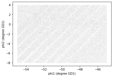
We started with a rectangle in the GD-1 frame. When transformed to the ICRS frame, it is a non-rectangular region. Now, transformed back to the GD-1 frame, it is a rectangle again.
pandas DataFrame
At this point we have two objects containing different sets of the
data relating to identifying stars in GD-1. polygon_results
is the Astropy Table we downloaded from Gaia.
OUTPUT
astropy.table.table.TableAnd skycoord_gd1 is a SkyCoord object that
contains the transformed coordinates and proper motions.
OUTPUT
astropy.coordinates.sky_coordinate.SkyCoordOn one hand, this division of labor makes sense because each object provides different capabilities. But working with multiple object types can be awkward. It will be more convenient to choose one object and get all of the data into it.
Now we can extract the columns we want from skycoord_gd1
and add them to a Pandas DataFrame. phi1 and
phi2 contain the transformed coordinates.
pandas DataFrames versus Astropy
Tables
Two common choices are the pandas DataFrame and Astropy
Table. pandas DataFrames and Astropy
Tables share many of the same characteristics and most of
the manipulations that we do can be done with either. As you become more
familiar with each, you will develop a sense of which one you prefer for
different tasks. For instance you may choose to use Astropy
Tables to read in data, especially astronomy specific data
formats, but pandas DataFrames to inspect the data.
Fortunately, Astropy makes it easy to convert between the two data
types. We will choose to use pandas DataFrame, for two
reasons:
It provides capabilities that are (almost) a superset of the other data structures, so it is the all-in-one solution.
pandas is a general-purpose tool that is useful in many domains, especially data science. If you are going to develop expertise in one tool, pandas is a good choice.
However, compared to an Astropy Table, pandas has one
big drawback: it does not keep the metadata associated with the table,
including the units for the columns. Nevertheless, we think it’s a
useful data type to be familiar with.
It is straightforward to convert an Astropy Table to a
pandas DataFrame.
DataFrame provides shape, which shows the
number of rows and columns.
OUTPUT
(140339, 6)It also provides head, which displays the first few
rows. head is useful for spot-checking large results as you
go along.
OUTPUT
source_id ra dec pmra pmdec parallax
0 637987125186749568 142.483019 21.757716 -2.516838 2.941813 -0.257345
1 638285195917112960 142.254529 22.476168 2.662702 -12.165984 0.422728
2 638073505568978688 142.645286 22.166932 18.306747 -7.950660 0.103640
3 638086386175786752 142.577394 22.227920 0.987786 -2.584105 -0.857327
4 638049655615392384 142.589136 22.110783 0.244439 -4.941079 0.099625
Now we can add the GD-1 coordinates and proper motions as columns in
the DataFrame. We use the .value attribute to
extract the numerical values without units, since Pandas
DataFrames do not preserve astropy units.
PYTHON
results_df['phi1'] = skycoord_gd1.phi1.value
results_df['phi2'] = skycoord_gd1.phi2.value
results_df['pm_phi1'] = skycoord_gd1.pm_phi1_cosphi2.value
results_df['pm_phi2'] = skycoord_gd1.pm_phi2.value
results_df.shapeOUTPUT
(140339, 10)And we can check the result with head:
OUTPUT
source_id ra dec pmra pmdec parallax phi1 phi2 pm_phi1 pm_phi2
0 637987125186749568 142.483019 21.757716 -2.516838 2.941813 -0.257345 -54.975623 -3.659349 6.429945 6.518157
1 638285195917112960 142.254529 22.476168 2.662702 -12.165984 0.422728 -54.498247 -3.081524 -3.168637 -6.206795
2 638073505568978688 142.645286 22.166932 18.306747 -7.950660 0.103640 -54.551634 -3.554229 9.129447 -16.819570
3 638086386175786752 142.577394 22.227920 0.987786 -2.584105 -0.857327 -54.536457 -3.467966 3.837120 0.526461
4 638049655615392384 142.589136 22.110783 0.244439 -4.941079 0.099625 -54.627448 -3.542738 1.466103 -0.185292
Why .value?
The attributes of a SkyCoord object, like
phi1 and phi2, are Quantity
objects that carry units (for example, degrees). Pandas
DataFrames do not support Quantity columns, so
we use the .value attribute to extract the numerical values
without units.
Detail If you notice that SkyCoord has an attribute
called proper_motion, you might wonder why we are not using
it.
We could have: proper_motion contains the same data as
pm_phi1_cosphi2 and pm_phi2, but in a
different format.
Attributes vs functions
shape is an attribute, so we display its value without
calling it as a function.
head is a function, so we need the parentheses.
Before we go any further, we will take all of the steps that we have
done and consolidate them into a single function that we can use to take
the coordinates and proper motion that we get as an Astropy
Table from our Gaia query, add columns representing the
reflex corrected GD-1 coordinates and proper motions, and transform it
into a pandas DataFrame. This is a general function that we
will use multiple times as we build different queries so we want to
write it once and then call the function rather than having to copy and
paste the code over and over again.
PYTHON
def make_dataframe(table):
"""Transform and astropy table with coords in ICRS, convert to pandas dataframe with GD-1 coordinates.
table: Astropy Table
returns: pandas DataFrame
"""
#Create a SkyCoord object with the coordinates and proper motions
# in the input table
skycoord = SkyCoord(
ra=table['ra'],
dec=table['dec'],
pm_ra_cosdec=table['pmra'],
pm_dec=table['pmdec'],
distance=8*u.kpc,
radial_velocity=0*u.km/u.s)
# Define the GD-1 reference frame
gd1_frame = GD1Koposov10()
# Transform input coordinates to the GD-1 reference frame
transformed = skycoord.transform_to(gd1_frame)
# Correct GD-1 coordinates for solar system motion around galactic center
skycoord_gd1 = reflex_correct(transformed)
# Create DataFrame
df = table.to_pandas()
# Add GD-1 reference frame columns for coordinates and proper motions
df['phi1'] = skycoord_gd1.phi1.value
df['phi2'] = skycoord_gd1.phi2.value
df['pm_phi1'] = skycoord_gd1.pm_phi1_cosphi2.value
df['pm_phi2'] = skycoord_gd1.pm_phi2.value
return dfHere is how we use the function:
Saving the DataFrame
At this point we have run a successful query and combined the results
into a single DataFrame. This is a good time to save the
data.
To save a pandas DataFrame, one option is to convert it
to an Astropy Table, like this:
PYTHON
from astropy.table import Table
results_table = Table.from_pandas(results_df)
type(results_table)OUTPUT
astropy.table.table.TableThen we could write the Table to a FITS file, as we did
in the previous lesson.
But, like Astropy, pandas provides functions to write DataFrames in
other formats; to see what they are find
the functions here that begin with to_.
One of the best options is HDF5, which is Version 5 of Hierarchical Data Format.
HDF5 is a binary format, so files are small and fast to read and write (like FITS, but unlike XML).
An HDF5 file is similar to an SQL database in the sense that it can contain more than one table, although in HDF5 vocabulary, a table is called a Dataset. (Multi-extension FITS files can also contain more than one table.)
And HDF5 stores the metadata associated with the table, including column names, row labels, and data types (like FITS).
Finally, HDF5 is a cross-language standard, so if you write an HDF5 file with pandas, you can read it back with many other software tools (more than FITS).
We can write a pandas DataFrame to an HDF5 file like
this:
Because an HDF5 file can contain more than one Dataset, we have to provide a name, or “key”, that identifies the Dataset in the file.
We could use any string as the key, but it is generally a good
practice to use a descriptive name (just like your
DataFrame variable name) so we will give the Dataset in the
file the same name (key) as the DataFrame.
By default, writing a DataFrame appends a new dataset to
an existing HDF5 file. We will use the argument mode='w' to
overwrite the file if it already exists rather than append another
dataset to it.
Summary
In this episode, we re-loaded the Gaia data we saved from a previous query.
We transformed the coordinates and proper motion from ICRS to a frame
aligned with the orbit of GD-1, stored the results in a pandas
DataFrame, and visualized them.
We combined all of these steps into a single function that we can reuse in the future to go straight from the output of a query with object coordinates in the ICRS reference frame directly to a pandas DataFrame that includes object coordinates in the GD-1 reference frame.
We saved our results to an HDF5 file which we can use to restart the analysis from this stage or verify our results at some future time.
- When you make a scatter plot, adjust the size of the markers and their transparency so the figure is not overplotted; otherwise it can misrepresent the data badly.
- For simple scatter plots in Matplotlib,
plotis faster thanscatter. - An Astropy
Tableand a pandasDataFrameare similar in many ways and they provide many of the same functions. They have pros and cons, but for many projects, either one would be a reasonable choice. - To store data from a pandas
DataFrame, a good option is an HDF5 file, which can contain multiple Datasets (we’ll dig in more in the Join lesson).
Content from Plotting and pandas
Last updated on 2026-06-19 | Edit this page
Overview
Questions
- How to efficiently explore our data and identify appropriate filters to produce a clean sample (in this case of GD-1 stars)?
Objectives
- Use a Boolean pandas
Seriesto select rows in aDataFrame. - Save multiple
DataFrames in an HDF5 file.
In the previous episode, we wrote a query to select stars from the region of the sky where we expect GD-1 to be, and saved the results in a FITS and HDF5 file.
Now we will read that data back in and implement the next step in the analysis, identifying stars with the proper motion we expect for GD-1.
Outline
We will put those results into a pandas
DataFrame, which we will use to select stars near the centerline of GD-1.Plotting the proper motion of those stars, we will identify a region of proper motion for stars that are likely to be in GD-1.
Finally, we will select and plot the stars whose proper motion is in that region.
Starting from this episode
If you are starting a new notebook for this episode, expand this section for information you will need to get started.
Previously, we ran a query on the Gaia server, downloaded data for
roughly 140,000 stars, transformed the coordinates to the GD-1 reference
frame, and saved the results in an HDF5 file (Dataset name
results_df). We will use that data for this episode.
Whether you are working from a new notebook or coming back from a
checkpoint, reloading the data will save you from having to run the
query again.
If you are starting this episode here or starting this episode in a new notebook, you will need to run the following lines of code.
This imports previously imported functions:
PYTHON
import astropy.units as u
import matplotlib.pyplot as plt
import pandas as pd
from episode_functions import *The following code loads in the data (instructions for downloading
data can be found in the setup instructions).
You may need to add a the path to the filename variable below
(e.g. filename = 'student_download/backup-data/gd1_data.hdf')
Exploring data
One benefit of using pandas is that it provides functions for
exploring the data and checking for problems. One of the most useful of
these functions is describe, which computes summary
statistics for each column.
OUTPUT
source_id ra dec pmra \
count 1.403390e+05 140339.000000 140339.000000 140339.000000
mean 6.792399e+17 143.823122 26.780285 -2.484404
std 3.792177e+16 3.697850 3.052592 5.913939
min 6.214900e+17 135.425699 19.286617 -106.755260
25% 6.443517e+17 140.967966 24.592490 -5.038789
50% 6.888060e+17 143.734409 26.746261 -1.834943
75% 6.976579e+17 146.607350 28.990500 0.452893
max 7.974418e+17 152.777393 34.285481 104.319923
pmdec parallax phi1 phi2 \
[Output truncated]Exercise (10 minutes)
Review the summary statistics in this table.
Do the values make sense based on what you know about the context?
Do you see any values that seem problematic, or evidence of other data issues?
The most noticeable issue is that some of the parallax values are negative, which seems non-physical.
Negative parallaxes in the Gaia database can arise from a number of causes like source confusion (high negative values) and the parallax zero point with systematic errors (low negative values).
Fortunately, we do not use the parallax measurements in the analysis (one of the reasons we used constant distance for reflex correction).
Plot proper motion
Now we are ready to replicate one of the panels in Figure 1 of the Price-Whelan and Bonaca paper, the one that shows components of proper motion as a scatter plot:
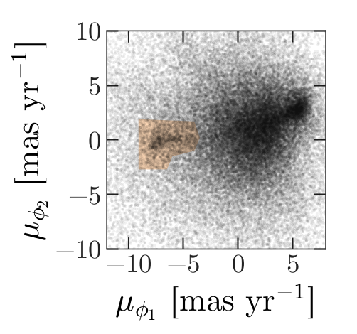
In this figure, the shaded area identifies stars that are likely to be in GD-1 because:
Due to the nature of tidal streams, we expect the proper motion for stars in GD-1 to be along the axis of the stream; that is, we expect motion in the direction of
phi2to be near 0.In the direction of
phi1, we do not have a prior expectation for proper motion, except that it should form a cluster at a non-zero value.
By plotting proper motion in the GD-1 frame, we hope to find this cluster. Then we will use the bounds of the cluster to select stars that are more likely to be in GD-1.
The following figure is a scatter plot of proper motion, in the GD-1
frame, for the stars in results_df.
PYTHON
x = results_df['pm_phi1']
y = results_df['pm_phi2']
plt.plot(x, y, 'ko', markersize=0.1, alpha=0.1)
plt.xlabel('Proper motion phi1 (mas/yr GD1 frame)')
plt.ylabel('Proper motion phi2 (mas/yr GD1 frame)')OUTPUT
<Figure size 432x288 with 1 Axes>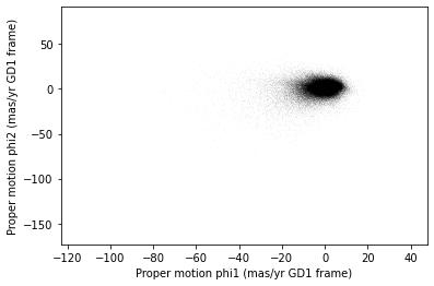
Most of the proper motions are near the origin, but there are a few
extreme values. Following the example in the paper, we will use
xlim and ylim to zoom in on the region near
the origin.
PYTHON
x = results_df['pm_phi1']
y = results_df['pm_phi2']
plt.plot(x, y, 'ko', markersize=0.1, alpha=0.1)
plt.xlabel('Proper motion phi1 (mas/yr GD1 frame)')
plt.ylabel('Proper motion phi2 (mas/yr GD1 frame)')
plt.xlim(-12, 8)
plt.ylim(-10, 10)OUTPUT
<Figure size 432x288 with 1 Axes>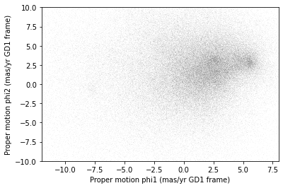
There is a hint of an overdense region near (-7.5, 0), but if you did not know where to look, you would miss it.
To see the cluster more clearly, we need a sample that contains a higher proportion of stars in GD-1. We will do that by selecting stars close to the centerline.
Selecting the centerline
As we can see in the following figure, many stars in GD-1 are less
than 1 degree from the line phi2=0.
Stars near this line have the highest probability of being in GD-1.
To select them, we will use a “Boolean mask”. We will start by
selecting the phi2 column from the
DataFrame:
OUTPUT
pandas.core.series.SeriesThe result is a Series, which is the structure pandas
uses to represent columns.
We can use a comparison operator, >, to compare the
values in a Series to a constant.
OUTPUT
pandas.core.series.SeriesThe result is a Series of Boolean values, that is,
True and False.
OUTPUT
0 False
1 False
2 False
3 False
4 False
Name: phi2, dtype: boolTo select values that fall between phi2_min and
phi2_max, we will use the & operator,
which computes “logical AND”. The result is true where elements from
both Boolean Series are true.
Logical operators
Python’s logical operators (and, or, and
not) do not work with NumPy or pandas. Both libraries use
the bitwise operators (&, |, and
~) to do elementwise logical operations (explanation
here).
Also, we need the parentheses around the conditions; otherwise the order of operations is incorrect.
The sum of a Boolean Series is the number of
True values, so we can use sum to see how many
stars are in the selected region.
OUTPUT
np.int64(25084)A Boolean Series is sometimes called a “mask” because we
can use it to mask out some of the rows in a DataFrame and
select the rest, like this:
OUTPUT
pandas.core.frame.DataFramecenterline_df is a DataFrame that contains
only the rows from results_df that correspond to
True values in mask. So it contains the stars
near the centerline of GD-1.
We can use len to see how many rows are in
centerline_df:
OUTPUT
25084And what fraction of the rows we have selected.
OUTPUT
0.1787386257562046There are about 25,000 stars in this region, about 18% of the total.
Plotting proper motion
This is the second time we are plotting proper motion, and we can imagine we might do it a few more times. Instead of copying and pasting the previous code, we will write a function that we can reuse on any dataframe.
PYTHON
def plot_proper_motion(df):
"""Plot proper motion.
df: DataFrame with `pm_phi1` and `pm_phi2`
"""
x = df['pm_phi1']
y = df['pm_phi2']
plt.plot(x, y, 'ko', markersize=0.3, alpha=0.3)
plt.xlabel('Proper motion phi1 (mas/yr)')
plt.ylabel('Proper motion phi2 (mas/yr)')
plt.xlim(-12, 8)
plt.ylim(-10, 10)And we can call it like this:
OUTPUT
<Figure size 432x288 with 1 Axes>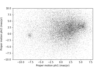
Now we can see more clearly that there is a cluster near (-7.5, 0).
You might notice that our figure is less dense than the one in the paper. That is because we started with a set of stars from a relatively small region. The figure in the paper is based on a region about 10 times bigger.
In the next episode we will go back and select stars from a larger region. But first we will use the proper motion data to identify stars likely to be in GD-1.
Filtering based on proper motion
The next step is to select stars in the “overdense” region of proper motion, which are candidates to be in GD-1.
In the original paper, Price-Whelan and Bonaca used a polygon to cover this region, as shown in this figure.
We will use a simple rectangle for now, but in a later lesson we will see how to select a polygonal region as well.
Here are bounds on proper motion we chose by eye:
To draw these bounds, we will use the make_rectangle
function we wrote in episode 2 to make two lists containing the
coordinates of the corners of the rectangle.
Here is what the plot looks like with the bounds we chose.
OUTPUT
<Figure size 432x288 with 1 Axes>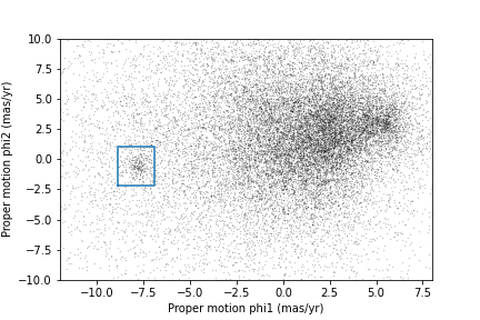
Now that we have identified the bounds of the cluster in proper
motion, we will use it to select rows from results_df.
We will use the following function, which uses pandas operators to
make a mask that selects rows where series falls between
low and high.
PYTHON
def between(series, low, high):
"""Check whether values are between `low` and `high`."""
return (series > low) & (series < high)The following mask selects stars with proper motion in the region we chose.
PYTHON
pm1 = results_df['pm_phi1']
pm2 = results_df['pm_phi2']
pm_mask = (between(pm1, pm1_min, pm1_max) &
between(pm2, pm2_min, pm2_max))Again, the sum of a Boolean series is the number of TRUE
values.
OUTPUT
np.int64(1049)Now we can use this mask to select rows from
results_df.
OUTPUT
1049These are the stars we think are likely to be in GD-1. We can inspect these stars, plotting their coordinates (not their proper motion).
PYTHON
x = selected_df['phi1']
y = selected_df['phi2']
plt.plot(x, y, 'ko', markersize=1, alpha=1)
plt.xlabel('phi1 (degree GD1)')
plt.ylabel('phi2 (degree GD1)')OUTPUT
<Figure size 432x288 with 1 Axes>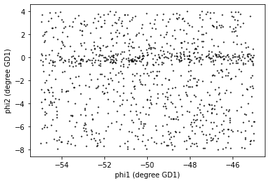
Now that is starting to look like a tidal stream!
To clean up the plot a little bit we can add two new Matplotlib commands:
axiswith the parameterequalsets up the axes so a unit is the same size along thexandyaxes.titleputs the input string as a title at the top of the plot. Thefontsizekeyword sets thefontsizeto bemedium, a little smaller than the defaultlarge.
In an example like this, where x and y
represent coordinates in space, equal axes ensure that the distance
between points is represented accurately. Since we are now constraining
the relative proportions of our axes, the data may not fill the entire
figure.
PYTHON
x = selected_df['phi1']
y = selected_df['phi2']
plt.plot(x, y, 'ko', markersize=0.3, alpha=0.3)
plt.xlabel('phi1 [deg]')
plt.ylabel('phi2 [deg]')
plt.title('Proper motion selection', fontsize='medium')
plt.axis('equal')OUTPUT
<Figure size 432x288 with 1 Axes>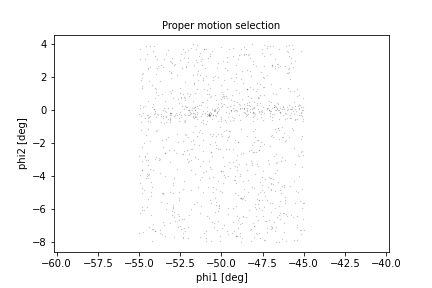
Before we go any further, we will put the code we wrote to make one of the panel figures into a function that we will use in future episodes to recreate this entire plot with a single line of code.
PYTHON
def plot_pm_selection(df):
"""Plot in GD-1 spatial coordinates the location of the stars
selected by proper motion
"""
x = df['phi1']
y = df['phi2']
plt.plot(x, y, 'ko', markersize=0.3, alpha=0.3)
plt.xlabel('phi1 [deg]')
plt.ylabel('phi2 [deg]')
plt.title('Proper motion selection', fontsize='medium')
plt.axis('equal')Now our one line plot command is:
Saving the DataFrame
At this point we have run a successful query and cleaned up the
results. This is a good time to save the data. We have already started a
results file called gd1_data.hdf which we wrote results_df
to.
Recall that we chose HDF5 because it is a binary format producing small files that are fast to read and write and are a cross-language standard.
Additionally, HDF5 files can contain more than one dataset and can store metadata associated with each dataset (such as column names or observatory information, like a FITS header).
We can add to our existing pandas DataFrame to an HDF5
file by omitting the mode='w' keyword like this:
Because an HDF5 file can contain more than one Dataset, we have to provide a name, or “key”, that identifies the Dataset in the file.
We could use any string as the key, but it is generally a good
practice to use a descriptive name (just like your
DataFrame variable name) so we will give the Dataset in the
file the same name (key) as the DataFrame.
Exercise (5 minutes)
We are going to need centerline_df later as well. Write
a line of code to add it as a second Dataset in the HDF5 file.
Hint: Since the file already exists, you should not use
mode='w'.
We can use getsize to confirm that the file exists and
check the size. getsize returns a value in bytes. For the
size files we’re looking at, it will be useful to view their size in
MegaBytes (MB), so we will divide by 1024*1024.
OUTPUT
13.992530822753906If you forget what the names of the Datasets in the file are, you can read them back like this:
OUTPUT
['/centerline_df', '/results_df', '/selected_df']Context Managers
We use a with statement here to open the file before the
print statement and (automatically) close it after. Read more about context
managers.
The keys are the names of the Datasets which makes it easy for us to
remember which DataFrame is in which Dataset.
Summary
In this episode, we re-loaded the transformed Gaia data we saved from a previous query.
Then we prototyped the selection process from the Price-Whelan and Bonaca paper locally using data that we had already downloaded.:
We selected stars near the centerline of GD-1 and made a scatter plot of their proper motion.
We identified a region of proper motion that contains stars likely to be in GD-1.
We used a Boolean
Seriesas a mask to select stars whose proper motion is in that region.
So far, we have used data from a relatively small region of the sky so that our local dataset was not too big. In the next lesson, we will write a query that selects stars based on the proper motion limits we identified in this lesson, which will allow us to explore a larger region.
- A workflow is often prototyped on a small set of data which can be explored more easily and used to identify ways to limit a dataset to exactly the data you want.
- To store data from a pandas
DataFrame, a good option is an HDF5 file, which can contain multiple Datasets.
Content from Transform and Select
Last updated on 2026-06-19 | Edit this page
Overview
Questions
- When should we use the database server for computation?
- When should we download the data from the database server and compute locally?
Objectives
- Transform proper motions from one frame to another.
- Compute the convex hull of a set of points.
- Write an ADQL query that selects based on proper motion.
In the previous episode, we identified stars with the proper motion we expect for GD-1.
Now we will do the same selection in an ADQL query, which will make it possible to work with a larger region of the sky and still download less data.
Outline
Using data from the previous episode, we will identify the values of proper motion for stars likely to be in GD-1.
Then we will compose an ADQL query that selects stars based on proper motion, so we can download only the data we need.
That will make it possible to search a bigger region of the sky in a single query.
Starting from this episode
If you are starting a new notebook for this episode, expand this section for information you will need to get started.
Previously, we ran a query on the Gaia server, downloaded data for roughly 140,000 stars, and saved the data in a FITS file. We then selected just the stars with the same proper motion as GD-1 and saved the results to an HDF5 file. We will use that data for this episode. Whether you are working from a new notebook or coming back from a checkpoint, reloading the data will save you from having to run the query again.
If you are starting this episode here or starting this episode in a
new notebook, you will need to run the following lines of code. The last
two lines of the import statements assume your notebook is being run in
the student_download directory. If you are running it from
a different directory you will need to add the path using
sys.path.append(<path to student download>) where
<path to student_download> is the path to your
student_download directory ending with
student_download.
This imports previously imported functions:
PYTHON
import astropy.units as u
from astropy.coordinates import SkyCoord
from astroquery.gaia import Gaia
from gala.coordinates import GD1Koposov10, reflex_correct
import matplotlib.pyplot as plt
import pandas as pd
from episode_functions import *
from gd1 import GD1Koposov10
from reflex import reflex_correctThe following code loads in the data (instructions for downloading
data can be found in the setup instructions).
You may need to add a the path to the filename variable below
(e.g. filename = 'student_download/backup-data/gd1_data.hdf')
PYTHON
filename = 'gd1_data.hdf'
centerline_df = pd.read_hdf(filename, 'centerline_df')
selected_df = pd.read_hdf(filename, 'selected_df')This defines previously defined quantities:
Selection by proper motion
Let us review how we got to this point.
We made an ADQL query to the Gaia server to get data for stars in the vicinity of a small part of GD-1.
We transformed the coordinates to the GD-1 frame (
GD1Koposov10) so we could select stars along the centerline of GD-1.We plotted the proper motion of stars along the centerline of GD-1 to identify the bounds of an anomalous overdense region associated with the proper motion of stars in GD-1.
We made a mask that selects stars whose proper motion is in this overdense region and which are therefore likely to be part of the GD-1 stream.
At this point we have downloaded data for a relatively large number of stars (more than 100,000) and selected a relatively small number (around 1000).
It would be more efficient to use ADQL to select only the stars we need. That would also make it possible to download data covering a larger region of the sky.
However, the selection we did was based on proper motion in the GD-1 frame. In order to do the same selection on the Gaia catalog in ADQL, we have to work with proper motions in the ICRS frame as this is the frame that the Gaia catalog uses.
First, we will verify that our proper motion selection was correct,
starting with the plot_proper_motion function that we
defined in episode 3. The following figure shows:
Proper motion for the stars we selected along the center line of GD-1,
The rectangle we selected, and
The stars inside the rectangle highlighted in green.
PYTHON
plot_proper_motion(centerline_df)
plt.plot(pm1_rect, pm2_rect)
x = selected_df['pm_phi1']
y = selected_df['pm_phi2']
plt.plot(x, y, 'gx', markersize=0.3, alpha=0.3);OUTPUT
<Figure size 432x288 with 1 Axes>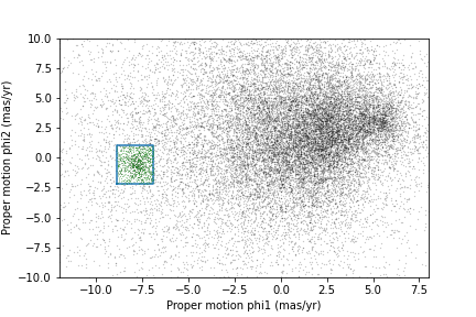
Now we will make the same plot using proper motions in the ICRS
frame, which are stored in columns named pmra and
pmdec.
PYTHON
x = centerline_df['pmra']
y = centerline_df['pmdec']
plt.plot(x, y, 'ko', markersize=0.3, alpha=0.3)
x = selected_df['pmra']
y = selected_df['pmdec']
plt.plot(x, y, 'gx', markersize=1, alpha=0.3)
plt.xlabel('Proper motion ra (ICRS frame)')
plt.ylabel('Proper motion dec (ICRS frame)')
plt.xlim([-10, 5])
plt.ylim([-20, 5]);OUTPUT
<Figure size 432x288 with 1 Axes>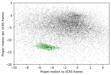
The proper motions of the selected stars are more spread out in this frame, which is why it was preferable to do the selection in the GD-1 frame.
In the following exercise, we will identify a rectangle that encompasses the majority of the stars we identified as having proper motion consistent with that of GD-1 without including too many other stars.
Exercise (5 minutes)
Looking at the proper motion of the stars we identified along the
centerline of GD-1, in the ICRS reference frame define a rectangle
(pmra_min, pmra_max, pmdec_min,
and pmdec_max) that encompass the proper motion of the
majority of the stars near the centerline of GD-1 without including too
much contamination from other stars.
Assembling the query
In episode 2 we used the following query to select stars in a polygonal region around a small part of GD-1 with a few filters on color and distance (parallax):
PYTHON
candidate_coord_query_base = """SELECT
{columns}
FROM gaiadr2.gaia_source
WHERE parallax < 1
AND bp_rp BETWEEN -0.75 AND 2
AND 1 = CONTAINS(POINT(ra, dec),
POLYGON({sky_point_list}))
"""In this episode we will make two changes:
We will select stars with coordinates in a larger region to include more of GD-1.
We will add another clause to select stars whose proper motion is in the range we just defined in the previous exercise.
The fact that we remove most contaminating stars with the proper motion filter is what allows us to expand our query to include most of GD-1 without returning too many results. As we did in episode 2, we will define the physical region we want to select in the GD-1 frame and transform it to the ICRS frame to query the Gaia catalog which is in the ICRS frame.
Here are the coordinates of the larger rectangle in the GD-1 frame.
PYTHON
phi1_min = -70 * u.degree
phi1_max = -20 * u.degree
phi2_min = -5 * u.degree
phi2_max = 5 * u.degreeWe selected these bounds by trial and error, defining the largest region we can process in a single query.
Here is how we transform it to ICRS, as we saw in episode 2.
PYTHON
corners = SkyCoord(phi1=phi1_rect, phi2=phi2_rect, frame=gd1_frame)
corners_icrs = corners.transform_to('icrs')To use corners_icrs as part of an ADQL query, we have to
convert it to a string. Fortunately, we wrote a function,
skycoord_to_string to do this in episode 2 which we will
call now.
OUTPUT
'135.306, 8.39862, 126.51, 13.4449, 163.017, 54.2424, 172.933, 46.4726, 135.306, 8.39862'Here are the columns we want to select.
Now we have everything we need to assemble the query, but DO NOT try to run this query. Because it selects a larger region, there are too many stars to handle in a single query. Until we select by proper motion, that is.
PYTHON
candidate_coord_query = candidate_coord_query_base.format(columns=columns,
                            sky_point_list=sky_point_list)
print(candidate_coord_query)
OUTPUT
SELECT
source_id, ra, dec, pmra, pmdec
FROM gaiadr2.gaia_source
WHERE parallax < 1
  AND bp_rp BETWEEN -0.75 AND 2
  AND 1 = CONTAINS(POINT(ra, dec),
                   POLYGON(135.306, 8.39862, 126.51, 13.4449, 163.017, 54.2424, 172.933, 46.4726, 135.306, 8.39862))
Selecting proper motion
Now we are ready to add a WHERE clause to select stars
whose proper motion falls range we defined in the last exercise.
Exercise (10 minutes)
Define candidate_coord_pm_query_base, starting with
candidate_coord_query_base and adding two new
BETWEEN clauses to select stars whose coordinates of proper
motion, pmra and pmdec, fall within the region
defined by pmra_min, pmra_max,
pmdec_min, and pmdec_max. In the next exercise
we will use the format statement to fill in the values we defined
above.
Exercise (5 minutes)
Use format to format
candidate_coord_pm_query_base and define
candidate_coord_pm_query, filling in the values of
columns, sky_point_list, and
pmra_min, pmra_max, pmdec_min,
pmdec_max.
Now we can run the query like this:
PYTHON
candidate_coord_pm_job = Gaia.launch_job_async(candidate_coord_pm_query)
print(candidate_coord_pm_job)OUTPUT
INFO: Query finished. [astroquery.utils.tap.core]
<Table length=8409>
name dtype unit description
--------- ------- -------- ------------------------------------------------------------------
source_id int64 Unique source identifier (unique within a particular Data Release)
ra float64 deg Right ascension
dec float64 deg Declination
pmra float64 mas / yr Proper motion in right ascension direction
pmdec float64 mas / yr Proper motion in declination direction
Jobid: 1616771462206O
Phase: COMPLETED
[Output truncated]And get the results.
OUTPUT
8409BETWEEN vs POLYGON
You may be wondering why we used BETWEEN for proper
motion when we previously used POLYGON for coordinates.
ADQL intends the POLYGON function to only be used on
coordinates and not on proper motion. To enforce this, it will produce
an error when a negative value is passed into the first argument.
We call the results candidate_gaia_table because it
contains information from the Gaia table for stars that are good
candidates for GD-1.
sky_point_list, pmra_min,
pmra_max, pmdec_min, and
pmdec_max are a set of selection criteria that we derived
from data downloaded from the Gaia Database. To make sure we can repeat
our analysis at a later date we should save this information to a
file.
There are several ways we could do that, but since we are already storing data in an HDF5 file, we will do the same with these variables.
To save them to an HDF5 file we first need to put them in a pandas
object. We have seen how to create a Series from a column
in a DataFrame. Now we will build a Series
from scratch. We do not need the full DataFrame format with
multiple rows and columns because we are only storing one string
(sky_point_list). We can store each string as a row in the
Series and save it. One aspect that is nice about
Series is that we can label each row. To do this we need an
object that can define both the name of each row and the data to go in
that row. We can use a Python Dictionary for this, defining
the row names with the dictionary keys and the row data with the
dictionary values.
PYTHON
d = dict(sky_point_list=sky_point_list, pmra_min=pmra_min, pmra_max=pmra_max, pmdec_min=pmdec_min, pmdec_max=pmdec_max)
dOUTPUT
{'sky_point_list': '135.306, 8.39862, 126.51, 13.4449, 163.017, 54.2424, 172.933, 46.4726, 135.306, 8.39862',
'pmra_min': -6.7,
'pmra_max': -3,
'pmdec_min': -14.31,
'pmdec_max': -11.2}And use this Dictionary to initialize a
Series.
OUTPUT
sky_point_list 135.306, 8.39862, 126.51, 13.4449, 163.017, 54...
pmra_min -6.7
pmra_max -3
pmdec_min -14.31
pmdec_max -11.2
dtype: objectNow we can save our Series using
to_hdf().
Performance Warning
You may see the previous command issue this or a similar performance warning:
OUTPUT
[...] PerformanceWarning:
your performance may suffer as PyTables will pickle object types that it cannot
map directly to c-types [inferred_type->mixed-integer,key->values] [items->None]
point_series.to_hdf(filename, 'point_series')This is because in the Series we just created, we are mixing
variables of different types: sky_point_list is a string
(text), whereas pmra_min etc. are floating point numbers.
While combining different data types in a single Series is somewhat
inefficient, the amount of data is small enough to not matter in this
case, so this warning can be safely ignored.
Plotting one more time
Now we can examine the results:
PYTHON
x = candidate_gaia_table['ra']
y = candidate_gaia_table['dec']
plt.plot(x, y, 'ko', markersize=0.3, alpha=0.3)
plt.xlabel('ra (degree ICRS)')
plt.ylabel('dec (degree ICRS)');OUTPUT
<Figure size 432x288 with 1 Axes>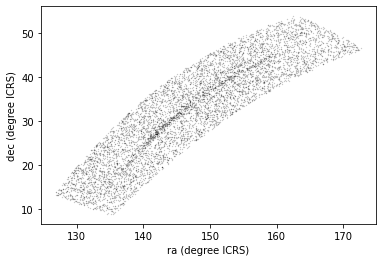
This plot shows why it was useful to transform these coordinates to the GD-1 frame. In ICRS, it is more difficult to identify the stars near the centerline of GD-1.
We can use our make_dataframe function from episode 3 to
transform the results back to the GD-1 frame. In addition to doing the
coordinate transformation and reflex correction for us, this function
also compiles everything into a single object (a DataFrame)
to make it easier to use. Note that because we put this code into a
function, we can do all of this with a single line of code!
We can check the results using the plot_pm_selection
function we wrote in episode 3.
OUTPUT
<Figure size 432x288 with 1 Axes>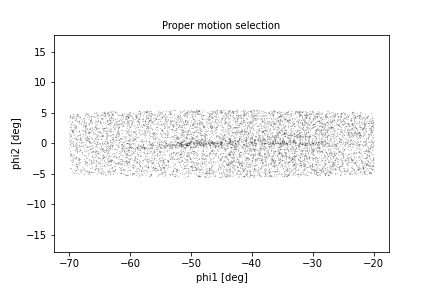
We are starting to see GD-1 more clearly. We can compare this figure with this panel from Figure 1 from the original paper:
This panel shows stars selected based on proper motion only, so it is comparable to our figure (although notice that the original figure covers a wider region).
In the next episode, we will use photometry data from Pan-STARRS to do a second round of filtering, and see if we can replicate this panel.
Later we will learn how to add annotations like the ones in the figure and customize the style of the figure to present the results clearly and compellingly.
Summary
In the previous episode we downloaded data for a large number of stars and then selected a small fraction of them based on proper motion.
In this episode, we improved this process by writing a more complex query that uses the database to select stars based on proper motion. This process requires more computation on the Gaia server, but then we are able to either:
Search the same region and download less data, or
Search a larger region while still downloading a manageable amount of data.
In the next episode, we will learn about the database
JOIN operation, which we will use in later episodes to join
our Gaia data with photometry data from Pan-STARRS.
- When possible, ‘move the computation to the data’; that is, do as much of the work as possible on the database server before downloading the data.
Content from Join
Last updated on 2026-06-19 | Edit this page
Overview
Questions
- How do we use
JOINto combine information from multiple tables? - How can we make a selection within a joined table?
- How should we save the result?
Objectives
- Write ADQL queries involving
JOINoperations. - Save data in CSV format.
The next step in our analysis is to select candidate stars based on photometry data. The following figure from the Price-Whelan and Bonaca paper is a color-magnitude diagram for the stars selected based on proper motion:
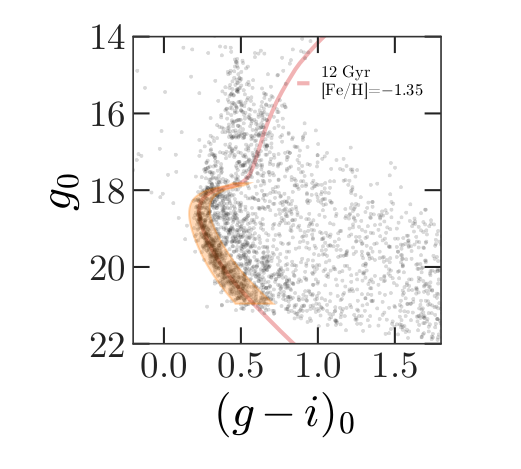
In red is a stellar isochrone, showing where we expect the stars in GD-1 to fall based on the metallicity and age of their original globular cluster.
By selecting stars in the shaded area, we can further distinguish the main sequence of GD-1 from younger background stars.
Outline
We will reload the candidate stars we identified in the previous episode.
Then we will run a query on the Gaia server that uploads the table of candidates and uses a
JOINoperation to select photometry data for the candidate stars.We will write the results to a file for use in the next episode.
Starting from this episode
If you are starting a new notebook for this episode, expand this section for information you will need to get started.
In the previous episode, we define a rectangle around stars in GD-1 in spatial coordinates and in proper motion which we transformed into ICRS coordinates and created point lists of the polygon vertices. We will use that data for this episode. Whether you are working from a new notebook or coming back from a checkpoint, reloading the data will save you from having to run the query again.
If you are starting this episode here or starting this episode in a new notebook, you will need run the following lines of code.
This imports previously imported functions:
The following code loads in the data (instructions for downloading
data can be found in the setup instructions).
You may need to add a the path to the filename variable below
(e.g. filename = 'student_download/backup-data/gd1_data.hdf')
Getting photometry data
The Gaia dataset contains some photometry data, including the
variable bp_rp, which contains BP-RP color (the difference
in mean flux between the BP and RP bands). We use this variable to
select stars with bp_rp between -0.75 and 2, which excludes
many class M dwarf stars.
But we can do better than that. Assuming GD-1 is a globular cluster,
all of the stars formed at the same time from the same material, so the
stars’ photometric properties should be consistent with a single
isochrone in a color magnitude diagram. We can use photometric color and
apparent magnitude to select stars with the age and metal richness we
expect in GD-1. However, the broad Gaia photometric bands (G, BP, RP)
are not optimized for this task, instead we will use the more narrow
photometric bands available from the Pan-STARRS survey to obtain the
g-i color and apparent g-band magnitude.
Conveniently, the Gaia server provides data from Pan-STARRS as a table in the same database we have been using, so we can access it by making ADQL queries.
A caveat about matching stars between catalogs
In general, choosing a star from the Gaia catalog and finding the corresponding star in the Pan-STARRS catalog is not easy. This kind of cross matching is not always possible, because a star might appear in one catalog and not the other. And even when both stars are present, there might not be a clear one-to-one relationship between stars in the two catalogs. Additional catalog matching tools are available from the Astropy coordinates package.
Fortunately, people have worked on this problem, and the Gaia database includes cross-matching tables that suggest a best neighbor in the Pan-STARRS catalog for many stars in the Gaia catalog.
This document describes the cross matching process. Briefly, it uses a cone search to find possible matches in approximately the right position, then uses attributes like color and magnitude to choose pairs of observations most likely to be the same star.
The best neighbor table
So the hard part of cross-matching has been done for us. Using the results is a little tricky, but it gives us a chance to learn about one of the most important tools for working with databases: “joining” tables.
A “join” is an operation where you match up records from one table with records from another table using as a “key” a piece of information that is common to both tables, usually some kind of ID code.
In this example:
Stars in the Gaia dataset are identified by
source_id.Stars in the Pan-STARRS dataset are identified by
obj_id.
For each candidate star we have selected so far, we have the
source_id; the goal is to find the obj_id for
the same star in the Pan-STARRS catalog.
To do that we will:
Use the
JOINoperator to look up each Pan-STARRSobj_id, for the stars we are interested in, in thepanstarrs1_best_neighbourtable using thesource_idsthat we have already identified.Use the
JOINoperator again to look up the Pan-STARRS photometry for these stars in thepanstarrs1_original_validtable using theobj_idswe just identified.
Before we get to the JOIN operation, we will explore
these tables.
British vs American Spelling of Neighbour
The Gaia database was created and is maintained by the European Space Astronomy Center. For this reason, the table spellings use the British spelling of neighbour (with a “u”). Do not forget to include it in your table names in the queries below.
Here is the metadata for panstarrs1_best_neighbour.
OUTPUT
TAP Table name: gaiadr2.gaiadr2.panstarrs1_best_neighbour
Description: Pan-STARRS1 BestNeighbour table lists each matched Gaia object with its
best neighbour in the external catalogue.
There are 1 327 157 objects in the filtered version of Pan-STARRS1 used
to compute this cross-match that have too early epochMean.
Size (bytes): 98462015488
Num. columns: 7And here are the columns.
OUTPUT
source_id
original_ext_source_id
angular_distance
number_of_neighbours
number_of_mates
best_neighbour_multiplicity
gaia_astrometric_paramsHere is the documentation for these variables.
The ones we will use are:
source_id, which we will match up withsource_idin the Gaia table.best_neighbour_multiplicity, which indicates how many sources in Pan-STARRS are matched with the same probability to this source in Gaia.number_of_mates, which indicates the number of other sources in Gaia that are matched with the same source in Pan-STARRS.original_ext_source_id, which we will match up withobj_idin the Pan-STARRS table.
Ideally, best_neighbour_multiplicity should be 1 and
number_of_mates should be 0; in that case, there is a
one-to-one match between the source in Gaia and the corresponding source
in Pan-STARRS.
Number of neighbors
The table also contains number_of_neighbours which is
the number of stars in Pan-STARRS that match in terms of position,
before using other criteria to choose the most likely match. But we are
more interested in the final match, using both criteria.
Here is a query that selects these columns and returns the first 5 rows.
PYTHON
ps_best_neighbour_query = """SELECT
TOP 5
source_id, best_neighbour_multiplicity, number_of_mates, original_ext_source_id
FROM gaiadr2.panstarrs1_best_neighbour
"""OUTPUT
INFO: Query finished. [astroquery.utils.tap.core]OUTPUT
<Table length=5>
source_id best_neighbour_multiplicity number_of_mates original_ext_source_id
int64 int32 int16 int64
------------------- --------------------------- --------------- ----------------------
6745938972433480704 1 0 69742925668851205
6030466788955954048 1 0 69742509325691172
6756488099308169600 1 0 69742879438541228
6700154994715046016 1 0 69743055581721207
6757061941303252736 1 0 69742856540241198The Pan-STARRS table
Now that we know the Pan-STARRS obj_id, we are ready to
match this to the photometry in the
panstarrs1_original_valid table. Here is the metadata for
the table that contains the Pan-STARRS data.
OUTPUT
TAP Table name: gaiadr2.gaiadr2.panstarrs1_original_valid
Description: The Panoramic Survey Telescope and Rapid Response System (Pan-STARRS) is
a system for wide-field astronomical imaging developed and operated by
the Institute for Astronomy at the University of Hawaii. Pan-STARRS1
(PS1) is the first part of Pan-STARRS to be completed and is the basis
for Data Release 1 (DR1). The PS1 survey used a 1.8 meter telescope and
its 1.4 Gigapixel camera to image the sky in five broadband filters (g,
r, i, z, y).
The current table contains a filtered subsample of the 10 723 304 629
entries listed in the original ObjectThin table.
[Output truncated]And here are the columns.
OUTPUT
obj_name
obj_id
ra
dec
ra_error
dec_error
epoch_mean
g_mean_psf_mag
g_mean_psf_mag_error
g_flags
r_mean_psf_mag
[Output truncated]Here is the documentation for these variables .
The ones we will use are:
obj_id, which we will match up withoriginal_ext_source_idin the best neighbor table.g_mean_psf_mag, which contains mean magnitude from thegfilter.i_mean_psf_mag, which contains mean magnitude from theifilter.
Here is a query that selects these variables and returns the first 5 rows.
PYTHON
ps_valid_query = """SELECT
TOP 5
obj_id, g_mean_psf_mag, i_mean_psf_mag
FROM gaiadr2.panstarrs1_original_valid
"""OUTPUT
INFO: Query finished. [astroquery.utils.tap.core]OUTPUT
<Table length=5>
obj_id g_mean_psf_mag i_mean_psf_mag
mag
int64 float64 float64
----------------- -------------- ----------------
67130655389101425 -- 20.3516006469727
67553305590067819 -- 19.779899597168
67551423248967849 -- 19.8889007568359
67132026238911331 -- 20.9062995910645
67553513677687787 -- 21.2831001281738Joining tables
The following figure shows how these tables are related.
The orange circles and arrows represent the first
JOINoperation, which takes eachsource_idin the Gaia table and finds the same value ofsource_idin the best neighbor table.The blue circles and arrows represent the second
JOINoperation, which takes eachoriginal_ext_source_idin the best neighbor table and finds the same value ofobj_idin the PanSTARRS photometry table.
There is no guarantee that the corresponding rows of these tables are
in the same order, so the JOIN operation involves some
searching. However, ADQL/SQL databases are implemented in a way that
makes this kind of search efficient. If you are curious, you can read
more about it.
Now we will get to the details of performing a JOIN
operation.
We are about to build a complex query using software that doesn’t provide us with any helpful information for debugging. For this reason we are going to start with a simplified version of what we want to do until we are sure we are joining the tables correctly, then we will slowly add more layers of complexity, checking at each stage that our query still works. As a starting place, we will go all the way back to the cone search from episode 2.
PYTHON
test_cone_query = """SELECT
TOP 10
source_id
FROM gaiadr2.gaia_source
WHERE 1=CONTAINS(
POINT(ra, dec),
CIRCLE(88.8, 7.4, 0.08333333))
"""And we will run it, to make sure we have a working query to build on.
OUTPUT
INFO: Query finished. [astroquery.utils.tap.core]OUTPUT
<Table length=10>
source_id
int64
-------------------
3322773965056065536
3322773758899157120
3322774068134271104
3322773930696320512
3322774377374425728
3322773724537891456
3322773724537891328
[Output truncated]Now we can start adding features. First, we will replace
source_id with the format specifier columns so
that we can alter what columns we want to return without having to
modify our base query:
PYTHON
cone_base_query = """SELECT
{columns}
FROM gaiadr2.gaia_source
WHERE 1=CONTAINS(
POINT(ra, dec),
CIRCLE(88.8, 7.4, 0.08333333))
"""As a reminder, here are the columns we want from the Gaia table:
PYTHON
columns = 'source_id, ra, dec, pmra, pmdec'
cone_query = cone_base_query.format(columns=columns)
print(cone_query)OUTPUT
SELECT
source_id, ra, dec, pmra, pmdec
FROM gaiadr2.gaia_source
WHERE 1=CONTAINS(
POINT(ra, dec),
CIRCLE(88.8, 7.4, 0.08333333))We run the query again.
OUTPUT
INFO: Query finished. [astroquery.utils.tap.core]OUTPUT
<Table length=594>
source_id ra ... pmdec
deg ... mas / yr
int64 float64 ... float64
------------------- ----------------- ... -------------------
3322773965056065536 88.78178020183375 ... -2.5057036964736907
3322773758899157120 88.83227057144585 ... --
3322774068134271104 88.8206092188033 ... -1.5260889445858044
3322773930696320512 88.80843339290348 ... -0.9292104395445717
3322774377374425728 88.86806108182265 ... -3.8676624830902435
3322773724537891456 88.81308602813434 ... -33.078133430952086
[Output truncated]Adding the best neighbor table
Now we are ready for the first join. The join operation requires two clauses:
JOINspecifies the name of the table we want to join with, andONspecifies how we will match up rows between the tables.
In this example, we join with
gaiadr2.panstarrs1_best_neighbour AS best, which means we
can refer to the best neighbor table with the abbreviated name
best, which will save us a lot of typing. Similarly, we
will be referring to the gaiadr2.gaia_source table by the
abbreviated name gaia.
The ON clause indicates that we will match up the
source_id column from the Gaia table with the
source_id column from the best neighbor table.
PYTHON
neighbours_base_query = """SELECT
{columns}
FROM gaiadr2.gaia_source AS gaia
JOIN gaiadr2.panstarrs1_best_neighbour AS best
ON gaia.source_id = best.source_id
WHERE 1=CONTAINS(
POINT(gaia.ra, gaia.dec),
CIRCLE(88.8, 7.4, 0.08333333))
"""SQL detail
In this example, the ON column has the same name in both
tables, so we could replace the ON clause with a simpler USINGclause:
Now that there is more than one table involved, we can’t use simple
column names any more; we have to use qualified column
names. In other words, we have to specify which table each
column is in. The column names do not have to be the same and, in fact,
in the next join they will not be. That is one of the reasons that we
explicitly specify them. Here is the complete query, including the
columns we want from the Gaia and best neighbor tables. Here you can
start to see that using the abbreviated names is making our query easier
to read and requires less typing for us. In addition to the spatial
coordinates and proper motion, we are going to return the
best_neighbour_multiplicity and
number_of_mates columns from the
panstarrs1_best_neighbour table in order to evaluate the
quality of the data that we are using by evaluating the number of
one-to-one matches between the catalogs. Recall that
best_neighbour_multiplicity tells us the number of
PanSTARRs objects that match a Gaia object and
number_of_mates tells us the number of Gaia objects that
match a PanSTARRs object.
PYTHON
column_list_neighbours = ['gaia.source_id',
'gaia.ra',
'gaia.dec',
'gaia.pmra',
'gaia.pmdec',
'best.best_neighbour_multiplicity',
'best.number_of_mates',
]
columns = ', '.join(column_list_neighbours)
neighbours_query = neighbours_base_query.format(columns=columns)
print(neighbours_query)OUTPUT
SELECT
gaia.source_id, gaia.ra, gaia.dec, gaia.pmra, gaia.pmdec, best.best_neighbour_multiplicity, best.number_of_mates
FROM gaiadr2.gaia_source AS gaia
JOIN gaiadr2.panstarrs1_best_neighbour AS best
ON gaia.source_id = best.source_id
WHERE 1=CONTAINS(
POINT(gaia.ra, gaia.dec),
CIRCLE(88.8, 7.4, 0.08333333))OUTPUT
INFO: Query finished. [astroquery.utils.tap.core]OUTPUT
<Table length=490>
source_id ra ... number_of_mates
deg ...
int64 float64 ... int16
------------------- ----------------- ... ---------------
3322773965056065536 88.78178020183375 ... 0
3322774068134271104 88.8206092188033 ... 0
3322773930696320512 88.80843339290348 ... 0
3322774377374425728 88.86806108182265 ... 0
3322773724537891456 88.81308602813434 ... 0
3322773724537891328 88.81570329208743 ... 0
[Output truncated]This result has fewer rows than the previous result. That is because there are sources in the Gaia table with no corresponding source in the Pan-STARRS table.
By default, the result of the join only includes rows where the same
source_id appears in both tables. This default is called an
“inner” join because the results include only the intersection of the
two tables. You
can read about the other kinds of join here.
Adding the Pan-STARRS table
Exercise (15 minutes)
Now we are ready to bring in the Pan-STARRS table. Starting with the
previous query, add a second JOIN clause that joins with
gaiadr2.panstarrs1_original_valid, gives it the abbreviated
name ps, and matches original_ext_source_id
from the best neighbor table with obj_id from the
Pan-STARRS table.
Add g_mean_psf_mag and i_mean_psf_mag to
the column list, and run the query. The result should contain 490 rows
and 9 columns.
PYTHON
join_solution_query_base = """SELECT
{columns}
FROM gaiadr2.gaia_source as gaia
JOIN gaiadr2.panstarrs1_best_neighbour as best
ON gaia.source_id = best.source_id
JOIN gaiadr2.panstarrs1_original_valid as ps
ON best.original_ext_source_id = ps.obj_id
WHERE 1=CONTAINS(
POINT(gaia.ra, gaia.dec),
CIRCLE(88.8, 7.4, 0.08333333))
"""
column_list = ['gaia.source_id',
'gaia.ra',
'gaia.dec',
'gaia.pmra',
'gaia.pmdec',
'best.best_neighbour_multiplicity',
'best.number_of_mates',
'ps.g_mean_psf_mag',
'ps.i_mean_psf_mag']
columns = ', '.join(column_list)
join_solution_query = join_solution_query_base.format(columns=columns)
print(join_solution_query)
join_solution_job = Gaia.launch_job_async(join_solution_query)
join_solution_results = join_solution_job.get_results()
join_solution_resultsOUTPUT
<Table length=490>
source_id ra ... g_mean_psf_mag i_mean_psf_mag
deg ... mag
int64 float64 ... float64 float64
------------------- ----------------- ... ---------------- ----------------
3322773965056065536 88.78178020183375 ... 19.9431991577148 17.4221992492676
3322774068134271104 88.8206092188033 ... 18.6212005615234 16.6007995605469
3322773930696320512 88.80843339290348 ... -- 20.2203998565674
3322774377374425728 88.86806108182265 ... 18.0676002502441 16.9762001037598
3322773724537891456 88.81308602813434 ... 20.1907005310059 17.8700008392334
3322773724537891328 88.81570329208743 ... 22.6308002471924 19.6004009246826
[Output truncated]Selecting by coordinates and proper motion
We are now going to replace the cone search with the GD-1 selection
that we built in previous episodes. We will start by making sure that
our previous query works, then add in the JOIN. Now we will
bring in the WHERE clause from the previous episode, which
selects sources based on parallax, BP-RP color, sky coordinates, and
proper motion.
Here is candidate_coord_pm_query_base from the previous
episode.
PYTHON
candidate_coord_pm_query_base = """SELECT
{columns}
FROM gaiadr2.gaia_source
WHERE parallax < 1
  AND bp_rp BETWEEN -0.75 AND 2
  AND 1 = CONTAINS(POINT(ra, dec),
                   POLYGON({sky_point_list}))
  AND pmra BETWEEN {pmra_min} AND  {pmra_max}
  AND pmdec BETWEEN {pmdec_min} AND {pmdec_max}
"""Now we can assemble the query using the sky point list and proper motion range we compiled in episode 5.
PYTHON
columns = 'source_id, ra, dec, pmra, pmdec'
candidate_coord_pm_query = candidate_coord_pm_query_base.format(columns=columns,
                            sky_point_list=sky_point_list,
                            pmra_min=pmra_min,
                            pmra_max=pmra_max,
                            pmdec_min=pmdec_min,
                            pmdec_max=pmdec_max)
print(candidate_coord_pm_query)OUTPUT
SELECT
source_id, ra, dec, pmra, pmdec
FROM gaiadr2.gaia_source
WHERE parallax < 1
  AND bp_rp BETWEEN -0.75 AND 2
  AND 1 = CONTAINS(POINT(ra, dec),
                   POLYGON(135.306, 8.39862, 126.51, 13.4449, 163.017, 54.2424, 172.933, 46.4726, 135.306, 8.39862))
  AND pmra BETWEEN -6.70 AND -3
  AND pmdec BETWEEN -14.31 AND -11.2
We run it to make sure we are starting with a working query.
OUTPUT
INFO: Query finished. [astroquery.utils.tap.core]OUTPUT
<Table length=8409>
    source_id              ra         ...        pmdec
                          deg         ...       mas / yr
      int64             float64       ...       float64
------------------ ------------------ ... -------------------
635559124339440000 137.58671691646745 ... -12.490481778113859
635860218726658176  138.5187065217173 ... -11.346409129876392
635674126383965568  138.8428741026386 ... -12.702779525389634
635535454774983040  137.8377518255436 ... -14.492308604905652
635497276810313600  138.0445160213759 ... -12.291499169815987
635614168640132864 139.59219748145836 ... -13.708904908478631
[Output truncated]Exercise (15 minutes)
Create a new query base called candidate_join_query_base
that combines the WHERE clauses from the previous query
with the JOIN clauses for the best neighbor and Pan-STARRS
tables. Format the query base using the column names in
column_list, and call the result
candidate_join_query.
Hint: Make sure you use qualified column names everywhere!
Run your query and download the results. The table you get should have 4300 rows and 9 columns.
PYTHON
candidate_join_query_base = """
SELECT
{columns}
FROM gaiadr2.gaia_source as gaia
JOIN gaiadr2.panstarrs1_best_neighbour as best
  ON gaia.source_id = best.source_id
JOIN gaiadr2.panstarrs1_original_valid as ps
  ON best.original_ext_source_id = ps.obj_id
WHERE parallax < 1
  AND bp_rp BETWEEN -0.75 AND 2
  AND 1 = CONTAINS(POINT(gaia.ra, gaia.dec),
                   POLYGON({sky_point_list}))
  AND gaia.pmra BETWEEN {pmra_min} AND  {pmra_max}
  AND gaia.pmdec BETWEEN {pmdec_min} AND {pmdec_max}
"""

columns = ', '.join(column_list)

candidate_join_query = candidate_join_query_base.format(columns=columns,
                            sky_point_list= sky_point_list,
                            pmra_min=pmra_min,
                            pmra_max=pmra_max,
                            pmdec_min=pmdec_min,
                            pmdec_max=pmdec_max)
print(candidate_join_query)


candidate_join_job = Gaia.launch_job_async(candidate_join_query)
candidate_table = candidate_join_job.get_results()
candidate_table
Checking the match
To get more information about the matching process, we can inspect
best_neighbour_multiplicity, which indicates for each star
in Gaia how many stars in Pan-STARRS are equally likely matches.
OUTPUT
<MaskedColumn name='best_neighbour_multiplicity' dtype='int16' description='Number of neighbours with same probability as best neighbour' length=4300>
  1
  1
  1
  1
  1
  1
  1
  1
  1
  1
[Output truncated]
Most of the values are 1, which is good; that means that
for each candidate star we have identified exactly one source in
Pan-STARRS that is likely to be the same star.
To check whether there are any values other than 1, we
can convert this column to a pandas Series and use
describe, which we saw in episode 3.
PYTHON
multiplicity = pd.Series(candidate_table['best_neighbour_multiplicity'])
multiplicity.describe()
OUTPUT
count    4300.0
mean        1.0
std         0.0
min         1.0
25%         1.0
50%         1.0
75%         1.0
max         1.0
dtype: float64
In fact, 1 is the only value in the Series,
so every candidate star has a single best match.
Numpy Mask Warning
You may see a warning that ends with the following phrase:
site-packages/numpy/lib/function_base.py:4650:
UserWarning: Warning: 'partition' will ignore the 'mask' of the MaskedColumn.
arr.partition(
This is because astroquery is returning a table with masked columns (which are really fancy masked numpy arrays). When we turn this column into a pandas Series, it maintains its mask. Describe calls numpy functions to perform statistics. Numpy recently implemented this warning to let you know that the mask is not being considered in the calculation its performing.
Similarly, number_of_mates indicates the number of
other stars in Gaia that match with the same star in
Pan-STARRS.
OUTPUT
count    4300.0
mean        0.0
std         0.0
min         0.0
25%         0.0
50%         0.0
75%         0.0
max         0.0
dtype: float64
All values in this column are 0, which means that for
each match we found in Pan-STARRS, there are no other stars in Gaia that
also match.
Saving the DataFrame
We can make a DataFrame from our Astropy
Table and save our results so we can pick up where we left
off without running this query again. Once again, we will make use of
our make_dataframe function.
The HDF5 file should already exist, so we’ll add
candidate_df to it.
We can use getsize to confirm that the file exists and
check the size:
OUTPUT
15.422508239746094Another file format - CSV
pandas can write a variety of other formats, which you can read about here. We won’t cover all of them, but one other important one is CSV, which stands for “comma-separated values”.
CSV is a plain-text format that can be read and written by pretty much any tool that works with data. In that sense, it is the “least common denominator” of data formats.
However, it has an important limitation: some information about the data gets lost in translation, notably the data types. If you read a CSV file from someone else, you might need some additional information to make sure you are getting it right.
Also, CSV files tend to be big, and slow to read and write.
With those caveats, here is how to write one:
We can check the file size like this:
OUTPUT
0.8787498474121094We can read the CSV file back like this:
We will compare the first few rows of candidate_df and
read_back_csv
OUTPUT
            source_id          ra        dec      pmra      pmdec  \
0  635860218726658176  138.518707  19.092339 -5.941679 -11.346409
1  635674126383965568  138.842874  19.031798 -3.897001 -12.702780
2  635535454774983040  137.837752  18.864007 -4.335041 -14.492309

   best_neighbour_multiplicity  number_of_mates  g_mean_psf_mag  \
0                            1                0         17.8978
1                            1                0         19.2873
2                            1                0         16.9238

   i_mean_psf_mag       phi1      phi2   pm_phi1   pm_phi2
[Output truncated]OUTPUT
   Unnamed: 0           source_id          ra        dec      pmra      pmdec  \
0           0  635860218726658176  138.518707  19.092339 -5.941679 -11.346409
1           1  635674126383965568  138.842874  19.031798 -3.897001 -12.702780
2           2  635535454774983040  137.837752  18.864007 -4.335041 -14.492309

   best_neighbour_multiplicity  number_of_mates  g_mean_psf_mag  \
0                            1                0         17.8978
1                            1                0         19.2873
2                            1                0         16.9238

   i_mean_psf_mag       phi1      phi2   pm_phi1   pm_phi2
[Output truncated]
The CSV file contains the names of the columns, but not the data
types. A keen observer may note that the dataframe that we
wrote to the CSV file did not contain data types, so it is unsurprising
that the CSV file also does not. However, even if we had written a CSV
file from an astropy Table, which does contain data type,
data type would not appear in the CSV file, highlighting a limitation of
this format. Additionally, notice that the index in
candidate_df has become an unnamed column in
read_back_csv and a new index has been created. The pandas
functions for writing and reading CSV files provide options to avoid
that problem, but this is an example of the kind of thing that can go
wrong with CSV files.
Summary
In this episode, we used database JOIN operations to
select photometry data for the stars we’ve identified as candidates to
be in GD-1.
In the next episode, we will use this data for a second round of selection, identifying stars that have photometry data consistent with GD-1.
- Use
JOINoperations to combine data from multiple tables in a database, using some kind of identifier to match up records from one table with records from another. This is another example of a practice we saw in the previous notebook, moving the computation to the data. - For most applications, saving data in FITS or HDF5 is better than CSV. FITS and HDF5 are binary formats, so the files are usually smaller, and they store metadata, so you don’t lose anything when you read the file back.
- On the other hand, CSV is a ‘least common denominator’ format; that is, it can be read by practically any application that works with data.
Content from Photometry
Last updated on 2026-06-19 | Edit this page
Overview
Questions
- How do we use Matplotlib to define a polygon and select points that fall inside it?
Objectives
- Use isochrone data to specify a polygon and determine which points fall inside it.
- Use Matplotlib features to customize the appearance of figures.
In the previous episode we downloaded photometry data from Pan-STARRS, which is available from the same server we have been using to get Gaia data.
The next step in the analysis is to select candidate stars based on the photometry data. The following figure from the paper is a color-magnitude diagram showing the stars we previously selected based on proper motion:
In red is a theoretical isochrone, showing where we expect the stars in GD-1 to fall based on the metallicity and age of their original globular cluster.
By selecting stars in the shaded area, we can further distinguish the main sequence of GD-1 from mostly younger background stars.
Outline
We will reload the data from the previous episode and make a color-magnitude diagram.
We will use an isochrone computed by MIST to specify a polygonal region in the color-magnitude diagram and select the stars inside of it.
Starting from this episode
If you are starting a new notebook for this episode, expand this section for information you will need to get started.
In the previous episode, we selected stars in GD-1 based on proper motion and downloaded the spatial, proper motion, and photometry information by joining the Gaia and PanSTARRs datasets. We will use that data for this episode. Whether you are working from a new notebook or coming back from a checkpoint, reloading the data will save you from having to run the query again.
If you are starting this episode here or starting this episode in a new notebook, you will need run the following lines of code.
This imports previously imported functions:
PYTHON
from os.path import getsize

import pandas as pd

from matplotlib import pyplot as plt

from episode_functions import *
The following code loads in the data (instructions for downloading
data can be found in the setup instructions).
You may need to add a the path to the filename variable below
(e.g. filename = 'student_download/backup-data/gd1_data.hdf')
Plotting photometry data
Now that we have photometry data from Pan-STARRS, we can produce a color-magnitude diagram to replicate the diagram from the original paper:
The y-axis shows the apparent magnitude of each source with the g filter.
The x-axis shows the difference in apparent magnitude between the g and i filters, which indicates color.
A slight detour for non-domain experts
If you are wondering (as a non-domain expert) how to interpret this color-magnitude diagram, please expand the section below.
As a pathologist can easily point to tumor on a biopsy slide, so too can astronomers who study stellar populations see two stellar main groups of stars in this color magnitude diagram, one from an old star cluster (presumably, GD-1), and the other, stars much closer, but at every distance between the Earth and the cluster (“foreground”). The color magnitude diagram is a technique developed to separate these features out just as pathologists have techniques to contrast human tissue. The color of a star is primarily related to the star’s surface temperature, with bluer stars indicating higher temperatures and redder stars indicating lower temperatures. This logic is not too far off from the color at the bottom of a match flame compared to the top.
Foreground Stars: To know the temperature of a star, you first need to know its distance and to account for the dust between us and the star. You can guess the effect of distance. A star farther away will be fainter (lower y-axis value) than the same star closer (think of car headlights as they approach). Dust will remove light from the star’s path to our telescopes, which makes the star seem like it has less energy than it otherwise would have, which makes it do two things on this diagram: 1) look fainter (lower on the y-axis; larger magnitude value) and 2) look cooler (higher x-axis value). The stars spread throughout the diagram are all stars bright enough to be detected in our Milky Way between GD-1 and us but made fainter and redder (spread to the lower-right) by their spread in distance from us and the amount dust in the line of sight.
GD-1: The pile up of stars in the lower-left quadrant of this diagram are interesting because it suggests something is at the same distance with the same amount of dust in the way. When we use our knowledge of theoretical astrophysics (independently calculated outside this work) to estimate how bright a population of old stars would be if it were at the distance of GD-1, we get that solid red line. The exact values of age and metallicity ([Fe/H] value) is a variable needed to reproduce the theoretical isochrone, but frankly, the choice could vary a lot and still would fit the data well.
More on color-magnitude diagrams and their theoretical counterpart, here.
With the photometry we downloaded from the PanSTARRS table into
candidate_df we can now recreate this plot.
PYTHON
x = candidate_df['g_mean_psf_mag'] - candidate_df['i_mean_psf_mag']
y = candidate_df['g_mean_psf_mag']
plt.plot(x, y, 'ko', markersize=0.3, alpha=0.3)

plt.ylabel('Magnitude (g)')
plt.xlabel('Color (g-i)')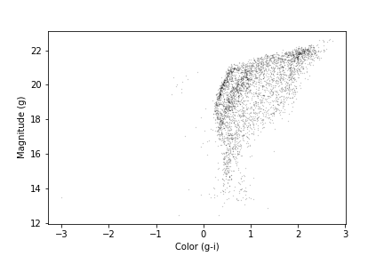
We have assigned the color and magnitude to variables x
and y, respectively.
We have done this out of convenience and to keep the code readable since
the table variables and column names are long and x
includes an operation between two columns.
We can zoom in on the region of interest by setting the range of x
and y values displayed with the xlim and ylim
functions. If we put the higher value first in the ylim
call, this will invert the y-axis, putting fainter magnitudes at the
bottom.
PYTHON
x = candidate_df['g_mean_psf_mag'] - candidate_df['i_mean_psf_mag']
y = candidate_df['g_mean_psf_mag']
plt.plot(x, y, 'ko', markersize=0.3, alpha=0.3)

plt.ylabel('Magnitude (g)')
plt.xlabel('Color (g-i)')

plt.xlim([0, 1.5])
plt.ylim([22, 14])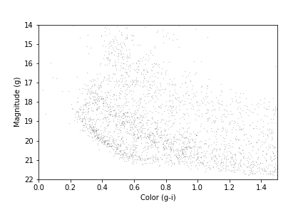
Our figure does not look exactly like the one in the paper because we are working with a smaller region of the sky, so we have fewer stars. But the main sequence of GD-1 appears as an overdense region in the lower left.
We want to be able to make this plot again, with any selection of
PanSTARRs photometry, so this is a natural time to put it into a
function that accepts as input an Astropy Table or pandas
DataFrame, as long as it has columns named
g_mean_psf_mag and i_mean_psf_mag. To do this
we will change our variable name from candidate_df to the
more generic dataframe.
PYTHON
def plot_cmd(dataframe):
    """Plot a color magnitude diagram.

    dataframe: DataFrame or Table with photometry data
    """
    y = dataframe['g_mean_psf_mag']
    x = dataframe['g_mean_psf_mag'] - dataframe['i_mean_psf_mag']

    plt.plot(x, y, 'ko', markersize=0.3, alpha=0.3)

    plt.xlim([0, 1.5])
    plt.ylim([22, 14])

    plt.ylabel('Magnitude (g)')
    plt.xlabel('Color (g-i)')
Here are the results:
OUTPUT
<Figure size 432x288 with 1 Axes>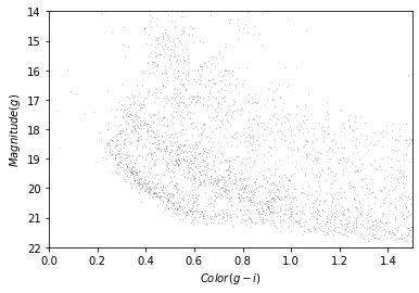
In the next section we will use an isochrone to specify a polygon that contains this overdense region.
Isochrone
Given our understanding of the age, metallicity, and distance to GD-1 we can overlay a theoretical isochrone for GD-1 from the MESA Isochrones and Stellar Tracks and better identify the main sequence of GD-1.
Calculating Isochrone
In fact, we can use MESA Isochrones & Stellar Tracks (MIST) to compute it for us. Using the MIST Version 1.2 web interface, we computed an isochrone with the following parameters:
- Rotation initial v/v_crit = 0.4
- Single age, linear scale = 12e9
- Composition [Fe/H] = -1.35
- Synthetic Photometry, PanStarrs
- Extinction av = 0
Making a polygon
The MIST isochrone files available on the website above can not be directly plotted over our data. We have selected the relevant part of the isochrone, the filters we are interested in, and scaled the photometry to the distance of GD-1 (details here). Now we can read in the results which you downloaded as part of the setup instructions:
OUTPUT
       mag_g  color_g_i
0  28.294743   2.195021
1  28.189718   2.166076
2  28.051761   2.129312
3  27.916194   2.093721
4  27.780024   2.058585
Here is what the isochrone looks like on the color-magnitude diagram.
OUTPUT
<Figure size 432x288 with 1 Axes>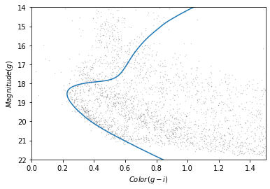
In the bottom half of the figure, the isochrone passes through the overdense region where the stars are likely to belong to GD-1.
Although some stars near the top half of the isochrone likely belong to GD-1, these represent stars that have evolved off the main sequence. The density of GD-1 stars in this region is therefore much less and the contamination with other stars much greater. So to get the purest sample of GD-1 stars we will select only stars on the main sequence.
So we will select the part of the isochrone that lies in the overdense region.
g_mask is a Boolean Series that is True
where g is between 18.0 and 21.5.
OUTPUT
117We can use it to select the corresponding rows in
iso_df:
OUTPUT
mag_g color_g_i
94 21.411746 0.692171
95 21.322466 0.670238
96 21.233380 0.648449
97 21.144427 0.626924
98 21.054549 0.605461Now, to select the stars in the overdense region, we have to define a polygon that includes stars near the isochrone.
PYTHON
g = iso_masked['mag_g']
left_color = iso_masked['color_g_i'] - 0.06
right_color = iso_masked['color_g_i'] + 0.12Here is our plot with these boundaries:
PYTHON
plot_cmd(candidate_df)
plt.plot(left_color, g, label='left color')
plt.plot(right_color, g, label='right color')
plt.legend();OUTPUT
<Figure size 432x288 with 1 Axes>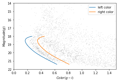
Which points are in the polygon?
Matplotlib provides a Polygon object that we can use to
check which points fall in the polygon we just constructed.
To make a Polygon, we need to assemble g,
left_color, and right_color into a loop, so
the points in left_color are connected to the points of
right_color in reverse order.
We will use a “slice index” to reverse the elements of
right_color. As explained in the NumPy
documentation, a slice index has three parts separated by
colons:
start: The index of the element where the slice starts.stop: The index of the element where the slice ends.step: The step size between elements.
reverse_right_color = right_color[::-1]{:.language-python}
In this example, start and stop are
omitted, which means all elements are selected.
And step is -1, which means the elements
are in reverse order.
To combine the left_color and right_color
arrays we will use the NumPy append function which takes
two arrays as input, and outputs them combined into a single array.
OUTPUT
(234,)We can repeat combine these two lines of code into a single line to
create a corresponding loop with the elements of g in
forward and reverse order.
OUTPUT
(234,)Here is the loop on our plot:
OUTPUT
<Figure size 432x288 with 1 Axes>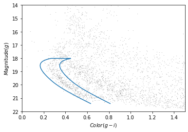
To make a Polygon, it will be useful to put
color_loop and mag_loop into a
DataFrame. This is convenient for two reasons - first,
Polygon is expecting an Nx2 array and the
DataFrame provides an easy way for us to pass that in that
is also descriptive for us. Secondly, for reproducibility of our work,
we may want to save the region we use to select stars, and the
DataFrame, as we have already seen, allows us to save into
a variety of formats.
PYTHON
loop_df = pd.DataFrame()
loop_df['color_loop'] = color_loop
loop_df['mag_loop'] = mag_loop
loop_df.head()OUTPUT
color_loop mag_loop
0 0.632171 21.411746
1 0.610238 21.322466
2 0.588449 21.233380
3 0.566924 21.144427
4 0.545461 21.054549Now we can pass loop_df to Polygon:
OUTPUT
<matplotlib.patches.Polygon at 0x7f439d33fdf0>The result is a Polygon object which has a
contains_points method. This allows us to pass
polygon.contains_points a list of points and for each point
it will tell us if the point is contained within the polygon. A point is
a tuple with two elements, x and y.
Exercise (5 minutes)
When we encounter a new object, it is good to create a toy example to
test that it does what we think it does. Define a list of two points
(represented as two tuples), one that should be inside the polygon and
one that should be outside the polygon. Call
contains_points on the polygon we just created, passing it
the list of points you defined, to verify that the results are as
expected.
We are almost ready to select stars whose photometry data falls in this polygon. But first we need to do some data cleaning.
Save the polygon
Reproducible research is “the idea that … the full computational environment used to produce the results in the paper such as the code, data, etc. can be used to reproduce the results and create new work based on the research.”
This lesson is an example of reproducible research because it contains all of the code needed to reproduce the results, including the database queries that download the data and the analysis.
In this episode, we used an isochrone to derive a polygon, which we used to select stars based on photometry. So it is important to record the polygon as part of the data analysis pipeline.
Here is how we can save it in an HDF5 file.
Selecting based on photometry
Now we will check how many of the candidate stars are inside the
polygon we chose. contains_points expects a list of (x,y)
pairs. As with creating the Polygon,
DataFrames are a convenient way to pass the colors and
magnitudes for all of our stars in candidates_df to our
Polygon to see which candidates are inside the polygon. We
will start by putting color and magnitude data from
candidate_df into a new DataFrame.
PYTHON
cmd_df = pd.DataFrame()
cmd_df['color'] = candidate_df['g_mean_psf_mag'] - candidate_df['i_mean_psf_mag']
cmd_df['mag'] = candidate_df['g_mean_psf_mag']
cmd_df.head()OUTPUT
color mag
0 0.3804 17.8978
1 1.6092 19.2873
2 0.4457 16.9238
3 1.5902 19.9242
4 1.4853 16.1516Which we can pass to contains_points:
OUTPUT
array([False, False, False, ..., False, False, False])The result is a Boolean array.
Exercise (5 minutes)
Boolean values are stored as 0s and 1s. FALSE = 0 and
TRUE = 1. Use this information to determine the number of
stars that fall inside the polygon.
Now we can use inside_mask as a mask to select stars
that fall inside the polygon.
We will make a color-magnitude plot one more time, highlighting the selected stars with green markers.
PYTHON
plot_cmd(candidate_df)
plt.plot(iso_df['color_g_i'], iso_df['mag_g'])
plt.plot(color_loop, mag_loop)
x = winner_df['g_mean_psf_mag'] - winner_df['i_mean_psf_mag']
y = winner_df['g_mean_psf_mag']
plt.plot(x, y, 'go', markersize=0.5, alpha=0.5);OUTPUT
<Figure size 432x288 with 1 Axes>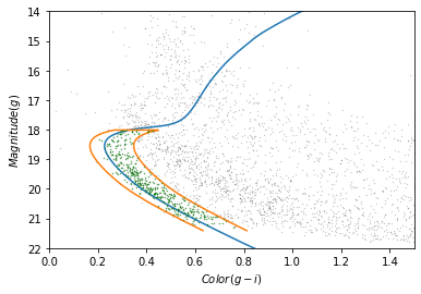
The selected stars are, in fact, inside the polygon, which means they have photometry data consistent with GD-1.
Finally, we can plot the coordinates of the selected stars:
PYTHON
fig = plt.figure(figsize=(10,2.5))
x = winner_df['phi1']
y = winner_df['phi2']
plt.plot(x, y, 'ko', markersize=0.7, alpha=0.9)
plt.xlabel(r'$\phi_1$ [deg]')
plt.ylabel(r'$\phi_2$ [deg]')
plt.title('Proper motion + photometry selection', fontsize='medium')
plt.axis('equal');OUTPUT
<Figure size 1000x250 with 1 Axes>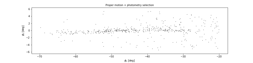
This example includes the new Matplotlib command figure,
which creates the larger canvas that the subplots are placed on. In
previous examples, we didn’t have to use this function; the figure was
created automatically. But when we call it explicitly, we can provide
arguments like figsize, which sets the size of the figure.
It also returns a figure object which we will use to further customize
our plotting in the next episode.
In the example above we also used TeX markup in our axis labels so
that they render as the Greek letter $\phi$ with subscripts
for 1 and 2. Matplotlib also allows us to
write basic TeX markup by wrapping the text we want rendered as TeX with
$ and then using TeX commands inside. This basic rendering
is performed with mathtext;
more advanced rendering with LaTex can be done with the
usetex option in rcParams which we will
discuss in Episode 7.
In the next episode we are going to make this plot several more
times, so it makes sense to make a function. As we have done with
previous functions we can copy and paste what we just wrote, replacing
the specific variable winner_df with the more generic
df.
PYTHON
def plot_cmd_selection(df):
x = df['phi1']
y = df['phi2']
plt.plot(x, y, 'ko', markersize=0.7, alpha=0.9)
plt.xlabel(r'$\phi_1$ [deg]')
plt.ylabel(r'$\phi_2$ [deg]')
plt.title('Proper motion + photometry selection', fontsize='medium')
plt.axis('equal')And here is how we use the function.
OUTPUT
<Figure size 1000x250 with 1 Axes>Write the data
Finally, we will write the selected stars to a file.
OUTPUT
15.486198425292969Summary
In this episode, we used photometry data from Pan-STARRS to draw a color-magnitude diagram. We used an isochrone to define a polygon and select stars we think are likely to be in GD-1. Plotting the results, we have a clearer picture of GD-1, similar to Figure 1 in the original paper.
- Matplotlib provides operations for working with points, polygons, and other geometric entities, so it is not just for making figures.
- Use Matplotlib options to control the size and aspect ratio of figures to make them easier to interpret.
- Record every element of the data analysis pipeline that would be needed to replicate the results.
Content from Visualization
Last updated on 2025-12-12 | Edit this page
Overview
Questions
- What elements make a compelling visualization that authentically reports scientific results ready for scientific presentation and publication?
- What tools and techniques are available to save time on creating presentation and publication-ready figures?
Objectives
- Design a figure that tells a compelling story.
- Use Matplotlib features to customize the appearance of figures.
- Generate a figure with multiple subplots.
In the previous episode, we selected photometry data from Pan-STARRS and used it to identify stars we think are likely to be in GD-1.
In this episode, we will take the results from previous episodes and use them to make a figure that tells a compelling scientific story.
Outline
Starting with the figure from the previous episode, we will add annotations to present the results more clearly.
Then we will learn several ways to customize figures to make them more appealing and effective.
Finally, we will learn how to make a figure with multiple panels.
Starting from this episode
If you are starting a new notebook for this episode, expand this section for information you will need to get started.
In the previous episode, we selected stars in GD-1 based on proper motion and downloaded the spatial, proper motion, and photometry information by joining the Gaia and PanSTARRs datasets. We will use that data for this episode. Whether you are working from a new notebook or coming back from a checkpoint, reloading the data will save you from having to run the query again.
If you are starting this episode here or starting this episode in a new notebook, you will need to run the following lines of code.
This imports previously imported functions:
PYTHON
import pandas as pd
import numpy as np
from matplotlib import pyplot as plt
from matplotlib.patches import Polygon
from episode_functions import *The following code loads in the data (instructions for downloading
data can be found in the setup instructions).
You may need to add a the path to the filename variable below
(e.g. filename = 'student_download/backup-data/gd1_data.hdf')
PYTHON
filename = 'gd1_data.hdf'
winner_df = pd.read_hdf(filename, 'winner_df')
centerline_df = pd.read_hdf(filename, 'centerline_df')
candidate_df = pd.read_hdf(filename, 'candidate_df')
loop_df = pd.read_hdf(filename, 'loop_df')This defines previously defined quantities:
Making Figures That Tell a Story
The figures we have made so far have been “quick and dirty”. Mostly
we have used Matplotlib’s default style, although we have adjusted a few
parameters, like markersize and alpha, to
improve legibility.
Now that the analysis is done, it is time to think more about:
Making professional-looking figures that are ready for publication.
Making figures that communicate a scientific result clearly and compellingly.
Not necessarily in that order.
We will start by reviewing Figure 1 from the original paper. We have seen the individual panels, but now we will look at the whole figure, along with the caption:
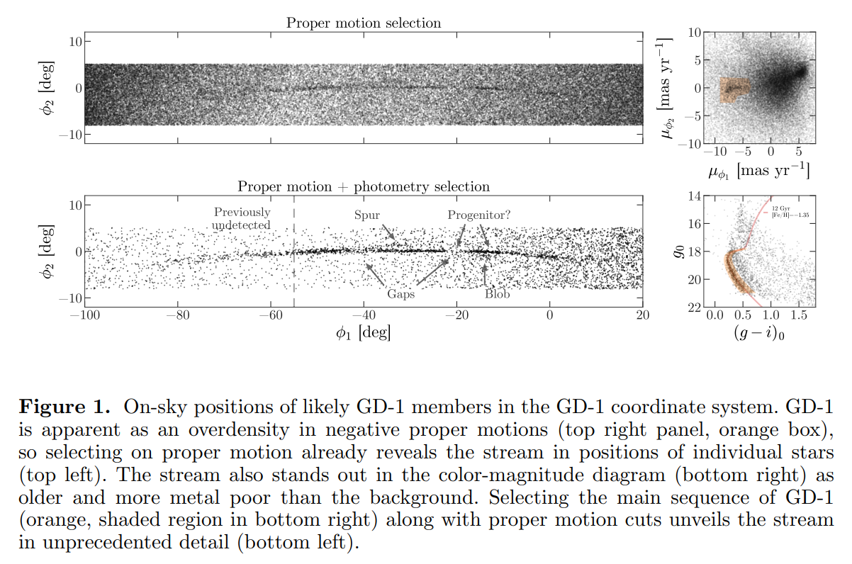
Exercise (10 minutes)
Think about the following questions:
What is the primary scientific result of this work?
What story is this figure telling?
In the design of this figure, can you identify 1 or 2 choices the authors made that you think are effective? Think about big-picture elements, like the number of panels and how they are arranged, as well as details like the choice of typeface.
Can you identify 1 or 2 elements that could be improved, or that you might have done differently?
No figure is perfect, and everyone can be a critic. Here are some topics that could come up in this discussion:
The primary result is that adding physical selection criteria makes it possible to separate likely candidates from the background more effectively than in previous work, which makes it possible to see the structure of GD-1 in “unprecedented detail,” allowing the authors to detect that the stream is larger than previously observed.
The figure documents the selection process as a sequence of reproducible steps, containing enough information for a skeptical reader to understand the authors’ choices. Reading right-to-left, top-to-bottom, we see selection based on proper motion, the results of the first selection, selection based on stellar surface properties (color and magnitude), and the results of the second selection. So this figure documents the methodology, presents the primary result, and serves as reference for other parts of the paper (and presumably, talk, if this figure is reused for colloquia).
The figure is mostly black and white, with minimal use of color, and mostly uses large fonts. It will likely work well in print and only needs a few adjustments to be accessible to low vision readers and none to accommodate those with poor color vision. The annotations in the bottom left panel guide the reader to the results discussed in the text.
The panels that can have the same units, dimensions, and their axes are aligned, do.
The on-sky positions likely do not need so much white space.
Axes ticks for the on-sky position figures are not necessary since this is not in an intuitive coordinate system or a finder chart. Instead, we would suggest size bar annotations for each dimension to give the reader the needed scale.
The text annotations could be darker for more contrast and appear only over white background to increase accessibility
The legend in the bottom right panel has a font too small for low-vision readers. At the very least, those details (and the isochrone line) could be called out in the caption.
Plotting GD-1 with Annotations
The lower left panel in the paper uses three other features to present the results more clearly and compellingly:
A vertical dashed line to distinguish the previously undetected region of GD-1,
A label that identifies the new region, and
Several annotations that combine text and arrows to identify features of GD-1.
Exercise (20 minutes)
Plot the selected stars in winner_df using the
plot_cmd_selection function and then choose any or all of
these features and add them to the figure:
To draw vertical lines, see
plt.vlinesandplt.axvline.To add text, see
plt.text.To add an annotation with text and an arrow, see
plt.annotate.
Here is some additional information about text and arrows.
PYTHON
fig = plt.figure(figsize=(10,2.5))
plot_cmd_selection(winner_df)
plt.axvline(-55, ls='--', color='gray',
alpha=0.4, dashes=(6,4), lw=2)
plt.text(-60, 5.5, 'Previously\nundetected',
fontsize='small', ha='right', va='top')
arrowprops=dict(color='gray', shrink=0.05, width=1.5,
headwidth=6, headlength=8, alpha=0.4)
plt.annotate('Spur', xy=(-33, 2), xytext=(-35, 5.5),
arrowprops=arrowprops,
fontsize='small')
plt.annotate('Gap', xy=(-22, -1), xytext=(-25, -5.5),
arrowprops=arrowprops,
fontsize='small');Customization
Matplotlib provides a default style that determines things like the colors of lines, the placement of labels and ticks on the axes, and many other properties.
There are several ways to override these defaults and customize your figures:
To customize only the current figure, you can call functions like
tick_params, which we will demonstrate below.To customize all figures in a notebook, you can use
rcParams.To override more than a few defaults at the same time, you can use a style sheet.
As a simple example, notice that Matplotlib puts ticks on the outside of the figures by default, and only on the left and bottom sides of the axes.
Note on Accessibility
Customization offers a high degree of personalization for creating scientific visualizations. It is important to also create accessible visualizations for a broad audience that may include low-vision or color-blind individuals. The AAS Journals provide a Graphics Guide for authors with tips and external links that can help you produce more accessible graphics: https://journals.aas.org/graphics-guide/
So far, everything we have wanted to do we could call directly from
the pyplot module with plt.. As you do more and more
customization you may need to run some methods on plotting objects
themselves. To use the method that changes the direction of the ticks we
need an axes object. So far, Matplotlib has implicitly
created our axes object when we called
plt.plot. To explicitly create an axes object
we can first create our figure object and then add an
axes object to it.
subplot and
axes
Confusingly, in Matplotlib the objects subplot and
axes are often used interchangeably. This is because a
subplot is an axes object with additional
methods and attributes.
You can use the add_subplot
method to add more than one axes object to a figure. For
this reason you have to specify the total number of columns, total
number of rows, and which plot number you are creating
(fig.add_subplot(ncols, nrows, pltnum)). The plot number
starts in the upper left corner and goes left to right and then top to
bottom. In the example above we have one column, one row, and we’re
plotting into the first plot space.
Now we are ready to change the direction of the ticks to the inside of the axes using our new axes object.
PYTHON
fig = plt.figure(figsize=(10,2.5))
ax = fig.add_subplot(1,1,1)
ax.tick_params(direction='in')Exercise (5 minutes)
Read the documentation of tick_params
and use it to put ticks on the top and right sides of the axes.
rcParams
If you want to make a customization that applies to all figures in a
notebook, you can use rcParams. When you import Matplotlib,
a dictionary is created with default values for everything you can
change about your plot. This is what you are overriding with
tick_params above.
Here is an example that reads the current font size from
rcParams:
OUTPUT
10.0And sets it to a new value:
Exercise (5 minutes)
Plot the previous figure again, and see what font sizes have changed.
Look up any other element of rcParams, change its value,
and check the effect on the figure.
PYTHON
fig = plt.figure(figsize=(10,2.5))
ax = fig.add_subplot(1,1,1)
ax.tick_params(top=True, right=True)
# Looking up the 'axes.edgecolor' rcParams value
print(plt.rcParams['axes.edgecolor'])
plt.rcParams['axes.edgecolor'] = 'red'
fig = plt.figure(figsize=(10,2.5))
ax = fig.add_subplot(1,1,1)
ax.tick_params(top=True, right=True)
# changing the rcParams value back to its original value
plt.rcParams['axes.edgecolor'] = 'black'When you import Matplotlib, plt.rcParams is populated
from a matplotlibrc file. If you want to permanently change a setting
for every plot you make, you can set that in your matplotlibrc file. To
find out where your matplotlibrc file lives type:
If the file doesn’t exist, you can download a sample matplotlibrc file to modify.
Style sheets
It is possible that you would like multiple sets of defaults, for
example, one default for plots for scientific papers and another for
talks or posters. Because the matplotlibrc file is read
when you import Matplotlib, it is not easy to switch from one set of
options to another.
The solution to this problem is style sheets, which you can read about here.
Matplotlib provides a set of predefined style sheets, or you can make your own. The style sheets reference shows a gallery of plots generated by common style sheets.
You can display a list of style sheets installed on your system.
OUTPUT
['Solarize_Light2',
'_classic_test_patch',
'bmh',
'classic',
'dark_background',
'fast',
'fivethirtyeight',
'ggplot',
'grayscale',
'seaborn',
'seaborn-bright',
[Output truncated]Note that seaborn-paper, seaborn-talk and
seaborn-poster are particularly intended to prepare
versions of a figure with text sizes and other features that work well
in papers, talks, and posters.
To use any of these style sheets, run plt.style.use like
this:
The style sheet you choose will affect the appearance of all figures
you plot after calling use, unless you override any of the
options or call use again.
Exercise (5 minutes)
Choose one of the styles on the list and select it by calling
use. Then go back and plot one of the previous figures to
see what changes in the figure’s appearance.
If you cannot find a style sheet that is exactly what you want, you
can make your own. This repository includes a style sheet called
az-paper-twocol.mplstyle, with customizations chosen by
Azalee Bostroem for publication in astronomy journals.
You can use it like this:
PYTHON
plt.style.use('./az-paper-twocol.mplstyle')
plot_cmd(candidate_df)
plt.plot(loop_df['color_loop'], loop_df['mag_loop'], g, label='GD1 Isochrone loop')
plt.legend();The prefix ./ tells Matplotlib to look for the file in
the current directory.
As an alternative, you can install a style sheet for your own use by
putting it into a directory named stylelib/ in your
configuration directory.
To find out where the Matplotlib configuration directory is, you can run
the following command:
Multiple panels
So far we have been working with one figure at a time, but the figure
we are replicating contains multiple panels. We will create each of
these panels as a different subplot. Matplotlib has multiple functions
for making figures with multiple panels. We have already used add_subplot
- however, this creates equal sized panels. For this reason, we will use
subplot2grid
which allows us to control the relative sizes of the panels.
Since we have already written functions that generate each panel of this figure, we can now create the full multi-panel figure by creating each subplot and then run our plotting function.
Like add_subplot,
subplot2grid
requires us to specify the total number of columns and rows in the grid
(this time as a tuple called shape), and the location of
the subplot (loc) - a tuple identifying the location in the
grid we are about to fill.
In this example, shape is (2, 2) to create
two rows and two columns.
For the first panel, loc is (0, 0), which
indicates row 0 and column 0, which is the upper-left panel.
Here is how we use this function to draw the four panels.
PYTHON
plt.style.use('default')
fig = plt.figure()
shape = (2, 2)
ax1 = plt.subplot2grid(shape, (0, 0))
plot_pm_selection(candidate_df)
ax2 = plt.subplot2grid(shape, (0, 1))
plot_proper_motion(centerline_df)
ax3 = plt.subplot2grid(shape, (1, 0))
plot_cmd_selection(winner_df)
ax4 = plt.subplot2grid(shape, (1, 1))
plot_cmd(candidate_df)
plt.tight_layout()OUTPUT
<Figure size 640x480 with 4 Axes>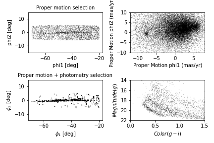
We use plt.tight_layout
at the end, which adjusts the sizes of the panels to make sure the
titles and axis labels don’t overlap. Notice how convenient it is that
we have written functions to plot each panel. This code is concise and
readable: we can tell what is being plotted in each panel thanks to our
explicit function names and we know what function to investigate if we
want to see the mechanics of exactly how the plotting is done.
Exercise (5 minutes)
What happens if you leave out tight_layout?
Without tight_layout the space between the panels is too
small. In this situation, the titles from the lower plots overlap with
the x-axis labels from the upper panels and the axis labels from the
right-hand panels overlap with the plots in the left-hand panels.
Adjusting proportions
In the previous figure, the panels are all the same size. To get a better view of GD-1, we would like to stretch the panels on the left and compress the ones on the right.
To do that, we will use the colspan argument to make a
panel that spans multiple columns in the grid. To do this we will need
more columns so we will change the shape from (2,2) to
(2,4).
The panels on the left span three columns, so they are three times wider than the panels on the right.
At the same time, we use figsize to adjust the aspect
ratio of the whole figure.
PYTHON
plt.figure(figsize=(9, 4.5))
shape = (2, 4)
ax1 = plt.subplot2grid(shape, (0, 0), colspan=3)
plot_pm_selection(candidate_df)
ax2 = plt.subplot2grid(shape, (0, 3))
plot_proper_motion(centerline_df)
ax3 = plt.subplot2grid(shape, (1, 0), colspan=3)
plot_cmd_selection(winner_df)
ax4 = plt.subplot2grid(shape, (1, 3))
plot_cmd(candidate_df)
plt.tight_layout()OUTPUT
<Figure size 900x450 with 4 Axes>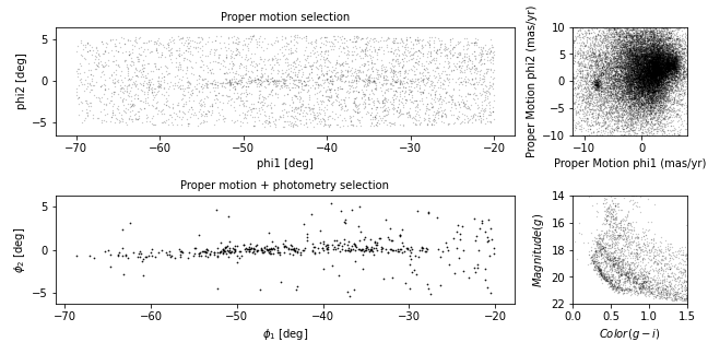
This is looking more and more like the figure in the paper.
Exercise (5 minutes)
In this example, the ratio of the widths of the panels is 3:1. How would you adjust it if you wanted the ratio to be 3:2?
PYTHON
plt.figure(figsize=(9, 4.5))
shape = (2, 5) # CHANGED
ax1 = plt.subplot2grid(shape, (0, 0), colspan=3)
plot_pm_selection(candidate_df)
ax2 = plt.subplot2grid(shape, (0, 3), colspan=2) # CHANGED
plot_proper_motion(centerline_df)
ax3 = plt.subplot2grid(shape, (1, 0), colspan=3)
plot_cmd_selection(winner_df)
ax4 = plt.subplot2grid(shape, (1, 3), colspan=2) # CHANGED
plot_cmd(candidate_df)
plt.tight_layout()Adding the shaded regions
The one thing our figure is missing is the shaded regions showing the stars selected by proper motion and around the isochrone in the color magnitude diagram.
In episode 4 we defined a rectangle in proper motion space around the
stars in GD-1. We stored the x-values of the vertices of this rectangle
in pm1_rect and the y-values as pm2_rect.
To plot this rectangle, we will use the Matplotlib
Polygon object which we used in episode 7 to check which
points were inside the polygon. However, this time we will be plotting
the Polygon.
To create a Polygon, we have to put the coordinates of
the rectangle in an array with x values in the first column
and y values in the second column.
OUTPUT
array([[-8.9, -2.2],
[-8.9, 1. ],
[-6.9, 1. ],
[-6.9, -2.2]])We will now create the Polygon, specifying its display
properties which will be used when it is plotted. We will specify
closed=True to make sure the shape is closed,
facecolor='orange to color the inside of the
Polygon orange, and alpha=0.4 to make the
Polygon semi-transparent.
Then to plot the Polygon we call the
add_patch method. add_patch like
tick_params must be called on an axes or
subplot object, so we will create a subplot
and then add the Patch to the subplot.
PYTHON
fig = plt.figure()
ax = fig.add_subplot(1,1,1)
poly = Polygon(vertices, closed=True,
facecolor='orange', alpha=0.4)
ax.add_patch(poly)
ax.set_xlim(-10, 7.5)
ax.set_ylim(-10, 10)OUTPUT
<Figure size 900x450 with 4 Axes>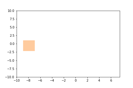
We can now call our plot_proper_motion function to plot the proper
motion for each star, and then add a shaded Polygon to show
the region we selected.
PYTHON
fig = plt.figure()
ax = fig.add_subplot(1,1,1)
plot_proper_motion(centerline_df)
poly = Polygon(vertices, closed=True,
facecolor='C1', alpha=0.4)
ax.add_patch(poly)OUTPUT
<Figure size 900x450 with 4 Axes>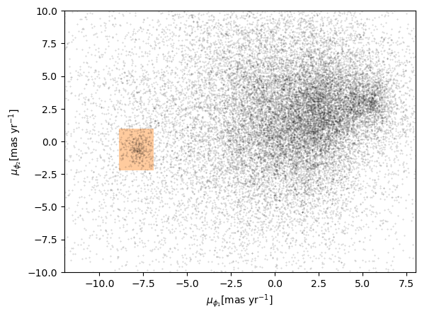
Exercise (5 minutes)
Add a few lines to be run after the plot_cmd function to
show the polygon we selected as a shaded area.
Hint: pass loop_df as an argument to
Polygon as we did in episode 7 and then plot it using
add_patch.
Exercise (5 minutes)
Add the Polygon patches you just created to the right
panels of the four panel figure.
PYTHON
fig = plt.figure(figsize=(9, 4.5))
shape = (2, 4)
ax1 = plt.subplot2grid(shape, (0, 0), colspan=3)
plot_pm_selection(candidate_df)
ax2 = plt.subplot2grid(shape, (0, 3))
plot_proper_motion(centerline_df)
poly = Polygon(vertices, closed=True,
facecolor='orange', alpha=0.4)
ax2.add_patch(poly)
ax3 = plt.subplot2grid(shape, (1, 0), colspan=3)
plot_cmd_selection(winner_df)
ax4 = plt.subplot2grid(shape, (1, 3))
plot_cmd(candidate_df)
poly_cmd = Polygon(loop_df, closed=True,
facecolor='orange', alpha=0.4)
ax4.add_patch(poly_cmd)
plt.tight_layout()OUTPUT
<Figure size 900x450 with 4 Axes>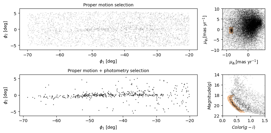
Summary
In this episode, we reverse-engineered the figure we have been replicating, identifying elements that seem effective and others that could be improved.
We explored features Matplotlib provides for adding annotations to figures – including text, lines, arrows, and polygons – and several ways to customize the appearance of figures. And we learned how to create figures that contain multiple panels.
- Effective figures focus on telling a single story clearly and authentically. The major decisions needed in creating an effective summary figure like this one can be done away from a computer and built up from low fidelity (hand drawn) to high (tweaking rcParams, etc.).
- Consider using annotations to guide the reader’s attention to the most important elements of a figure, while keeping in mind accessibility issues that such detail may introduce.
- The default Matplotlib style generates good quality figures, but there are several ways you can override the defaults.
- If you find yourself making the same customizations on several projects, you might want to create your own style sheet.