Photometry
Last updated on 2026-06-19 | Edit this page
Overview
Questions
- How do we use Matplotlib to define a polygon and select points that fall inside it?
Objectives
- Use isochrone data to specify a polygon and determine which points fall inside it.
- Use Matplotlib features to customize the appearance of figures.
In the previous episode we downloaded photometry data from Pan-STARRS, which is available from the same server we have been using to get Gaia data.
The next step in the analysis is to select candidate stars based on the photometry data. The following figure from the paper is a color-magnitude diagram showing the stars we previously selected based on proper motion:
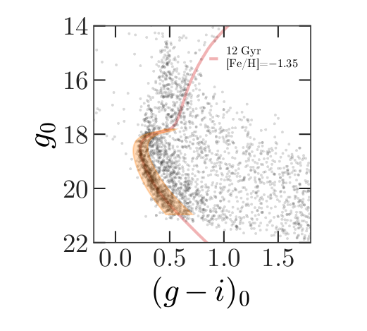
In red is a theoretical isochrone, showing where we expect the stars in GD-1 to fall based on the metallicity and age of their original globular cluster.
By selecting stars in the shaded area, we can further distinguish the main sequence of GD-1 from mostly younger background stars.
Outline
We will reload the data from the previous episode and make a color-magnitude diagram.
We will use an isochrone computed by MIST to specify a polygonal region in the color-magnitude diagram and select the stars inside of it.
Starting from this episode
If you are starting a new notebook for this episode, expand this section for information you will need to get started.
In the previous episode, we selected stars in GD-1 based on proper motion and downloaded the spatial, proper motion, and photometry information by joining the Gaia and PanSTARRs datasets. We will use that data for this episode. Whether you are working from a new notebook or coming back from a checkpoint, reloading the data will save you from having to run the query again.
If you are starting this episode here or starting this episode in a new notebook, you will need run the following lines of code.
This imports previously imported functions:
PYTHON
from os.path import getsize

import pandas as pd

from matplotlib import pyplot as plt

from episode_functions import *
The following code loads in the data (instructions for downloading
data can be found in the setup instructions).
You may need to add a the path to the filename variable below
(e.g. filename = 'student_download/backup-data/gd1_data.hdf')
Plotting photometry data
Now that we have photometry data from Pan-STARRS, we can produce a color-magnitude diagram to replicate the diagram from the original paper:
The y-axis shows the apparent magnitude of each source with the g filter.
The x-axis shows the difference in apparent magnitude between the g and i filters, which indicates color.
A slight detour for non-domain experts
If you are wondering (as a non-domain expert) how to interpret this color-magnitude diagram, please expand the section below.
As a pathologist can easily point to tumor on a biopsy slide, so too can astronomers who study stellar populations see two stellar main groups of stars in this color magnitude diagram, one from an old star cluster (presumably, GD-1), and the other, stars much closer, but at every distance between the Earth and the cluster (“foreground”). The color magnitude diagram is a technique developed to separate these features out just as pathologists have techniques to contrast human tissue. The color of a star is primarily related to the star’s surface temperature, with bluer stars indicating higher temperatures and redder stars indicating lower temperatures. This logic is not too far off from the color at the bottom of a match flame compared to the top.
Foreground Stars: To know the temperature of a star, you first need to know its distance and to account for the dust between us and the star. You can guess the effect of distance. A star farther away will be fainter (lower y-axis value) than the same star closer (think of car headlights as they approach). Dust will remove light from the star’s path to our telescopes, which makes the star seem like it has less energy than it otherwise would have, which makes it do two things on this diagram: 1) look fainter (lower on the y-axis; larger magnitude value) and 2) look cooler (higher x-axis value). The stars spread throughout the diagram are all stars bright enough to be detected in our Milky Way between GD-1 and us but made fainter and redder (spread to the lower-right) by their spread in distance from us and the amount dust in the line of sight.
GD-1: The pile up of stars in the lower-left quadrant of this diagram are interesting because it suggests something is at the same distance with the same amount of dust in the way. When we use our knowledge of theoretical astrophysics (independently calculated outside this work) to estimate how bright a population of old stars would be if it were at the distance of GD-1, we get that solid red line. The exact values of age and metallicity ([Fe/H] value) is a variable needed to reproduce the theoretical isochrone, but frankly, the choice could vary a lot and still would fit the data well.
More on color-magnitude diagrams and their theoretical counterpart, here.
With the photometry we downloaded from the PanSTARRS table into
candidate_df we can now recreate this plot.
PYTHON
x = candidate_df['g_mean_psf_mag'] - candidate_df['i_mean_psf_mag']
y = candidate_df['g_mean_psf_mag']
plt.plot(x, y, 'ko', markersize=0.3, alpha=0.3)

plt.ylabel('Magnitude (g)')
plt.xlabel('Color (g-i)')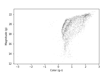
We have assigned the color and magnitude to variables x
and y, respectively.
We have done this out of convenience and to keep the code readable since
the table variables and column names are long and x
includes an operation between two columns.
We can zoom in on the region of interest by setting the range of x
and y values displayed with the xlim and ylim
functions. If we put the higher value first in the ylim
call, this will invert the y-axis, putting fainter magnitudes at the
bottom.
PYTHON
x = candidate_df['g_mean_psf_mag'] - candidate_df['i_mean_psf_mag']
y = candidate_df['g_mean_psf_mag']
plt.plot(x, y, 'ko', markersize=0.3, alpha=0.3)

plt.ylabel('Magnitude (g)')
plt.xlabel('Color (g-i)')

plt.xlim([0, 1.5])
plt.ylim([22, 14])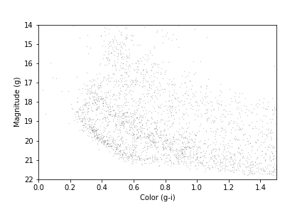
Our figure does not look exactly like the one in the paper because we are working with a smaller region of the sky, so we have fewer stars. But the main sequence of GD-1 appears as an overdense region in the lower left.
We want to be able to make this plot again, with any selection of
PanSTARRs photometry, so this is a natural time to put it into a
function that accepts as input an Astropy Table or pandas
DataFrame, as long as it has columns named
g_mean_psf_mag and i_mean_psf_mag. To do this
we will change our variable name from candidate_df to the
more generic dataframe.
PYTHON
def plot_cmd(dataframe):
    """Plot a color magnitude diagram.

    dataframe: DataFrame or Table with photometry data
    """
    y = dataframe['g_mean_psf_mag']
    x = dataframe['g_mean_psf_mag'] - dataframe['i_mean_psf_mag']

    plt.plot(x, y, 'ko', markersize=0.3, alpha=0.3)

    plt.xlim([0, 1.5])
    plt.ylim([22, 14])

    plt.ylabel('Magnitude (g)')
    plt.xlabel('Color (g-i)')
Here are the results:
OUTPUT
<Figure size 432x288 with 1 Axes>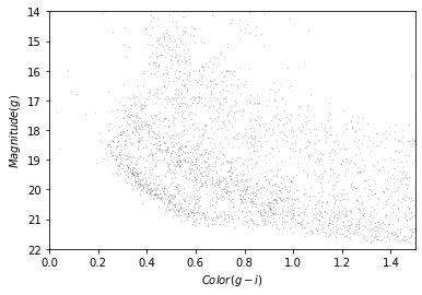
In the next section we will use an isochrone to specify a polygon that contains this overdense region.
Isochrone
Given our understanding of the age, metallicity, and distance to GD-1 we can overlay a theoretical isochrone for GD-1 from the MESA Isochrones and Stellar Tracks and better identify the main sequence of GD-1.
Calculating Isochrone
In fact, we can use MESA Isochrones & Stellar Tracks (MIST) to compute it for us. Using the MIST Version 1.2 web interface, we computed an isochrone with the following parameters:
- Rotation initial v/v_crit = 0.4
- Single age, linear scale = 12e9
- Composition [Fe/H] = -1.35
- Synthetic Photometry, PanStarrs
- Extinction av = 0
Making a polygon
The MIST isochrone files available on the website above can not be directly plotted over our data. We have selected the relevant part of the isochrone, the filters we are interested in, and scaled the photometry to the distance of GD-1 (details here). Now we can read in the results which you downloaded as part of the setup instructions:
OUTPUT
       mag_g  color_g_i
0  28.294743   2.195021
1  28.189718   2.166076
2  28.051761   2.129312
3  27.916194   2.093721
4  27.780024   2.058585
Here is what the isochrone looks like on the color-magnitude diagram.
OUTPUT
<Figure size 432x288 with 1 Axes>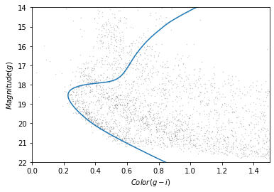
In the bottom half of the figure, the isochrone passes through the overdense region where the stars are likely to belong to GD-1.
Although some stars near the top half of the isochrone likely belong to GD-1, these represent stars that have evolved off the main sequence. The density of GD-1 stars in this region is therefore much less and the contamination with other stars much greater. So to get the purest sample of GD-1 stars we will select only stars on the main sequence.
So we will select the part of the isochrone that lies in the overdense region.
g_mask is a Boolean Series that is True
where g is between 18.0 and 21.5.
OUTPUT
117We can use it to select the corresponding rows in
iso_df:
OUTPUT
        mag_g  color_g_i
94  21.411746   0.692171
95  21.322466   0.670238
96  21.233380   0.648449
97  21.144427   0.626924
98  21.054549   0.605461
Now, to select the stars in the overdense region, we have to define a polygon that includes stars near the isochrone.
PYTHON
g = iso_masked['mag_g']
left_color = iso_masked['color_g_i'] - 0.06
right_color = iso_masked['color_g_i'] + 0.12
Here is our plot with these boundaries:
PYTHON
plot_cmd(candidate_df)

plt.plot(left_color, g, label='left color')
plt.plot(right_color, g, label='right color')

plt.legend();
OUTPUT
<Figure size 432x288 with 1 Axes>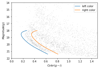
Which points are in the polygon?
Matplotlib provides a Polygon object that we can use to
check which points fall in the polygon we just constructed.
To make a Polygon, we need to assemble g,
left_color, and right_color into a loop, so
the points in left_color are connected to the points of
right_color in reverse order.
We will use a “slice index” to reverse the elements of
right_color. As explained in the NumPy
documentation, a slice index has three parts separated by
colons:
start: The index of the element where the slice starts.stop: The index of the element where the slice ends.step: The step size between elements.
reverse_right_color = right_color[::-1]{:.language-python}
In this example, start and stop are
omitted, which means all elements are selected.
And step is -1, which means the elements
are in reverse order.
To combine the left_color and right_color
arrays we will use the NumPy append function which takes
two arrays as input, and outputs them combined into a single array.
OUTPUT
(234,)We can repeat combine these two lines of code into a single line to
create a corresponding loop with the elements of g in
forward and reverse order.
OUTPUT
(234,)Here is the loop on our plot:
OUTPUT
<Figure size 432x288 with 1 Axes>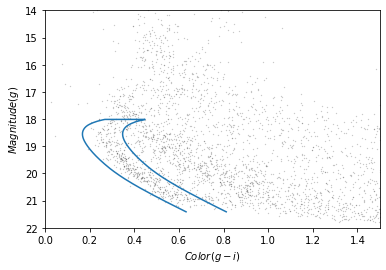
To make a Polygon, it will be useful to put
color_loop and mag_loop into a
DataFrame. This is convenient for two reasons - first,
Polygon is expecting an Nx2 array and the
DataFrame provides an easy way for us to pass that in that
is also descriptive for us. Secondly, for reproducibility of our work,
we may want to save the region we use to select stars, and the
DataFrame, as we have already seen, allows us to save into
a variety of formats.
PYTHON
loop_df = pd.DataFrame()
loop_df['color_loop'] = color_loop
loop_df['mag_loop'] = mag_loop
loop_df.head()
OUTPUT
   color_loop   mag_loop
0    0.632171  21.411746
1    0.610238  21.322466
2    0.588449  21.233380
3    0.566924  21.144427
4    0.545461  21.054549
Now we can pass loop_df to Polygon:
OUTPUT
<matplotlib.patches.Polygon at 0x7f439d33fdf0>The result is a Polygon object which has a
contains_points method. This allows us to pass
polygon.contains_points a list of points and for each point
it will tell us if the point is contained within the polygon. A point is
a tuple with two elements, x and y.
Exercise (5 minutes)
When we encounter a new object, it is good to create a toy example to
test that it does what we think it does. Define a list of two points
(represented as two tuples), one that should be inside the polygon and
one that should be outside the polygon. Call
contains_points on the polygon we just created, passing it
the list of points you defined, to verify that the results are as
expected.
We are almost ready to select stars whose photometry data falls in this polygon. But first we need to do some data cleaning.
Save the polygon
Reproducible research is “the idea that … the full computational environment used to produce the results in the paper such as the code, data, etc. can be used to reproduce the results and create new work based on the research.”
This lesson is an example of reproducible research because it contains all of the code needed to reproduce the results, including the database queries that download the data and the analysis.
In this episode, we used an isochrone to derive a polygon, which we used to select stars based on photometry. So it is important to record the polygon as part of the data analysis pipeline.
Here is how we can save it in an HDF5 file.
Selecting based on photometry
Now we will check how many of the candidate stars are inside the
polygon we chose. contains_points expects a list of (x,y)
pairs. As with creating the Polygon,
DataFrames are a convenient way to pass the colors and
magnitudes for all of our stars in candidates_df to our
Polygon to see which candidates are inside the polygon. We
will start by putting color and magnitude data from
candidate_df into a new DataFrame.
PYTHON
cmd_df = pd.DataFrame()

cmd_df['color'] = candidate_df['g_mean_psf_mag'] - candidate_df['i_mean_psf_mag']
cmd_df['mag'] = candidate_df['g_mean_psf_mag']

cmd_df.head()
OUTPUT
    color      mag
0  0.3804  17.8978
1  1.6092  19.2873
2  0.4457  16.9238
3  1.5902  19.9242
4  1.4853  16.1516
Which we can pass to contains_points:
OUTPUT
array([False, False, False, ..., False, False, False])The result is a Boolean array.
Exercise (5 minutes)
Boolean values are stored as 0s and 1s. FALSE = 0 and
TRUE = 1. Use this information to determine the number of
stars that fall inside the polygon.
Now we can use inside_mask as a mask to select stars
that fall inside the polygon.
We will make a color-magnitude plot one more time, highlighting the selected stars with green markers.
PYTHON
plot_cmd(candidate_df)
plt.plot(iso_df['color_g_i'], iso_df['mag_g'])
plt.plot(color_loop, mag_loop)

x = winner_df['g_mean_psf_mag'] - winner_df['i_mean_psf_mag']
y = winner_df['g_mean_psf_mag']
plt.plot(x, y, 'go', markersize=0.5, alpha=0.5);
OUTPUT
<Figure size 432x288 with 1 Axes>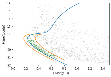
The selected stars are, in fact, inside the polygon, which means they have photometry data consistent with GD-1.
Finally, we can plot the coordinates of the selected stars:
PYTHON
fig = plt.figure(figsize=(10,2.5))

x = winner_df['phi1']
y = winner_df['phi2']
plt.plot(x, y, 'ko', markersize=0.7, alpha=0.9)

plt.xlabel(r'$\phi_1$ [deg]')
plt.ylabel(r'$\phi_2$ [deg]')
plt.title('Proper motion + photometry selection', fontsize='medium')

plt.axis('equal');
OUTPUT
<Figure size 1000x250 with 1 Axes>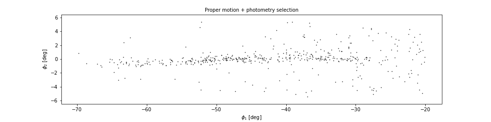
This example includes the new Matplotlib command figure,
which creates the larger canvas that the subplots are placed on. In
previous examples, we didn’t have to use this function; the figure was
created automatically. But when we call it explicitly, we can provide
arguments like figsize, which sets the size of the figure.
It also returns a figure object which we will use to further customize
our plotting in the next episode.
In the example above we also used TeX markup in our axis labels so
that they render as the Greek letter $\phi$ with subscripts
for 1 and 2. Matplotlib also allows us to
write basic TeX markup by wrapping the text we want rendered as TeX with
$ and then using TeX commands inside. This basic rendering
is performed with mathtext;
more advanced rendering with LaTex can be done with the
usetex option in rcParams which we will
discuss in Episode 7.
In the next episode we are going to make this plot several more
times, so it makes sense to make a function. As we have done with
previous functions we can copy and paste what we just wrote, replacing
the specific variable winner_df with the more generic
df.
PYTHON
def plot_cmd_selection(df):
    x = df['phi1']
    y = df['phi2']

    plt.plot(x, y, 'ko', markersize=0.7, alpha=0.9)

    plt.xlabel(r'$\phi_1$ [deg]')
    plt.ylabel(r'$\phi_2$ [deg]')
    plt.title('Proper motion + photometry selection', fontsize='medium')

    plt.axis('equal')
And here is how we use the function.
OUTPUT
<Figure size 1000x250 with 1 Axes>Write the data
Finally, we will write the selected stars to a file.
OUTPUT
15.486198425292969Summary
In this episode, we used photometry data from Pan-STARRS to draw a color-magnitude diagram. We used an isochrone to define a polygon and select stars we think are likely to be in GD-1. Plotting the results, we have a clearer picture of GD-1, similar to Figure 1 in the original paper.
- Matplotlib provides operations for working with points, polygons, and other geometric entities, so it is not just for making figures.
- Use Matplotlib options to control the size and aspect ratio of figures to make them easier to interpret.
- Record every element of the data analysis pipeline that would be needed to replicate the results.