Visualization
Last updated on 2025-12-12 | Edit this page
Overview
Questions
- What elements make a compelling visualization that authentically reports scientific results ready for scientific presentation and publication?
- What tools and techniques are available to save time on creating presentation and publication-ready figures?
Objectives
- Design a figure that tells a compelling story.
- Use Matplotlib features to customize the appearance of figures.
- Generate a figure with multiple subplots.
In the previous episode, we selected photometry data from Pan-STARRS and used it to identify stars we think are likely to be in GD-1.
In this episode, we will take the results from previous episodes and use them to make a figure that tells a compelling scientific story.
Outline
Starting with the figure from the previous episode, we will add annotations to present the results more clearly.
Then we will learn several ways to customize figures to make them more appealing and effective.
Finally, we will learn how to make a figure with multiple panels.
Starting from this episode
If you are starting a new notebook for this episode, expand this section for information you will need to get started.
In the previous episode, we selected stars in GD-1 based on proper motion and downloaded the spatial, proper motion, and photometry information by joining the Gaia and PanSTARRs datasets. We will use that data for this episode. Whether you are working from a new notebook or coming back from a checkpoint, reloading the data will save you from having to run the query again.
If you are starting this episode here or starting this episode in a new notebook, you will need to run the following lines of code.
This imports previously imported functions:
PYTHON
import pandas as pd
import numpy as np
from matplotlib import pyplot as plt
from matplotlib.patches import Polygon

from episode_functions import *
The following code loads in the data (instructions for downloading
data can be found in the setup instructions).
You may need to add a the path to the filename variable below
(e.g. filename = 'student_download/backup-data/gd1_data.hdf')
PYTHON
filename = 'gd1_data.hdf'
winner_df = pd.read_hdf(filename, 'winner_df')

centerline_df = pd.read_hdf(filename, 'centerline_df')
candidate_df = pd.read_hdf(filename, 'candidate_df')
loop_df = pd.read_hdf(filename, 'loop_df')
This defines previously defined quantities:
Making Figures That Tell a Story
The figures we have made so far have been “quick and dirty”. Mostly
we have used Matplotlib’s default style, although we have adjusted a few
parameters, like markersize and alpha, to
improve legibility.
Now that the analysis is done, it is time to think more about:
Making professional-looking figures that are ready for publication.
Making figures that communicate a scientific result clearly and compellingly.
Not necessarily in that order.
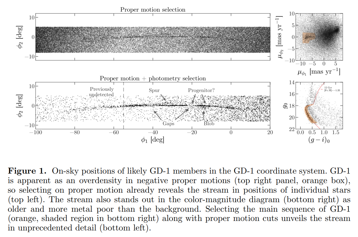
We will start by reviewing Figure 1 from the original paper. We have seen the individual panels, but now we will look at the whole figure, along with the caption:
Exercise (10 minutes)
Think about the following questions:
What is the primary scientific result of this work?
What story is this figure telling?
In the design of this figure, can you identify 1 or 2 choices the authors made that you think are effective? Think about big-picture elements, like the number of panels and how they are arranged, as well as details like the choice of typeface.
Can you identify 1 or 2 elements that could be improved, or that you might have done differently?
No figure is perfect, and everyone can be a critic. Here are some topics that could come up in this discussion:
The primary result is that adding physical selection criteria makes it possible to separate likely candidates from the background more effectively than in previous work, which makes it possible to see the structure of GD-1 in “unprecedented detail,” allowing the authors to detect that the stream is larger than previously observed.
The figure documents the selection process as a sequence of reproducible steps, containing enough information for a skeptical reader to understand the authors’ choices. Reading right-to-left, top-to-bottom, we see selection based on proper motion, the results of the first selection, selection based on stellar surface properties (color and magnitude), and the results of the second selection. So this figure documents the methodology, presents the primary result, and serves as reference for other parts of the paper (and presumably, talk, if this figure is reused for colloquia).
The figure is mostly black and white, with minimal use of color, and mostly uses large fonts. It will likely work well in print and only needs a few adjustments to be accessible to low vision readers and none to accommodate those with poor color vision. The annotations in the bottom left panel guide the reader to the results discussed in the text.
The panels that can have the same units, dimensions, and their axes are aligned, do.
The on-sky positions likely do not need so much white space.
Axes ticks for the on-sky position figures are not necessary since this is not in an intuitive coordinate system or a finder chart. Instead, we would suggest size bar annotations for each dimension to give the reader the needed scale.
The text annotations could be darker for more contrast and appear only over white background to increase accessibility
The legend in the bottom right panel has a font too small for low-vision readers. At the very least, those details (and the isochrone line) could be called out in the caption.
Plotting GD-1 with Annotations
The lower left panel in the paper uses three other features to present the results more clearly and compellingly:
A vertical dashed line to distinguish the previously undetected region of GD-1,
A label that identifies the new region, and
Several annotations that combine text and arrows to identify features of GD-1.
Exercise (20 minutes)
Plot the selected stars in winner_df using the
plot_cmd_selection function and then choose any or all of
these features and add them to the figure:
To draw vertical lines, see
plt.vlinesandplt.axvline.To add text, see
plt.text.To add an annotation with text and an arrow, see
plt.annotate.
Here is some additional information about text and arrows.
PYTHON
fig = plt.figure(figsize=(10,2.5))
plot_cmd_selection(winner_df)
plt.axvline(-55, ls='--', color='gray',
            alpha=0.4, dashes=(6,4), lw=2)
plt.text(-60, 5.5, 'Previously\nundetected',
         fontsize='small', ha='right', va='top')

arrowprops=dict(color='gray', shrink=0.05, width=1.5,
                headwidth=6, headlength=8, alpha=0.4)

plt.annotate('Spur', xy=(-33, 2), xytext=(-35, 5.5),
             arrowprops=arrowprops,
             fontsize='small')

plt.annotate('Gap', xy=(-22, -1), xytext=(-25, -5.5),
             arrowprops=arrowprops,
             fontsize='small');
Customization
Matplotlib provides a default style that determines things like the colors of lines, the placement of labels and ticks on the axes, and many other properties.
There are several ways to override these defaults and customize your figures:
To customize only the current figure, you can call functions like
tick_params, which we will demonstrate below.To customize all figures in a notebook, you can use
rcParams.To override more than a few defaults at the same time, you can use a style sheet.
As a simple example, notice that Matplotlib puts ticks on the outside of the figures by default, and only on the left and bottom sides of the axes.
Note on Accessibility
Customization offers a high degree of personalization for creating scientific visualizations. It is important to also create accessible visualizations for a broad audience that may include low-vision or color-blind individuals. The AAS Journals provide a Graphics Guide for authors with tips and external links that can help you produce more accessible graphics: https://journals.aas.org/graphics-guide/
So far, everything we have wanted to do we could call directly from
the pyplot module with plt.. As you do more and more
customization you may need to run some methods on plotting objects
themselves. To use the method that changes the direction of the ticks we
need an axes object. So far, Matplotlib has implicitly
created our axes object when we called
plt.plot. To explicitly create an axes object
we can first create our figure object and then add an
axes object to it.
subplot and
axes
Confusingly, in Matplotlib the objects subplot and
axes are often used interchangeably. This is because a
subplot is an axes object with additional
methods and attributes.
You can use the add_subplot
method to add more than one axes object to a figure. For
this reason you have to specify the total number of columns, total
number of rows, and which plot number you are creating
(fig.add_subplot(ncols, nrows, pltnum)). The plot number
starts in the upper left corner and goes left to right and then top to
bottom. In the example above we have one column, one row, and we’re
plotting into the first plot space.
Now we are ready to change the direction of the ticks to the inside of the axes using our new axes object.
PYTHON
fig = plt.figure(figsize=(10,2.5))
ax = fig.add_subplot(1,1,1)
ax.tick_params(direction='in')Exercise (5 minutes)
Read the documentation of tick_params
and use it to put ticks on the top and right sides of the axes.
rcParams
If you want to make a customization that applies to all figures in a
notebook, you can use rcParams. When you import Matplotlib,
a dictionary is created with default values for everything you can
change about your plot. This is what you are overriding with
tick_params above.
Here is an example that reads the current font size from
rcParams:
OUTPUT
10.0And sets it to a new value:
Exercise (5 minutes)
Plot the previous figure again, and see what font sizes have changed.
Look up any other element of rcParams, change its value,
and check the effect on the figure.
PYTHON
fig = plt.figure(figsize=(10,2.5))
ax = fig.add_subplot(1,1,1)
ax.tick_params(top=True, right=True)
# Looking up the 'axes.edgecolor' rcParams value
print(plt.rcParams['axes.edgecolor'])
plt.rcParams['axes.edgecolor'] = 'red'
fig = plt.figure(figsize=(10,2.5))
ax = fig.add_subplot(1,1,1)
ax.tick_params(top=True, right=True)
# changing the rcParams value back to its original value
plt.rcParams['axes.edgecolor'] = 'black'When you import Matplotlib, plt.rcParams is populated
from a matplotlibrc file. If you want to permanently change a setting
for every plot you make, you can set that in your matplotlibrc file. To
find out where your matplotlibrc file lives type:
If the file doesn’t exist, you can download a sample matplotlibrc file to modify.
Style sheets
It is possible that you would like multiple sets of defaults, for
example, one default for plots for scientific papers and another for
talks or posters. Because the matplotlibrc file is read
when you import Matplotlib, it is not easy to switch from one set of
options to another.
The solution to this problem is style sheets, which you can read about here.
Matplotlib provides a set of predefined style sheets, or you can make your own. The style sheets reference shows a gallery of plots generated by common style sheets.
You can display a list of style sheets installed on your system.
OUTPUT
['Solarize_Light2',
 '_classic_test_patch',
 'bmh',
 'classic',
 'dark_background',
 'fast',
 'fivethirtyeight',
 'ggplot',
 'grayscale',
 'seaborn',
 'seaborn-bright',
[Output truncated]
Note that seaborn-paper, seaborn-talk and
seaborn-poster are particularly intended to prepare
versions of a figure with text sizes and other features that work well
in papers, talks, and posters.
To use any of these style sheets, run plt.style.use like
this:
The style sheet you choose will affect the appearance of all figures
you plot after calling use, unless you override any of the
options or call use again.
Exercise (5 minutes)
Choose one of the styles on the list and select it by calling
use. Then go back and plot one of the previous figures to
see what changes in the figure’s appearance.
If you cannot find a style sheet that is exactly what you want, you
can make your own. This repository includes a style sheet called
az-paper-twocol.mplstyle, with customizations chosen by
Azalee Bostroem for publication in astronomy journals.
You can use it like this:
PYTHON
plt.style.use('./az-paper-twocol.mplstyle')

plot_cmd(candidate_df)

plt.plot(loop_df['color_loop'], loop_df['mag_loop'], g, label='GD1 Isochrone loop')

plt.legend();
The prefix ./ tells Matplotlib to look for the file in
the current directory.
As an alternative, you can install a style sheet for your own use by
putting it into a directory named stylelib/ in your
configuration directory.
To find out where the Matplotlib configuration directory is, you can run
the following command:
Multiple panels
So far we have been working with one figure at a time, but the figure
we are replicating contains multiple panels. We will create each of
these panels as a different subplot. Matplotlib has multiple functions
for making figures with multiple panels. We have already used add_subplot
- however, this creates equal sized panels. For this reason, we will use
subplot2grid
which allows us to control the relative sizes of the panels.
Since we have already written functions that generate each panel of this figure, we can now create the full multi-panel figure by creating each subplot and then run our plotting function.
Like add_subplot,
subplot2grid
requires us to specify the total number of columns and rows in the grid
(this time as a tuple called shape), and the location of
the subplot (loc) - a tuple identifying the location in the
grid we are about to fill.
In this example, shape is (2, 2) to create
two rows and two columns.
For the first panel, loc is (0, 0), which
indicates row 0 and column 0, which is the upper-left panel.
Here is how we use this function to draw the four panels.
PYTHON
plt.style.use('default')

fig = plt.figure()
shape = (2, 2)
ax1 = plt.subplot2grid(shape, (0, 0))
plot_pm_selection(candidate_df)

ax2 = plt.subplot2grid(shape, (0, 1))
plot_proper_motion(centerline_df)

ax3 = plt.subplot2grid(shape, (1, 0))
plot_cmd_selection(winner_df)

ax4 = plt.subplot2grid(shape, (1, 1))
plot_cmd(candidate_df)

plt.tight_layout()
OUTPUT
<Figure size 640x480 with 4 Axes>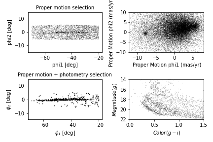
We use plt.tight_layout
at the end, which adjusts the sizes of the panels to make sure the
titles and axis labels don’t overlap. Notice how convenient it is that
we have written functions to plot each panel. This code is concise and
readable: we can tell what is being plotted in each panel thanks to our
explicit function names and we know what function to investigate if we
want to see the mechanics of exactly how the plotting is done.
Exercise (5 minutes)
What happens if you leave out tight_layout?
Without tight_layout the space between the panels is too
small. In this situation, the titles from the lower plots overlap with
the x-axis labels from the upper panels and the axis labels from the
right-hand panels overlap with the plots in the left-hand panels.
Adjusting proportions
In the previous figure, the panels are all the same size. To get a better view of GD-1, we would like to stretch the panels on the left and compress the ones on the right.
To do that, we will use the colspan argument to make a
panel that spans multiple columns in the grid. To do this we will need
more columns so we will change the shape from (2,2) to
(2,4).
The panels on the left span three columns, so they are three times wider than the panels on the right.
At the same time, we use figsize to adjust the aspect
ratio of the whole figure.
PYTHON
plt.figure(figsize=(9, 4.5))

shape = (2, 4)
ax1 = plt.subplot2grid(shape, (0, 0), colspan=3)
plot_pm_selection(candidate_df)

ax2 = plt.subplot2grid(shape, (0, 3))
plot_proper_motion(centerline_df)

ax3 = plt.subplot2grid(shape, (1, 0), colspan=3)
plot_cmd_selection(winner_df)

ax4 = plt.subplot2grid(shape, (1, 3))
plot_cmd(candidate_df)

plt.tight_layout()
OUTPUT
<Figure size 900x450 with 4 Axes>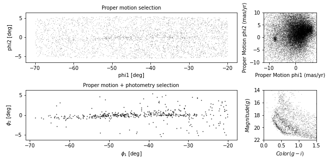
This is looking more and more like the figure in the paper.
Exercise (5 minutes)
In this example, the ratio of the widths of the panels is 3:1. How would you adjust it if you wanted the ratio to be 3:2?
PYTHON
plt.figure(figsize=(9, 4.5))

shape = (2, 5)                                   # CHANGED
ax1 = plt.subplot2grid(shape, (0, 0), colspan=3)
plot_pm_selection(candidate_df)

ax2 = plt.subplot2grid(shape, (0, 3), colspan=2)       # CHANGED
plot_proper_motion(centerline_df)

ax3 = plt.subplot2grid(shape, (1, 0), colspan=3)
plot_cmd_selection(winner_df)

ax4 = plt.subplot2grid(shape, (1, 3), colspan=2)       # CHANGED
plot_cmd(candidate_df)

plt.tight_layout()
Adding the shaded regions
The one thing our figure is missing is the shaded regions showing the stars selected by proper motion and around the isochrone in the color magnitude diagram.
In episode 4 we defined a rectangle in proper motion space around the
stars in GD-1. We stored the x-values of the vertices of this rectangle
in pm1_rect and the y-values as pm2_rect.
To plot this rectangle, we will use the Matplotlib
Polygon object which we used in episode 7 to check which
points were inside the polygon. However, this time we will be plotting
the Polygon.
To create a Polygon, we have to put the coordinates of
the rectangle in an array with x values in the first column
and y values in the second column.
OUTPUT
array([[-8.9, -2.2],
       [-8.9,  1. ],
       [-6.9,  1. ],
       [-6.9, -2.2]])
We will now create the Polygon, specifying its display
properties which will be used when it is plotted. We will specify
closed=True to make sure the shape is closed,
facecolor='orange to color the inside of the
Polygon orange, and alpha=0.4 to make the
Polygon semi-transparent.
Then to plot the Polygon we call the
add_patch method. add_patch like
tick_params must be called on an axes or
subplot object, so we will create a subplot
and then add the Patch to the subplot.
PYTHON
fig = plt.figure()
ax = fig.add_subplot(1,1,1)
poly = Polygon(vertices, closed=True,
                   facecolor='orange', alpha=0.4)
ax.add_patch(poly)
ax.set_xlim(-10, 7.5)
ax.set_ylim(-10, 10)OUTPUT
<Figure size 900x450 with 4 Axes>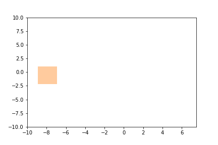
We can now call our plot_proper_motion function to plot the proper
motion for each star, and then add a shaded Polygon to show
the region we selected.
PYTHON
fig = plt.figure()
ax = fig.add_subplot(1,1,1)
plot_proper_motion(centerline_df)
poly = Polygon(vertices, closed=True,
               facecolor='C1', alpha=0.4)
ax.add_patch(poly)
OUTPUT
<Figure size 900x450 with 4 Axes>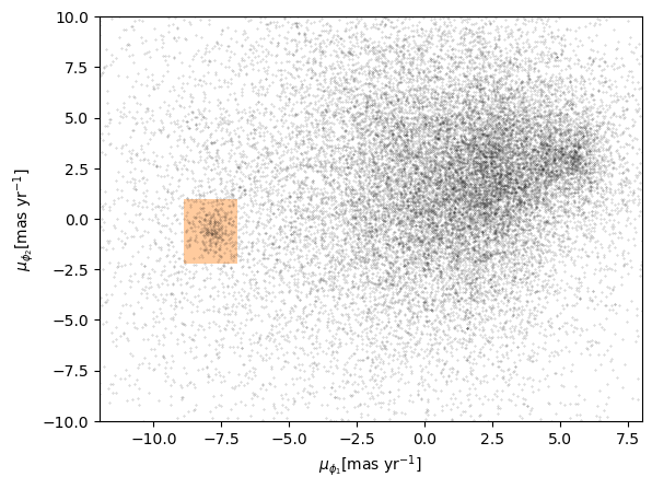
Exercise (5 minutes)
Add a few lines to be run after the plot_cmd function to
show the polygon we selected as a shaded area.
Hint: pass loop_df as an argument to
Polygon as we did in episode 7 and then plot it using
add_patch.
Exercise (5 minutes)
Add the Polygon patches you just created to the right
panels of the four panel figure.
PYTHON
fig = plt.figure(figsize=(9, 4.5))

shape = (2, 4)
ax1 = plt.subplot2grid(shape, (0, 0), colspan=3)
plot_pm_selection(candidate_df)

ax2 = plt.subplot2grid(shape, (0, 3))
plot_proper_motion(centerline_df)
poly = Polygon(vertices, closed=True,
               facecolor='orange', alpha=0.4)
ax2.add_patch(poly)

ax3 = plt.subplot2grid(shape, (1, 0), colspan=3)
plot_cmd_selection(winner_df)

ax4 = plt.subplot2grid(shape, (1, 3))
plot_cmd(candidate_df)
poly_cmd = Polygon(loop_df, closed=True,
               facecolor='orange', alpha=0.4)
ax4.add_patch(poly_cmd)

plt.tight_layout()
OUTPUT
<Figure size 900x450 with 4 Axes>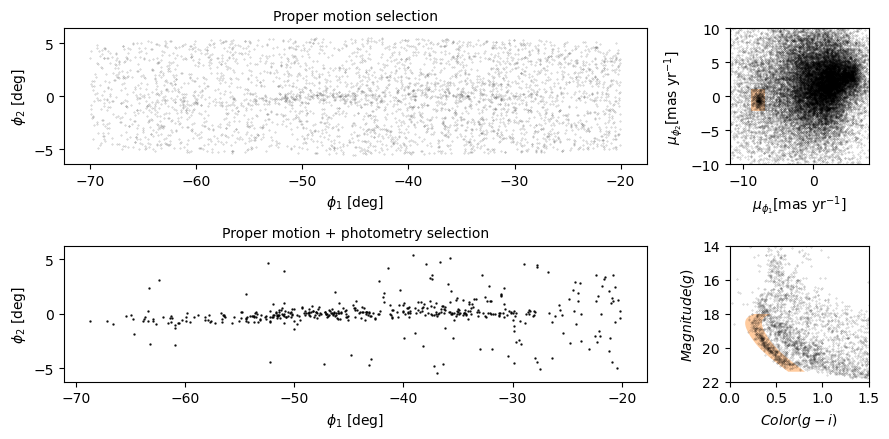
Summary
In this episode, we reverse-engineered the figure we have been replicating, identifying elements that seem effective and others that could be improved.
We explored features Matplotlib provides for adding annotations to figures – including text, lines, arrows, and polygons – and several ways to customize the appearance of figures. And we learned how to create figures that contain multiple panels.
- Effective figures focus on telling a single story clearly and authentically. The major decisions needed in creating an effective summary figure like this one can be done away from a computer and built up from low fidelity (hand drawn) to high (tweaking rcParams, etc.).
- Consider using annotations to guide the reader’s attention to the most important elements of a figure, while keeping in mind accessibility issues that such detail may introduce.
- The default Matplotlib style generates good quality figures, but there are several ways you can override the defaults.
- If you find yourself making the same customizations on several projects, you might want to create your own style sheet.